How to adapt a website for mobile devices on any screen
How to adapt a website for mobile devices and not lose 70% of customers? Step-by-step instructions: CSS, viewport and usability testing. Optimization checklist.

If you want to increase the number of customers and keep up with your competitors, you need to adapt your website for mobile devices. In Russia, 70% of users access the Internet via phone. No wonder: the gadget is always at hand. 60% of orders for goods and services are placed from smartphones.
If your website is not mobile-friendly, you risk losing customers and missing out on opportunities for business growth: 90% of users leave a website that is not mobile-friendly. In this article we will look at how to make a resource attractive and attractive on any screen. After all, no one wants users to run away from the site like cats from a vacuum cleaner.
Why create an adapted version?
- Increase conversion. The more convenient the mobile version is, the higher the likelihood that users will make a purchase or leave a request.
- Increase customer loyalty. Adaptability, user-friendly interface and fast page loading create a positive impression of the company.
- Improve SEO. Search engines give preference to sites adapted for mobile devices.
- Make your business available 24/7. Clients will be in contact with you anytime and anywhere.
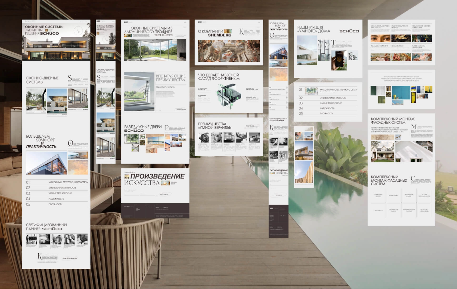
There are two ways to adapt a resource: create a responsive website or a mobile version.
What is a responsive website
An adaptive website is a virtual chameleon that automatically adjusts to the size of any screen: a large computer monitor, a tablet with a non-standard diagonal, or a small phone display. Adaptive pages look nice and, more importantly, are convenient, and on all devices.
Elements that help resources be adaptive:
- Rubber layout. Page elements change sizes depending on the width of the display. If the screen becomes narrower, the blocks and images also shrink, but remain proportional.
- CSS media queries. Media queries help you change page styles based on the characteristics of phones and tablets. For example, on smaller displays you can make fonts larger or images smaller. This will improve the design and make the resource more convenient.
- Flexible layout structure. Helps change the order and arrangement of page elements depending on the display size. This allows complex layouts to be displayed on large screens, and simplified ones on small screens.
- Responsive Media. Photos, infographics and pictures should automatically adjust to the display resolution. On a small screen the images will be smaller, but on a large screen they will appear in full size. This flexibility helps save Internet traffic and speeds up page loading.
- Convenience for clients. Nobody likes platforms that are difficult to open on their phones. If text is too small, buttons aren't clickable, and page elements extend off the screen, it's annoying.
- High download speed. Adapted pages load quickly.
- Improving search rankings in Yandex and Google. When ranking, search engines prefer adaptive sites. Unadapted resources do not make it to the top.
- Maintaining and increasing profits. If a resource is inconvenient to use on phones and tablets, customers go to competitors. And this leads to loss of profit.
- Favorable conditions for advertising. Advertisers prefer to cooperate with platforms adapted for mobile devices. If the site does not meet this requirement, advertisers may not come for fear of poor campaign performance.
How to make a responsive website

Creating a responsive website requires an integrated approach. It includes analysis, design and testing. Here are the main stages of creating a successful service:
- Audience research. Start with customer analysis. Find out what devices they use most often, what pages they visit, what problems and inconveniences they encounter. The answers to these questions will help you understand which devices to adapt the web service for first.
- Selecting a responsive template. If you're using a content management system (CMS), choose a template that's already configured to display correctly on devices with different displays. This will simplify website creation and save time. About the types of CMS and the principles of their selection, we wrote on the blog.
- Rubber layout. To set element values, use percentages and other relative units of measurement. So, instead of a fixed block width of 300 pixels, specify a width of 30% of the screen. This will allow elements to adjust to the size of the display.
- Setting up media queries. Create styles for different displays using CSS media queries. For example, you can set different font sizes for phones and laptops, hide some elements on smaller screens, or change the order in which blocks are displayed.
- Image optimization. Use photos, infographics and pictures that adjust to the width of the display. This can be done by uploading multiple versions of the same image with different resolutions. The choice of the optimal version depends on the user's device.
- Testing and refinement. Test the site on different phones and screens. Use Google's Mobile-Friendly Test and BrowserStack services to help ensure that pages display correctly on all displays.
- Constant monitoring. After launching a responsive web resource, it is important to monitor its performance. Analyze customer behavior and metrics, quickly respond to problems. Even the best website requires regular care and attention.
What is the mobile version
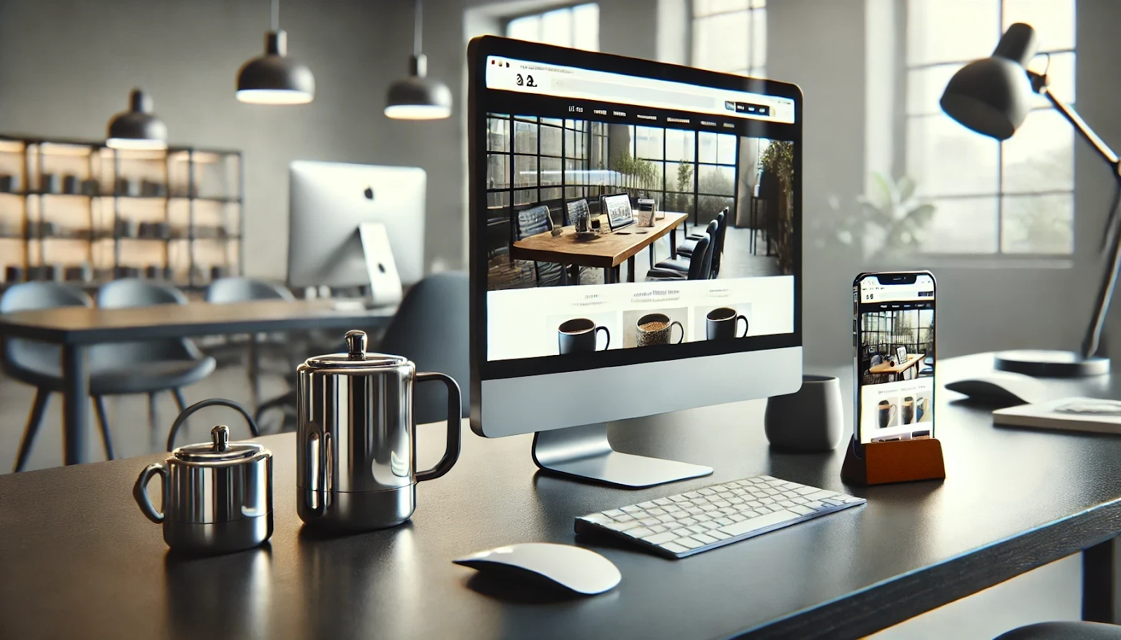
The mobile version is an alternative approach to adapting a resource for phones and tablets. In this case, a second website is created specifically for smartphones, which may differ from the main version in design and content. Typically, this version runs on the .m subdomain.
Advantages of the mobile version:
- Optimized for small screens. The mobile version allows you to develop an interface suitable for mini displays. You can remove unnecessary elements, enlarge important buttons and feedback forms.
- Speed up downloads. The mobile version is lighter and faster. This is especially important for customers with slow Internet. Nobody wants to wait a long time for pages to load.
How to make a mobile version

If you choose this path, you need to go through several steps:
- Needs Analysis. Find out what customers are looking for, what pages they visit more often, what products and services they order. The answers will help you focus on the features and information your audience needs.
- Creating a Layout. Develop a version of the project that is easy to view on smaller screens. It should be concise and easy to navigate. A mobile website is like a travel suitcase: take only the most important things, nothing unnecessary.
- Content optimization. Reduce the amount of text and images, remove irrelevant information. This will speed up loading and make the pages more user-friendly.
- Setting up a redirect. Automatically redirect clients to the mobile version. This can be done using settings on the server or a script that detects the user's device and directs it to the desired version of the resource.
- Testing. Test the created version on different smartphones and tablets. Check how quickly the pages load, whether the site is convenient to use, and whether the content is displayed correctly.
- Support and regular updates. After launching the mobile version, you need to monitor the operation of the resource, update content and correct errors. A good website requires constant attention and care.
Advantages and disadvantages of the two methods
Pros of a responsive website:
- one site for all devices;
- unified content management;
- savings on support.
- difficult to create;
- may display errors on older smartphones or displays with non-standard resolutions.
- design created specifically for phones;
- high download speed;
- convenient navigation.
- requires support for two versions of the resource, which increases development and maintenance costs;
- there may be difficulties with synchronizing content between the main and mobile versions;
- sometimes the mobile version has a negative impact on SEO, since search engines prefer responsive sites.
How to make a website convenient for everyone

Adapting a website for mobile phones is a necessary oxygen cylinder in a sea of competition. You can create a responsive website or develop an additional mobile version - each option has advantages and disadvantages. The choice depends on your goals, resources, and customer needs.
To make a responsive website, you need to do flexible layout, media queries and testing on different displays. You will receive a single resource that will be displayed correctly on all screens.
To create a mobile version, you need to develop a separate layout, optimize texts, illustrations and buttons, and set up redirects. You will get two sites: one for smartphones, the other for computers.
Both approaches require serious consideration and impeccable technical knowledge. Our programmers, marketers and designers always approach the task responsibly. Fill in brief, and they will tell you how they can adapt your site.