
What is identity in simple words
Brand identity is a system of visual and verbal elements by which a company is recognized. What is included in the identity, how it differs from the corporate identity and how to create it.

You walk into a coffee shop and don’t see the sign yet, but you already know it’s Starbucks. Green color, characteristic font, glass with a name on the side. Or you open the application on your phone: orange background, laconic icons - and it’s immediately clear that this is Yandex.Food, even if you just woke up and don’t yet fully understand who you are and where. This is how identity works. Silently, but convincingly, and around the clock.
Identity is not just a beautiful logo
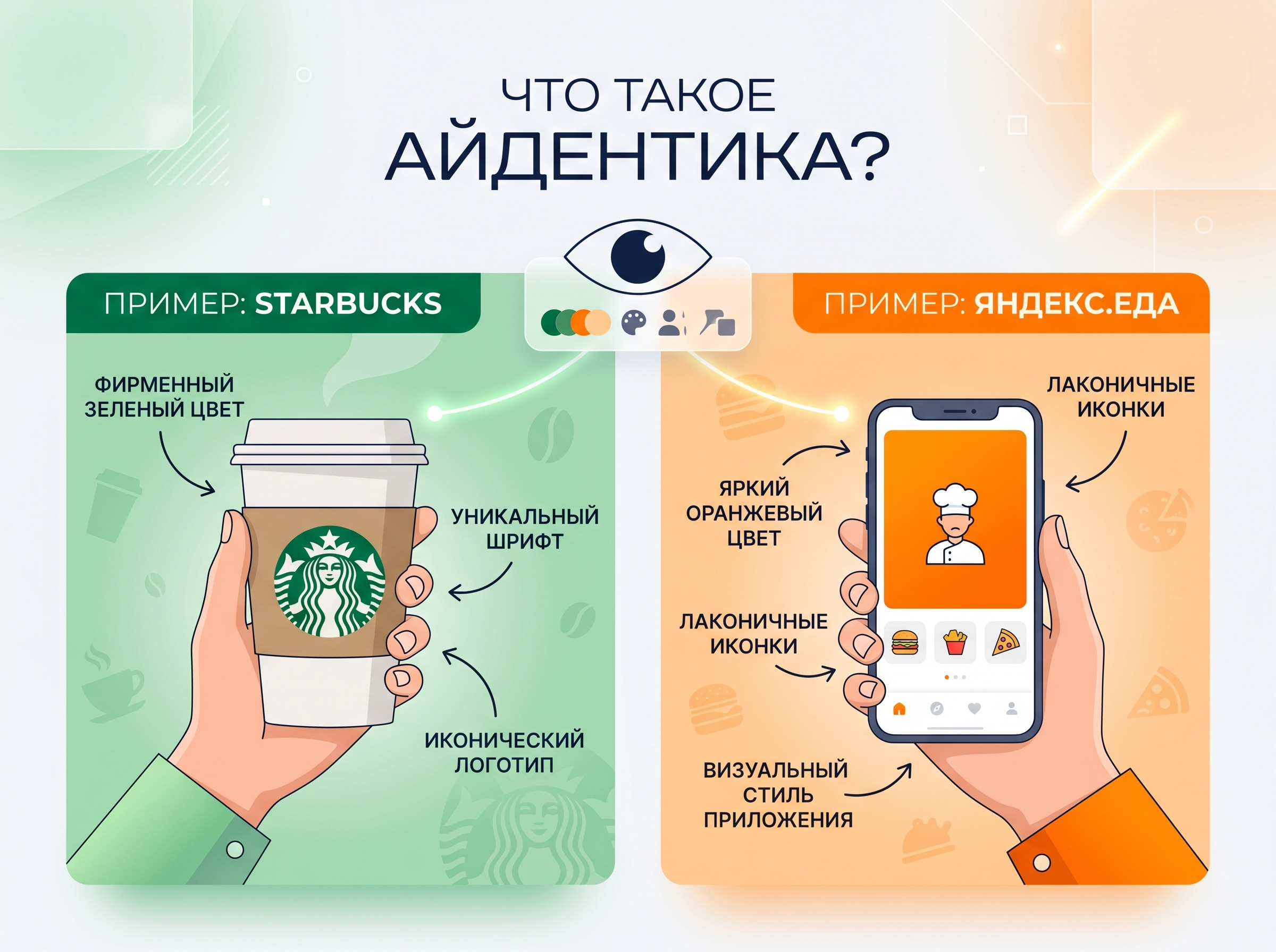
Brand identity (from the English identity - identity) is a system of visual, verbal and sensory elements through which a company expresses its identity. In simple words - everything by which you will be recognized without even reading the name.
The Golden Arches of McDonald's can be seen from a hundred meters away even in the fog. The red color of Coca-Cola catches your eye on a shelf among hundreds of other cans. A bitten Apple apple cannot be confused with anything - not on a laptop, not on a billboard, not on the cover of Forbes. None of these images appeared by chance: behind each there is a well-thought-out system, where each element of the identity works for the overall impression.
The identity reflects the company's philosophy. Who you are, who you work for, what your values are - all of this ends up being read visually and audibly even before the client has read a single word about you. If a company says “we are reliable and serious,” and the logo was drawn on the knee in fifteen minutes, the audience believes it. Not in words, but somewhere at the level of intuition.
Are identity and corporate style the same thing?
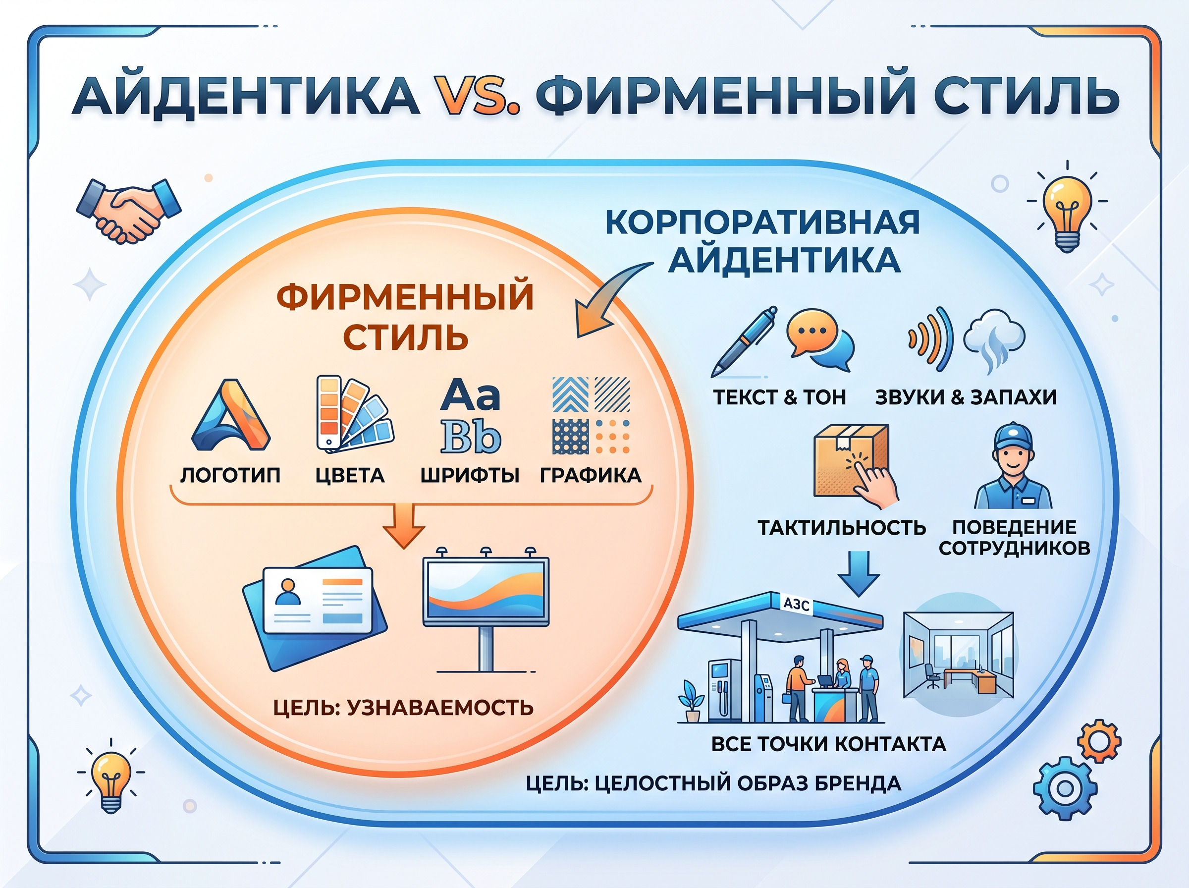
No, and confusion here is common - even among those who have been in business for a long time.
Corporate identity — visual component: logo, colors, fonts, graphics. What can be seen on a business card or banner.
Corporate identity - the system is wider. It includes corporate identity, but is not limited to it. This includes the brand’s voice, communication style, sounds, smells, and tactile sensations from the packaging. Everything that forms a holistic image of the company in a person - even when he does not look at the logo.
| Corporate identity | Identity | |
|---|---|---|
| What does it include | Logo, colors, fonts | Visual + text + sensations |
| Where does he work? | Visual media | All points of contact |
| Goal | Recognition | Holistic brand image |
Lukoil is a good example. Red and white colors, branded gas stations with recognizable architecture - this is the corporate style. And what the employees look like, how the checks are drawn up, what the tone of communications on social networks is - this is already a visual identity in a broader sense. One without the other works at half capacity.
Brands speak not only with their eyes
The sound of a Coca-Cola can opening is recognizable without a picture. The smell in Abercrombie & Fitch stores was specially sprayed so that it became part of the image - and when people walked inside, they instantly understood where they had ended up. The tactile packaging of the iPhone during unboxing is a thoughtful ritual that Apple has perfected to the point of automaticity. They say that some buyers deliberately filmed the unboxing - not because they were paid, but because the process itself was a pleasure.
A full-fledged identity is not limited to the visual: non-visual elements (sound, smell, tactility) work no less effectively on the brand image. Together they engage all five senses:
- Vision — logo, colors, fonts, visual materials;
- Rumor — jingle, sound logo, music at points of sale;
- Touch — packaging texture, product weight, carrier material;
- Smell — branded scent in stores and offices;
- Taste — relevant for food brands, cafes, restaurants.
For most companies, the first two or three levels are sufficient. But the more feelings are involved, the deeper the emotional connection with the audience, and the more difficult it is for competitors to copy you.
Why does your business need an identity - and what does money have to do with it?

A good identity works for a business silently and around the clock. While you are engaged in production, sales, or figuring out what to write in a corporate chat, it forms the image of the company in people’s minds. And this is just one of the benefits of identity - measurable and quite specific.
According to the report State of Brand Consistency platform Marq (formerly Lucidpress), consistent brand presentation across all touchpoints increases revenue by an average of 23%. One can argue about the accuracy of the figure, but the direction is correct.
Brand trust cannot be bought by advertising - it is earned by consistency

People trust what is familiar. When a company looks the same on the website, on social networks, on packaging and in the office, this is read as reliability. Not in words, but at the level of sensations: “these guys know what they are doing.”
“VkusVill” has built the image of an “honest store” through packaging without unnecessary plastic, a design without aggressive promotional price tags and a calm tone of communications. Everything is in one direction. The result is one of the highest loyalty scores among Russian retailers according to NPS research.
When a brand's image is consistent, customer loyalty naturally grows: repeat sales come naturally, and satisfied customers refer others. There is nothing cheaper than a client referral.
Recognition is when you are seen before you are read
On a shelf with thirty similar products, the winner is the one who is recognized in a split second. This is the main competitive advantage of a well-built system - you are caught by the eye where competitors merge into a gray background.
Google changes its logo every holiday, but you always know it's Google because the colors, shape, and spirit remain the same. Yandex.Food made a redesign in 2020: brighter orange, simplified icons. Memorability has increased, and the application has become more actively downloaded.
Unique visual elements create instant recognition—and it's measurable. Marketers use two measures: spontaneous brand knowledge (name a brand of coffee and you remember Starbucks without prompting) and induced knowledge (do you recognize the logo when shown it). The stronger the identity, the higher both indicators are.
What does identity consist of: from logo to mascot
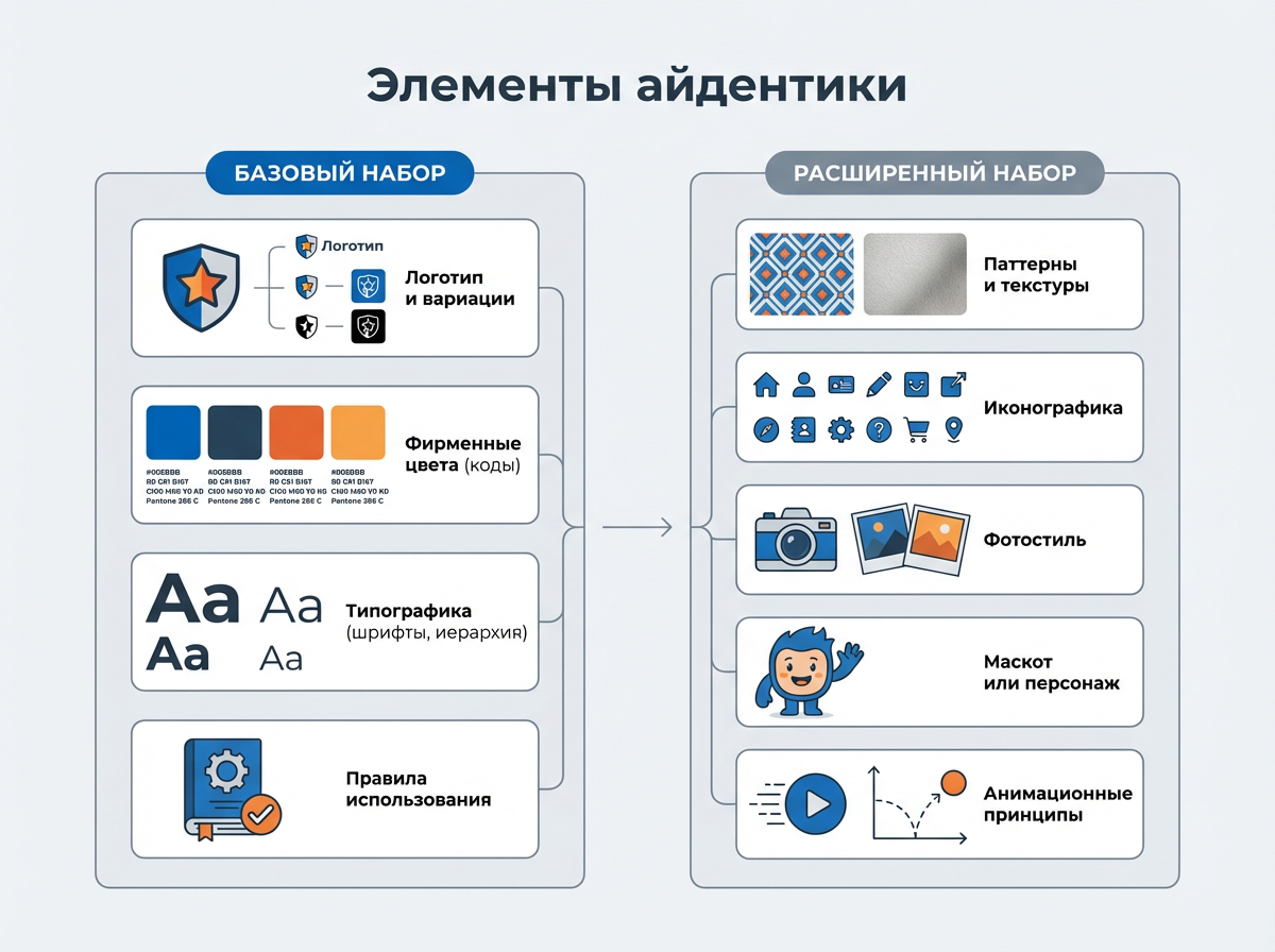
Identity elements are divided into basic ones, which you can’t live without, and advanced ones, which add character and depth. Not everyone needs everything: a small local bakery needs a logo, two colors and one font, while a federal bank needs a complete system with hundreds of rules and a separate guide for each format.
The basic set looks like this:
- Logo and its variations (horizontal, vertical, monochrome);
- Corporate colors with exact codes - HEX, RGB, CMYK, Pantone;
- Typography: fonts, sizes, hierarchy;
- Rules for use on media.
Extended set:
- Patterns and textures;
- Iconography;
- Photo style;
- Mascot or brand character;
- Animation principles for the digital environment.
Logo, colors, fonts - the three pillars on which everything rests
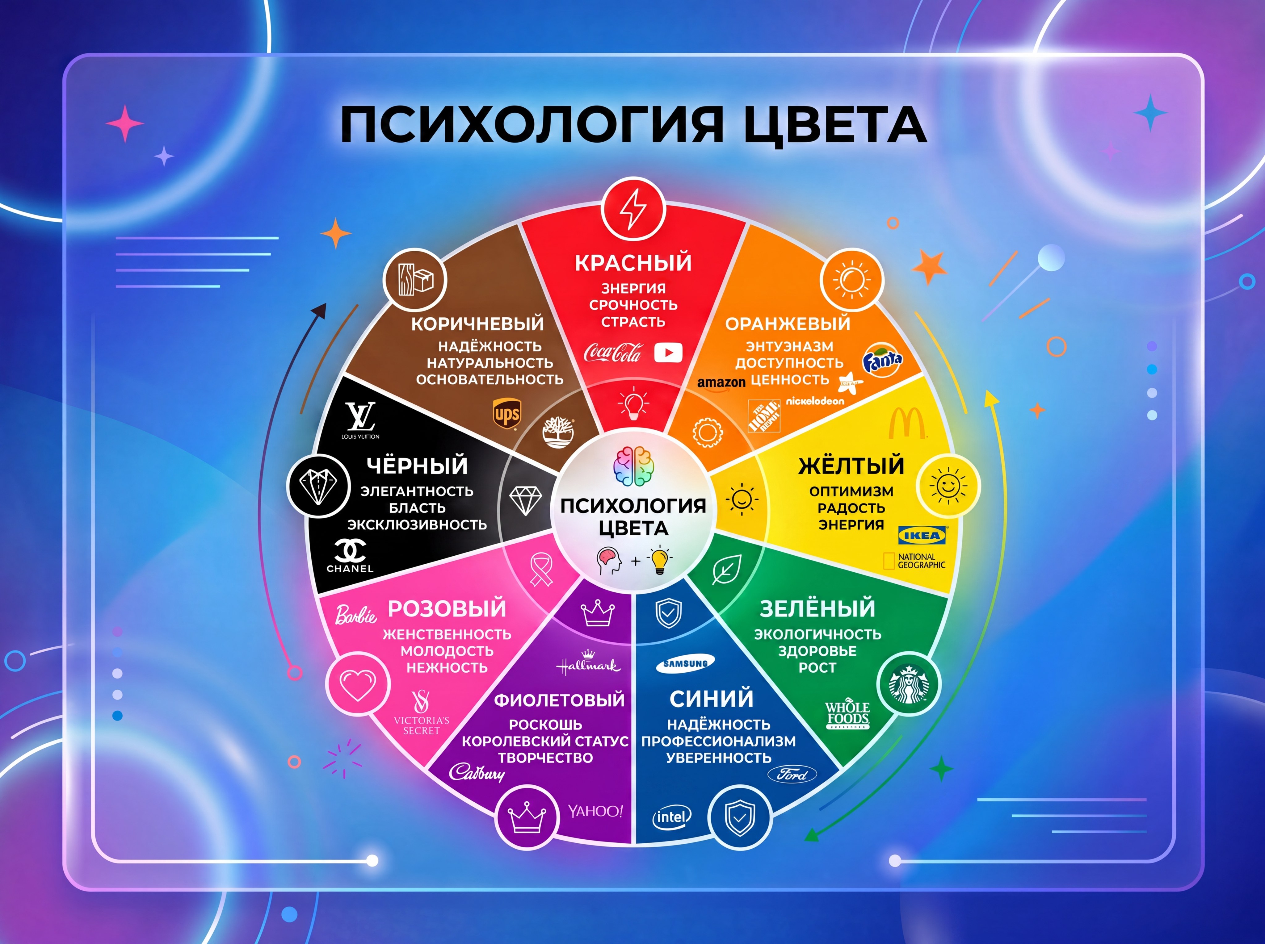
The visual identity rests on three elements, and each does its job.
- Logo - the main sign of recognition. A good one works on black and white printing, on a phone screen the size of a fingernail, and on an airplane. The Nike Swoosh is one line that is recognized all over the world. Lacoste is a small crocodile that fits on a shirt cuff and costs more than the entire print on a competitor's T-shirt. A bad logo is one that needs to be explained.
- Color palette — the emotional layer of the brand. Red – energy, urgency, appetite, passion: KFC, YouTube, Netflix. Blue - reliability, calmness, professionalism: Samsung, Visa. Green - ecology, health, freshness: Starbucks, VkusVill. Choosing a color for reasons like “I like blue” is a way for the brand to say one thing, but the color to convey another. The audience feels it.
- Typography communicates the character of the brand before you read the text. Serifs - classic, reliable, history. Grotesques - modernity, technology, democracy. Handwritten fonts - warm, craft, personal. Apple uses San Francisco - neutral, clear, technological. Exactly what a company that sells the idea of simplicity in a complex device needs.
Static or live: which identity to choose
When creating a brand, the question always arises: which type of identity to choose—a rigid and stable system or a flexible and adaptive system? There is no universal answer - it depends on the business.
Static identity: stability as a value
Static identity (aka traditional, classic identity) is a proven approach. The logo, colors and fonts are fixed once and for all, written down in the brand book and do not change without a good reason - and certainly not because the new designer “wanted to refresh something.”
A static identity is optimal if:
- the company operates in a conservative industry - finance, law, medicine, premium segment;
- the brand is already recognizable and changing something without a reason means losing capital;
- communications are carried out by different contractors, and it is important to maintain a single standard;
- a product or service requires maximum trust from the client.
This is suitable for financial companies, law firms, the premium segment - anywhere where stability and predictability are valuable in themselves. Mercedes-Benz does not change the three-pointed star every season. Hermès does not make “fun” variations of the logo for the New Year. And this is not conservatism for the sake of conservatism - this is a message to the audience: “we were here yesterday, we are here today, we will be here tomorrow.”
The main requirement for this approach is a detailed brand book (or guideline), which answers any question from the contractor: what indentation, what shade, what size in what format. Otherwise, in a year, there will be three different shades of “signature blue” on different media, and each performer will be sure that he has the right one.
Dynamic identity: when flexibility is a strategy
Dynamic identity (or flexible identity) is a system in which some elements change depending on the context, site or season, but recognition is maintained. It sounds like a contradiction, but in practice it works great - if done head-on.
Google changes the doodle every day, but the four brand colors and Product Sans font remain the same - so you always know it's Google. VKontakte adapts the icon for different formats and thematic periods. MTV once made one of the most famous adaptive identities in the world: a polymorphic logo with one constant shape, but the letter “M” is filled with new content each time - and this became their feature.
Dynamic identity is suitable if:
- the brand is present on many digital platforms with different formats;
- the audience is young and values liveliness, relevance, and involvement;
- the company regularly launches special projects, collaborations or seasonal campaigns;
- the brand wants to stand out due to the very approach to identity, and not just the visual.
Dynamic, adaptive identity works well in the digital environment, in media, in youth and lifestyle brands - where liveliness and changeability are organic and expected by the audience.
How an identity is developed - and how much it costs
Many people think that identity development means “draw a logo and send it by email.” If a contractor offers to “make an identity in three days,” most likely we are talking about a stock logo with a color change. This is not an identity, it is an illusion of identity.
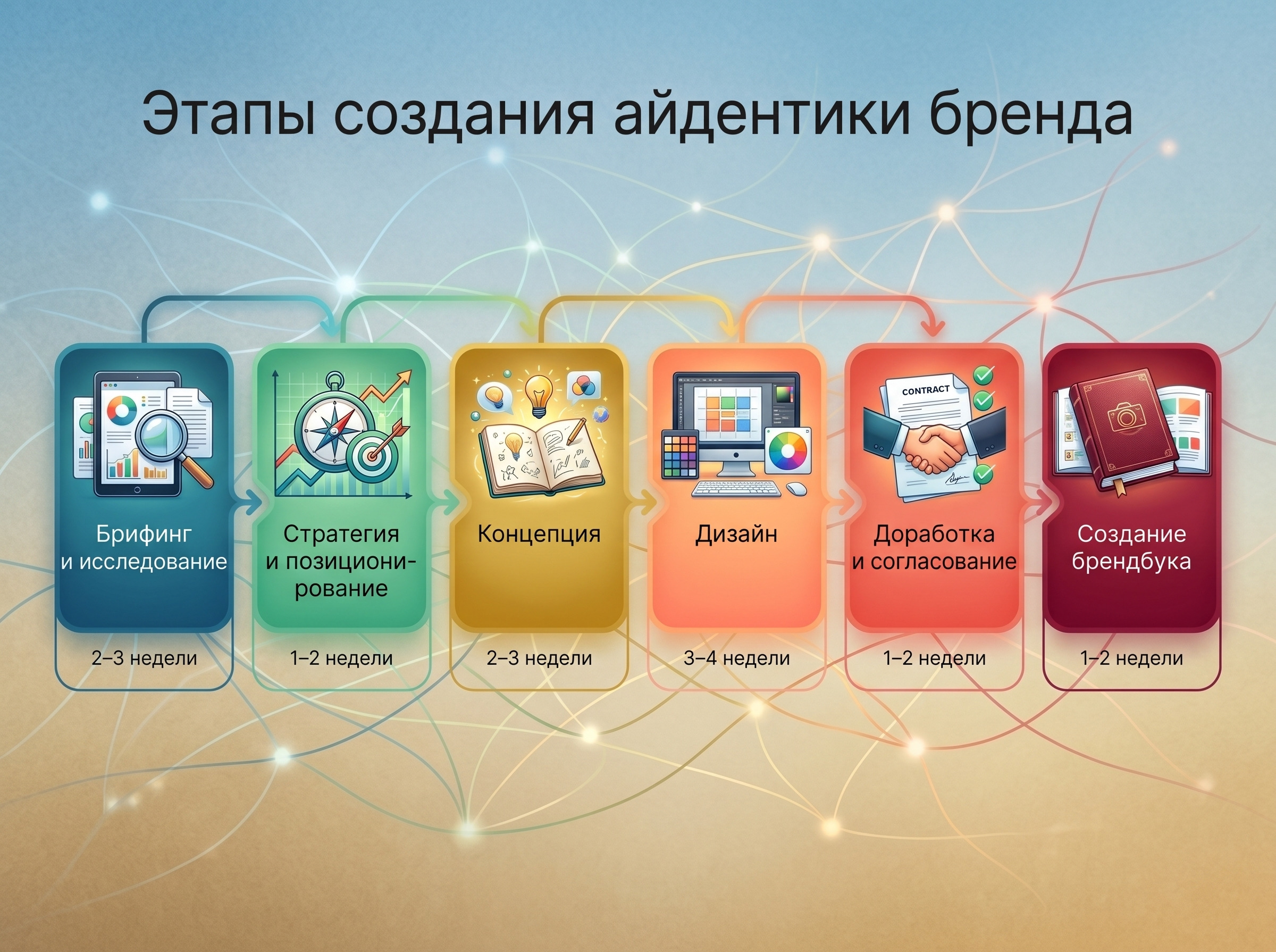
The normal process for creating a brand identity looks like this:
- Briefing and research (2–3 weeks) - market analysis, competitors, audience research, problem formulation.
- Strategy and positioning (1–2 weeks) - who you are, for whom, how you differ from others.
- Concept (2-3 weeks) - several visual directions, search for brand language.
- Design (3–4 weeks) — development of all elements of the system.
- Finalization and approval (1–2 weeks) — edits, final version.
- Creation of a brand book (1–2 weeks) – fixing all the rules in a single document.
All stages of identity development take from one and a half to three months in total. It can be faster, but then either the task is smaller, or something has been simplified somewhere - and this will come back to haunt you later.
There is a wide range of budgets, and it honestly reflects the level of immersion in the task:
- Freelancer - from 50,000 to $2,000
- Studio - from 300,000 to $8,000
- Large agency - from $10,000
If you don’t know how to create an identity from scratch, we’ll take it upon ourselves: from strategy and concept to the finished product brand book with rules for all media.
Identity is about consistency: when each point of contact with the audience says the same thing, in the same voice and in the same style. Without this, even the best product gets lost in the noise.
Briefly about the main thing
What examples of successful identity exist?
From global ones - Apple, Nike, Coca-Cola, Google. Among the Russian ones - Sber after a large-scale redesign in 2020, VkusVill with its environmentally friendly and honest aesthetics, Yandex with a unified visual system for dozens of products at once. All these brands have one thing in common: each element works for the same image, without contradictions. I saw - I learned - I remembered.
What are the minimum identity elements needed for a start-up business?
A logo in several variations, two or three corporate colors with codes and one or two fonts - this is enough to get started. The main thing is to fix the rules in at least a minimal guide, so that the website, social networks and business cards look like a single whole, and not three different companies that accidentally ended up in the same building.
How is identity different from branding?
Branding is a broader concept. This is the whole process of building a brand: strategy, positioning, communications, reputation. Identity is one of the tools within this process, responsible for how the brand looks and sounds.
When is it time for a business to think about identity?
The sooner the better. But if you missed the start, it’s definitely time when you have several contractors making materials differently, the logo exists in five versions of unknown origin, and the website and business cards look like products of different companies.
Is it possible to develop an identity yourself?
Basic level - yes. Canva or Figma provide the tools to create a simple visual system. But if your business is growing and your reputation is at stake, it’s better to entrust it to professionals. A homemade identity saves money now and costs more later when you have to redo everything from scratch.
How often should you update your identity?
There are no hard deadlines. An update is appropriate when a company changes its positioning, enters a new market, or the identity is simply outdated and no longer reflects the reality of the business. On average, large brands review their visual system every 7–10 years.
What is a brand book and why is it needed?
A brand book is a document that records all the rules for using the identity: colors with codes, fonts, indents, acceptable and unacceptable logo options. Without it, each new contractor will do things “his own way” - and in a year there will be no trace left of the uniform image.