


We will build a responsive
website for every device
Let’s say you like the pendant at the jewelry store. But you were in a hurry and did not have time to buy it on the spot, and decided to do it online. Take the phone, go to the seller's website. And what you see: the checkout buttons are tiny, the description text crawls out of the fields, the photos don't open. Of course, you close the page.
This happened because the site was not adapted for mobile devices. For a serious growing business, this is unacceptable. 80% of online purchases are made from phones. If you do not want to lose customers, you should take care of adapting the site. It should be displayed correctly on any screen: from Siemens C60 to iPhone 16 Pro Max.
Here are three reasons why a responsive website is necessary:
-
Increased sales. For convenience, customers are willing to pay in rubles. If
The site doesn’t work well on mobile phones, you lose 40 to 60% of customers. -
SEO promotion. Search engines bring responsive sites to the top.
They are given priority in the results of issuance. -
Savings. Instead of developing separate versions for PC and mobile,
You get a universal solution.
Clear navigation, accurate placement of buttons, correct display of photos - take into account every detail. Make a responsive design that helps your business thrive.
Cost of adapting the site
mobile
from $950
What's included in the price:
- analysis of the current state of the site;
- study of competitors;
- optimization of the structure;
- change of design;
- mobile layout;
- increase in loading speed;
- configuration of forms and buttons;
- animation;
- programming;
- testing;
- launch of the updated version;
- lifetime warranty.
Additionally you can order:
- logo;
- development of a personal account for clients;
- Connecting the online payment function;
- integration with the CRM system;
- comprehensive promotion of the company.

Portfolio


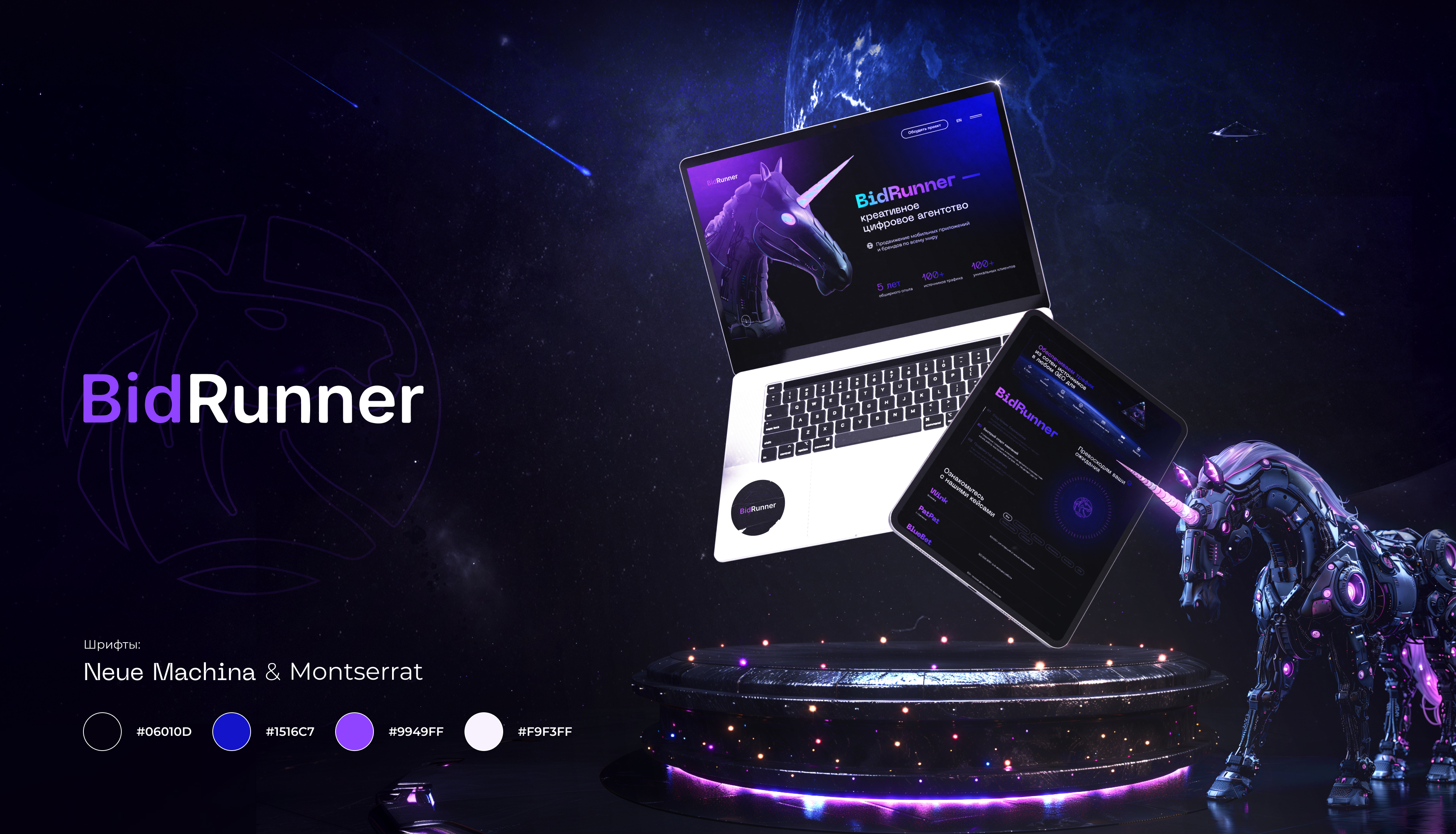
Website for the advertising agency BidRunner. Where else will you see a cyberpunk unicorn?

SHEMBERG
Creation of the Site

Website for the logistics operator Seametria Logistic. How we made a cargo ship float in the air

Development of the site
transporter
Stages of responsive website design
-
01
Brief
-
02
Analysis
-
03
Structure
-
04
Design of
-
05
Layout
-
06
Contact
-
07
Testing
-
08
Launch
Advantages of ordering an adaptive site in Veonix
Deep audit
We conduct an audit and understand what needs to be improved. We offer solutions to make the site cool and modern.
Responsive design
We make the elements adjust to the size of the screen.
SEO
Adaptive site is better promoted in search engines. Google and Yandex will love it.
Experience
We have over a thousand projects in our portfolio. We were building responsive websites before it became commonplace.
Versatility
We guarantee the correct operation on all devices: from a button phone to a widescreen TV.
High speed.
Your customers don't like to wait. We guarantee that the site will load quickly.
Simple management
Once completed, you can easily update the content.
Support
We always stay in touch. We help with updates even after launch.
How Responsive Website Design Works
Adapting the site for mobile devices has become the standard in development. Companies that ignore it risk being left behind. If a site does not display well on smartphones and tablets, it loses half of its audience.
Responsive design is a way to make pages convenient for all users. No limits. The site should adapt to every display size, from the old Sony Ericsson to the latest iPad.
The work of adaptive design on the example of the site menu:
- Desktop computer. The menu is traditionally located at the top of the page: it is easy to point the mouse to the desired field.
- Tablet. The screen is smaller, so all the points on top do not fit. The menu here is compressed into a compact look.
- Smartphone. It involves the creation of a “burger” – a button in the form of three horizontal stripes. When you click on it, categories are disclosed as a vertical list.
Why You Need Responsive Design
The layout is handled by a front-end developer. Without his work, a visitor with a phone would have to load the page for a day, and then squint to press the button for checkout. What the front-end developer’s actions bring:
-
Growth of mobile traffic
The number of mobile Internet users is growing from year to year. Losing them is a bad omen that promises an empty pocket. Optimization for mobile phones and tablets will attract customers, and with them – additional profit. -
Improved convenience
The design should be designed in such a way that it brings the user closer to making an application or making a purchase. In the pages adapted for smartphones, the vertical arrangement of blocks. The content organically fits into the screen in width. Important navigation elements are concentrated at the bottom. That's because it's easier to reach with your thumb. For this decision, users will definitely put your site finger up. -
SEO promotion
Search engines prefer resources with responsive design. It affects the rating and helps to rise to the top of the issue. The bottom line is that you don’t spend money on advertising, and traffic increases. -
Relevance
The adaptability of the design shows that the company is keeping pace with the times. Your online presence will look professional and trustworthy. Users are already used to quality online services, do not return them in the 2010s to clumsy sites on uCoz. -
Fast loading
The front-end developer will act as a speedy racer. He'll squeeze the gas pedal to maximum. Minimal image weight, simplified code and adaptive layout will make pages load quickly even with a weak Internet. The visitor will not leave disappointed without waiting for the wheel to roll.
How to adapt the site
Adapting a website means revising its structure and design to make it work perfectly on all devices. Here are the tools you can use:
-
Page optimization
Fixed block sizes should be removed. It is better to get rid of horizontal scrolling: flipping the page to the right and left is inconvenient. -
Enlarge buttons
Interactive elements need to be made larger. The average size of the thumb pad is 2.5 cm. Appropriate objects with a width of 72 pixels. -
Image selection
Images are compressed and scaled to make downloads fast even with weak internet. -
Font consolidation
Small text is a pain to the eyes. To allow this in the mobile version is disrespectful to users. The standard for main text in the mobile version ranges from 16 to 18 px. - Testing You need to check the operation of the site on different devices and in all popular browsers.
Advantages of Adaptive Design
-
Cost savings
Instead of creating two separate versions for a smartphone and a tablet, it’s a single solution. Adaptability reduces the cost of development and technical support. -
User loyalty
When the site is convenient, visitors spend more time on it. They are happy to come back and make orders. -
Increased audience
A pleasant interface and instant access to information are a serious help in turning visitors into customers.
Conclusion
Website adaptability is not a trend, but a necessity. The feature increases traffic, improves user experience and helps to climb in SERPs. The investment pays off many times over. Take a step towards convenience and efficiency – your business deserves it.
Order responsive website design from Veonix
Websites for every industry
We develop every type of website
Responsive website
Key employees
Frequently Asked Questions
Why does the site need an adaptive version?
What are the advantages of adaptive design?
At what stage is it better to adapt the design?
What to choose: responsive design or mobile version?
How do sites with responsive design progress in search engines?
Is it possible to create a responsive design for an existing website?