
What is a brand in simple words
A brand is not just a logo, but an image of a company in people’s heads. Let's understand what a brand is in simple words: what it consists of, why a business needs it, and how to create it from scratch.

Every day you choose between similar products - and your hand reaches for one for no apparent reason. Sneakers with a tick, coffee with a mermaid on a glass, a phone with a bitten apple. For all this they pay three times more than for analogues, with almost the same characteristics. Behind this is a brand - and everyone who builds or develops a business needs to understand what a brand really is.
Key findings:
- A brand is not a logo or a legal document, but an image in people’s heads
- A brand consists of two parts: visible (identity) and invisible (values, mission, voice)
- A strong brand gives a price premium of up to 30% and reduces the cost of customer retention
- Creating a brand starts with strategy, not with choosing colors in Figma
- A brand is an asset that requires regular management
A brand is not a logo, or even a company.

A brand is the image of a company, product or person in people’s heads. Not a logo, not packaging and not an entry in the Rospatent register. The image is what people think, feel and the trust they have in you when they hear your name.
Apple is associated with simplicity and status. Volvo - with safety. Red Bull - with energy and extreme. These associations did not arise on their own; they were built over the years at every point where a person encounters the brand:
- Product and packaging - the first thing a person holds in his hands;
- Price — a silent signal about who you are on the market;
- Advertising and content - what you say and in what tone;
- Service - how the buyer feels after giving the money;
- Employees — living carriers of the brand, whether you like it or not;
- Visual language - logo, colors, fonts (yes, this is also part of the brand - just not the whole brand).
It is important to separate the two concepts here. Brand identity is how a company wants to see itself. Consumer perception of a brand is how they see the company from the outside. The task of branding is to bring these two images as close as possible. If the gap is large, no advertising budget will close it.
Brief history of the brand
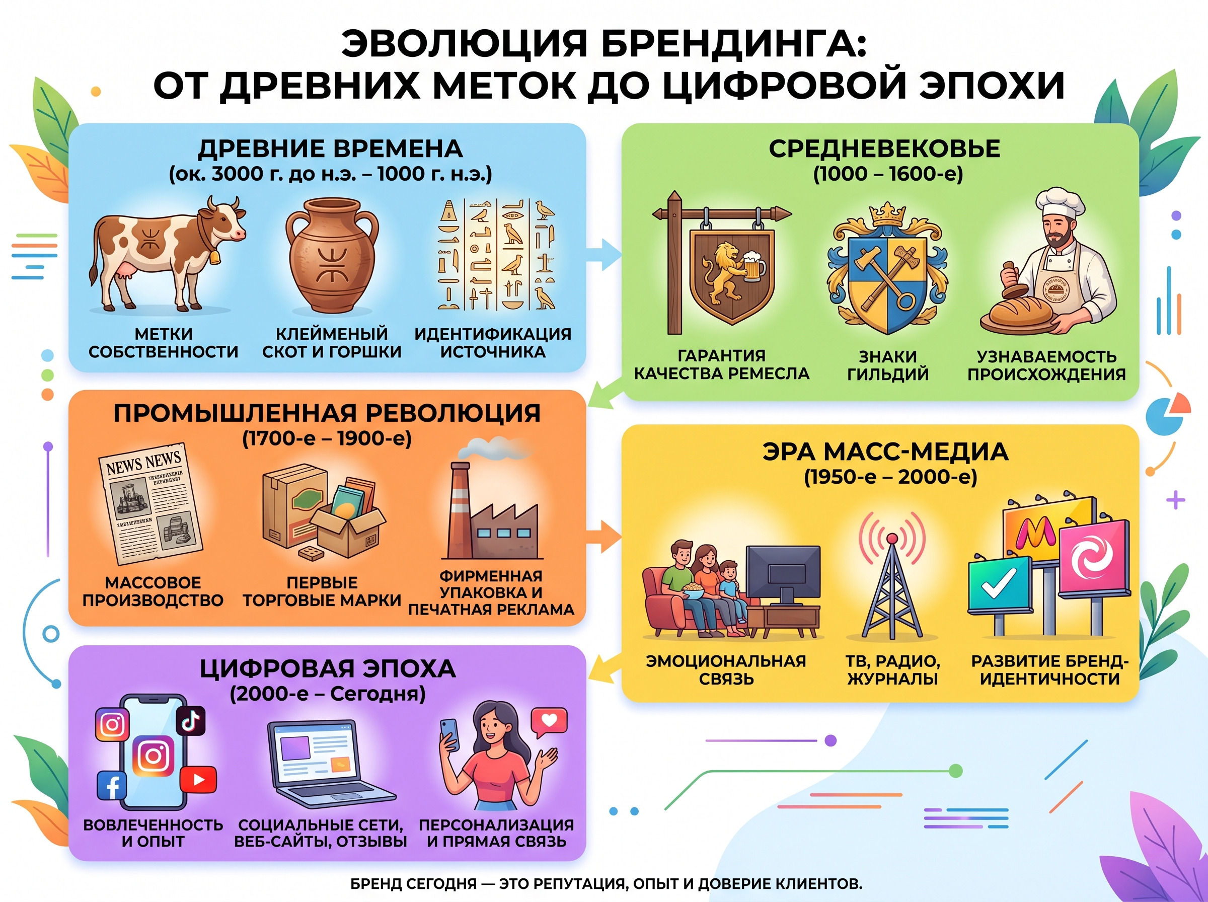
The word “brand” comes from the Old Norse brandr - “to burn.” Cattle breeders burned a brand on their cattle to distinguish theirs from others. The task was extremely simple: “this is mine, don’t mix it up.” Thousands of years have passed since then, but the essence remains the same - only instead of red-hot iron there are now design systems, brand values, voice - and millions of advertising budgets.
Brand, trademark and trademark - three different beasts
Confusion is the norm here, even among experienced entrepreneurs. Let's sort it out once and for all.
Trademark - legal instrument. It is registered with Rospatent (Federal Service for Intellectual Property) to protect the logo, name or slogan from copying. Without registering a trademark, it will not be officially possible to prohibit competitors from using a similar designation.
Brand — a set of visual and verbal symbols of a company or product. Broader than a trademark, but still in the realm of legal and marketing tools.
A brand lives in people’s heads - in associations, emotions, memories. You can register a trademark and still not have any image in the eyes of the audience. And vice versa - build a reputation for years without thinking about legal protection, and end up feeding those who rivet fakes.
The easiest way to explain the difference is with an example: Coca-Cola is a registered trademark. And the feeling of celebration that arises when you see a red can in the hands of Santa Claus is already a brand.
| Brand | Trademark | Brand | |
|---|---|---|---|
| What is | Image in the audience's mind | Legally protected designation | Set of company designations |
| Purpose | Builds loyalty and trust | Intellectual Property Protection | Market identification |
| Value | Intangible asset | Legal document | Marketing tool |
Luxury, mass market and everything in between: how brands divide the market by price

Brand positioning largely determines who your buyer is and what they are willing to pay. There are several price categories:
- Lux — Hermès, Ferrari, Rolex. The high price is part of the product. The buyer pays for status, exclusivity and a special ownership experience.
- Premium brand — Apple, BMW, Nespresso. Above the market price, but more widespread than luxury. Emphasis on quality and image.
- Mass market - IKEA, H&M, Lay's. Wide audience, affordable price, high recognition.
- Economy brand — retailers’ own brands. Minimum price, minimum branding.
Switching between price categories is one of the riskiest maneuvers. An attempt to suddenly “jump” into premium without changing the product and communications ends the same way: the audience doesn’t believe it, sales fall.
What's inside a brand: visible and invisible

Brand components are divided into two parts - what is visible and what is felt. A skew in any direction destroys integrity.
What's on the surface: identity and corporate style
The visual elements of the brand are the most obvious layer. Each of the elements has its own job:
- Logo — the face of the brand, which should be readable both on the business card and on the billboard;
- Color palette — the fastest emotional signal (that’s why there are exact codes, and not “something bluish”);
- Typography — fonts set the character: strict, playful, modern;
- Icons and patterns — details that make the system recognizable even without a logo;
- Photo style — a unified visual language for all brand images.
All these rules are collected in a brand book. Without it, each contractor works differently - and a year later there is one shade of blue on the website, another on social networks, a third on the packaging, and all three are sure that they have the right one.

Color in branding is a different story:
- Red - conveys energy and urgency (Coca-Cola, YouTube).
- Blue — reliability and professionalism (Samsung, Intel).
- Green - environmental friendliness and health (Whole Foods, Starbucks).
- Yellow — optimism, joy, energy (McDonald's, IKEA, National Geographic)
- Orange - enthusiasm, accessibility, value (Amazon, Home Depot, Fanta, Nickelodeon)
- Purple - luxury, royal status, creativity (Cadbury, Hallmark, Yahoo)
- Black - elegance, power, exclusivity (Chanel, Louis Vuitton, Gucci)
- Pink — femininity, youth, tenderness (Barbie, Victoria's Secret)
- Brown — reliability, naturalness, solidity (UPS, Timberland)
Randomly choosing a color for reasons of “looks nice” usually costs more than it seems.
If you need turnkey visual identity development, we deal with identity for companies of any size - from logo to full brand book.
What is not visible, but works the most
Brand values, mission, character and voice are something you can't draw in Illustrator, but that's what keeps people coming back.
- Brand mission — why the company exists. It sounds abstract, but it is she who sets the vector for all decisions: where to open points, how to train employees, how to design the space. Starbucks at the growth stage formulated its mission not as “selling coffee”, but as “creating a place between home and work” - and everything, from the arrangement of furniture to the music in the room, was subordinated to this.
- Brand values — principles from which the company does not deviate even for the sake of profit. Patagonia builds its entire brand image around ecology: it repairs things instead of replacing them, donates a percentage of revenue to environmental projects, and encourages people to buy less in advertising. It works precisely because it is consistent.
- Tone of voice (brand voice) is a way of communicating with the audience. Aviasales speaks first-hand, jokes and is not afraid of sensitive topics. “VkusVill” is warm and neighborly. Sberbank is official and balanced. All three approaches work when chosen consciously and followed on every platform without exception. The company announces innovation, but the site does not open on the phone - the audience feels this gap without even formulating it in words.
- Brand positioning — the answer to the question “why you and not a competitor?” Volvo = safety. FedEx = express delivery. The more precisely it is formulated, the better it works in the minds of the target audience.
Why should a business invest in a brand?
A brand is often perceived as an expense item - a beautiful picture, an expensive logo, an incomprehensible result. In fact, this is an asset with a direct impact on the business - and it works in several directions at once.
- Price premium. Products of the same composition are sold at completely different prices - just because one brand has a name, history and reputation, while the other does not.
- Customer loyalty to the brand. A regular customer costs a business much less than attracting a new one. A brand is one of the main retention tools: people return to where they feel comfortable and where they seem to know them personally.
- Competitive advantage. In saturated niches where products are as similar as twins, brand character and values become the main differentiator. You can buy from dozens of suppliers - choose the one who is understandable and close.
- Attracting employees. A strong brand image works for both buyers and potential candidates. People want to work for companies with a clear mission and a good reputation - especially now that the job market is competitive.
How to create a brand that doesn't just look good
Creating a brand begins with questions: who are you, for whom and why? Without an answer to them, any logo is just a picture. A good brand grows from within, not from choosing colors in Figma.
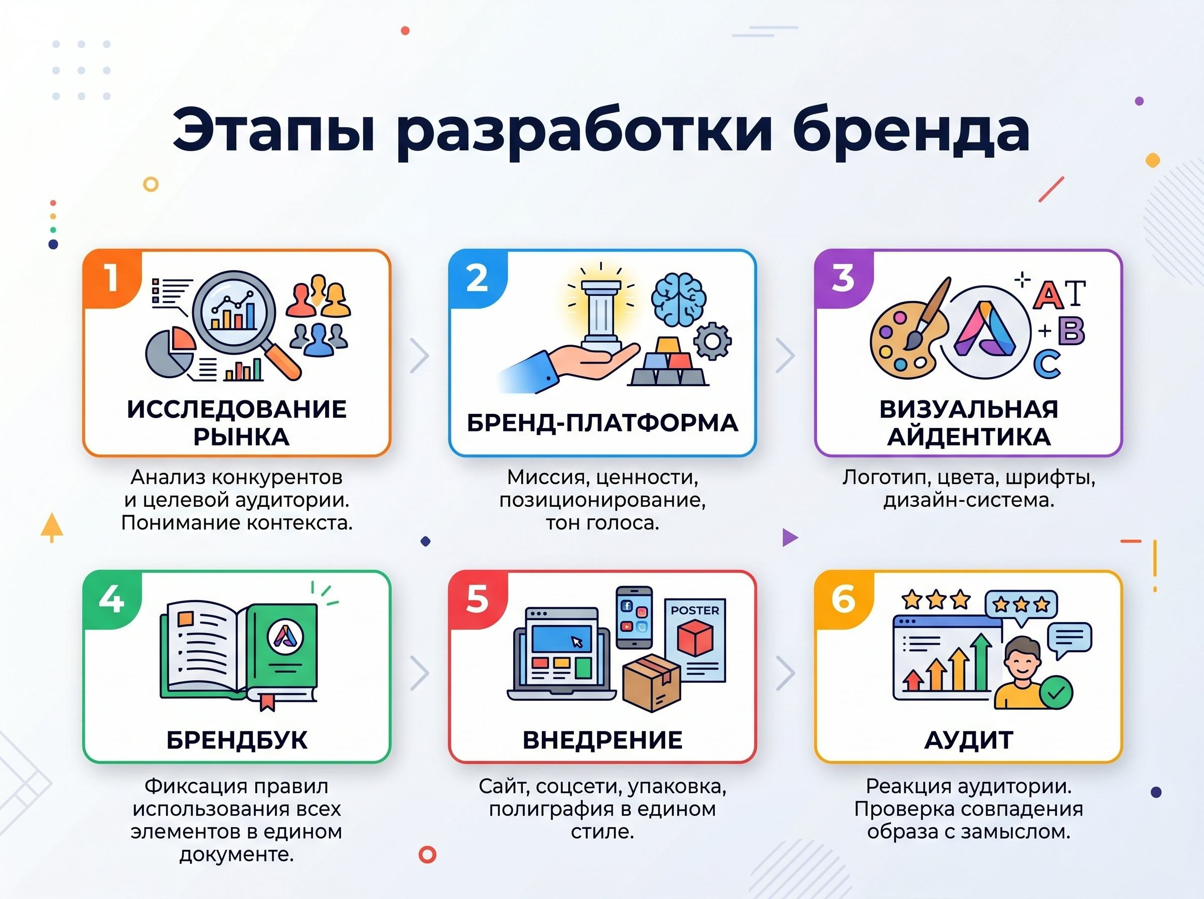
A sequence that works in practice:
- Market research — analysis of competitors and target audience. Without it, brand strategy is based on guesswork.
- Brand platform — formulation of the mission, brand values, positioning and tone of voice. The foundation from which everyone starts: designers, copywriters, marketers.
- Visual identity — logo, colors, fonts, design system. Here abstract meanings receive visual form.
- Brand book — fixing the rules for using all brand elements in a single document.
- Implementation — website, social networks, packaging, printing, everything is brought to a single form.
- Audit — the audience’s reaction will show whether the brand’s image coincides with the concept.
The most common mistake in branding is starting with a logo. The designer paints a beautiful picture, but without a strategy it doesn’t work. If there is no understanding of who your client is and what you promise him, no visual will fix it. A good logo without a platform is like an expensive business suit on a person who doesn’t know why he came to a meeting.
Launching a brand is half the battle. The main thing is to keep it in shape
Brand management requires regular attention - and in large companies a separate brand manager does this: monitoring perceptions, checking the consistency of communications, adapting to market changes. Google has changed its logo six times since its founding in 1998 - each time carefully, without sharp breaks from the previous image. This is a healthy evolution of the brand.
Rebranding is a more radical step. It is appropriate when the brand is outdated and no longer reflects the reality of the company, when the business enters a new market or radically changes its positioning. A classic failure: Gap in 2010: the company changed its iconic logo to a faceless design, received a wave of criticism and returned the old one a few days later. A good rebranding requires strategy, testing and a clear understanding of the goal - otherwise it turns out like Gap, only more expensive.
A few rules for those who want to keep their brand in order:
- Regularly check all points of contact with the audience - website, social networks, packaging, documents, office.
- Update your brand book every time your visual system changes.
- Train new employees on brand standards - otherwise they do “as understood.”
- Monitor mentions and track changes in brand perception.
A brand takes years to build, but it starts with one decision - to understand who you want to be in the eyes of your audience. If this question is still open or you need help with the visual part, our team is ready to take on brand development - from platform to turnkey corporate identity.
Briefly about the main thing
What types of brands are there?
By scale - corporate, grocery, personal. According to pricing policy - luxury, premium brand, mass market, economy brand. By coverage - global, national, regional. A separate category is the HR brand (employer brand): the image of the company as an employer, which directly affects the attraction and retention of employees.
Is it possible to create a brand on a limited budget?
Yes - the brand strategy is primarily about thinking, not about money. A small business can easily formulate brand values, choose positioning and develop a consistent tone of voice without multimillion-dollar budgets. The main thing is consistency: three different logos on the website, on social networks and on the business card destroy the company’s reputation faster than any crisis.