
Rebranding in simple words: what it is and how to do it correctly
Rebranding is a strategic refresh of a brand, not just a logo change. We explain in simple words when it is needed, how to rebrand correctly and not lose customers.

Sberbank became Sber. "Siberia" - S7. The grandfather in the Old Spice sweater gave way to a macho man with a horse. Behind each of these changes is a huge amount of work, millions of rubles and considerable risk. Because rebranding isn't just a new logo and a different shade of blue. And this is where many companies make costly mistakes.
What is rebranding - and why it's not what you think

Rebranding is a strategic update of a brand: its image, values, positioning and visual system. What changes is how the company looks from the outside - logo, corporate color, fonts - and how it is perceived from the inside: the image of the product in the eyes of the buyer, the promises that the brand makes to the market.
A good analogy is moving. You can change your apartment, leaving all your habits, routes and social circle. Or you can move to another city, start a new life and even change your name. Rebranding can be both – it’s just a matter of scale.
The main thing you need to understand right away is that changing the logo is not rebranding. This is a redesign. Just like new wallpaper in an apartment is a renovation, not a move. Confusion between these concepts costs companies both money and reputation. Real rebranding affects both the visual and the way the company is positioned on the market, which means it often requires re-registration of the trademark: legal protection of the new image.
Rebranding, restyling, repositioning - it looks similar at first glance, but it’s not the same thing
- Restyling — updating the visual while maintaining the essence. Coca-Cola has refreshed the font and bottle shape dozens of times, but the red color and wavy ribbon have not gone away. Burberry returned the classic check to the center of the image, removing all the excess that had accumulated over the years.
- Repositioning — changing the audience or meaning while maintaining the visual. Old Spice has been associated with grandpa's cologne for decades. In 2010, the company simply said, “This is now for young men,” and made a viral advertising campaign with a macho man on horseback. The logo hasn't changed much, but the brand has changed.
- Rebranding — when everything or almost everything changes: the name, visual system, positioning, brand voice. Sberbank became Sber - changed the name, the color of the logo to a brighter green, added an ecosystem of services and fundamentally different communication. This is a complete rebranding of the company.
| Restyling | Repositioning | Rebranding | |
|---|---|---|---|
| Scale | Visual | Meanings | Everything |
| Risk | Low | Medium | High |
| Deadlines | 1–3 months | 3–6 months | 6–18 months |
| Cost | Low | Average | High |
When does a company need rebranding, and when is it better to leave it alone?
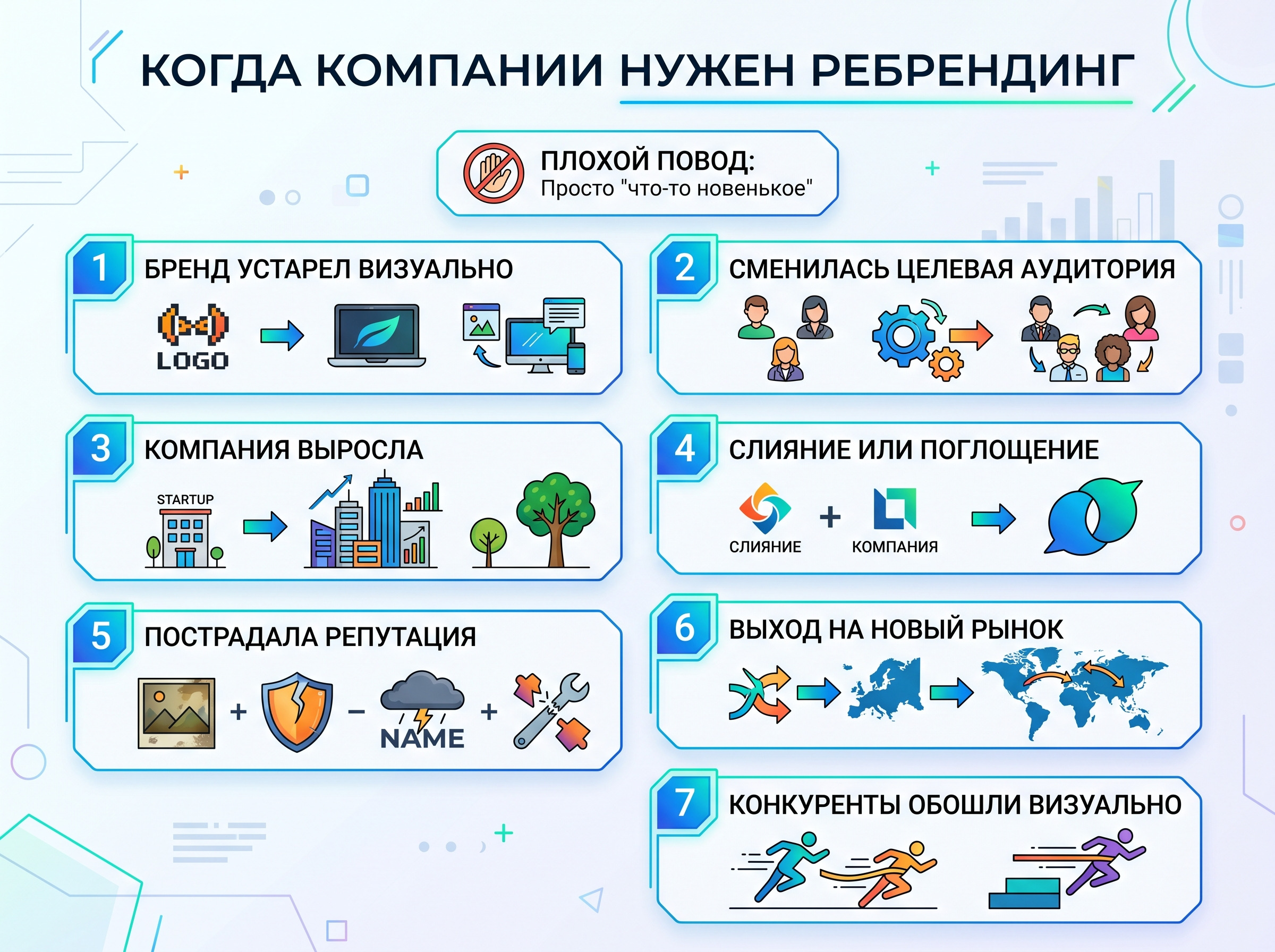
The desire to do “something new” is a bad reason for rebranding. A good reason is specific changes in the life of the company or market.
Signs that it's time to change your brand
- The brand is visually outdated. The brand is visually outdated. The logo looks like something from the nineties, but the audience is already different. Not because it’s “unfashionable,” but because the image no longer corresponds to the actual product. Users of digital services feel this especially painfully: they compare everything at once, and an out-of-date visual is read as a signal “they don’t monitor quality here.”
- The target audience has changed. You worked with b2b, now you are going to b2c. Or vice versa. Or your clients are ten years younger.
- The company has grown. A startup logo drawn the night before the pitch does not fit into the negotiation room with investors from Dubai.
- A merger or acquisition has occurred. Two companies have become one - we need a single image.
- Reputation suffered. Scandal, crisis, toxic associations - sometimes changing your name and image helps you start with a clean slate. Sometimes not, but that's a separate conversation.
- We entered a new market. What worked in Russia may not work in Asia or Europe. Name, color, image - everything requires testing on new grounds.
- Visually outperformed competitors. You look paler than the market, and clients are increasingly choosing through the eyes of your competitors.
- The assortment has changed. You started as a monoproduct, and now you have fifteen directions. The old brand simply doesn't accommodate everything you do - and customers don't understand who they're dealing with.
- The market has changed trends. When the entire industry is moving towards sustainable development, technology or, for example, human-centricity - and you look like you stopped in 2012, this is also a signal.
When rebranding won't help
Three situations when companies undertake rebranding, although the problem is completely different:
- Bad product. A new logo won't fix what's broken on the inside. If customers are leaving because of the quality of service, a beautiful redesign will only draw attention to the problem.
- Weak sales due to marketing. If the problem is that they don’t know about you, you need to invest in promotion, and not change the visual system. Sometimes it’s enough to rework a web resource, launch normal content and set up advertising - and awareness will increase without any rebranding.
- Owner's boredom. “I want something new” is the most expensive whim in business. Without a strategic rationale, rebranding risks simply confusing those customers who already knew you.
Three types of rebranding: choosing the scale
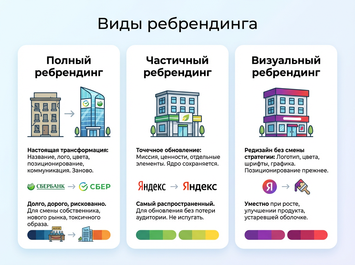
Complete rebranding - when you need real transformation
A complete rebrand affects everything: the company name, logo, colors, fonts, brand voice, positioning and communication strategy. In essence, the company is reinventing itself.
This is the most expensive, time-consuming and risky option. But when it is done correctly, the result is immediately visible. Sberbank spent several years and, according to various estimates, billions of rubles on its transformation into Sberbank. But he got the image of a modern technology company instead of the image of a “bank with queues.”
A complete rebranding is appropriate when business owners change, the company enters a completely new market, or when the old image has become so toxic that it is easier to start over.
Partial rebranding - spot update
Partial rebranding changes individual elements without affecting the essence of the brand. You can update the mission, adjust the values, change one or two visual elements - but maintain the core for which you are known and loved.
Yandex carried out partial updates several times: added new services under a single visual system, slightly changed the logo, and adjusted the tone of communications. The goal of each such step was clear: not to “update for the sake of updating,” but to specifically tighten the image to the new reality of the company. At the same time, recognition was not lost - on the contrary, the image became cleaner and more modern.
This is the most common option for companies that already have an audience and reputation. The main task is to update yourself without scaring those who have known you for a long time.
Visual rebranding - redesign without changing strategy
Visual rebranding - updating the corporate identity while maintaining the strategy. The logo, color palette, fonts, graphic elements, photographic style - all this changes, but the positioning and values remain the same.
This is appropriate when the company has changed internally - grown, improved the product, expanded the team - but the external appearance has not kept pace with these changes. Or when the visual system simply became outdated and began to hinder rather than help.
How to rebrand correctly: stages and timing
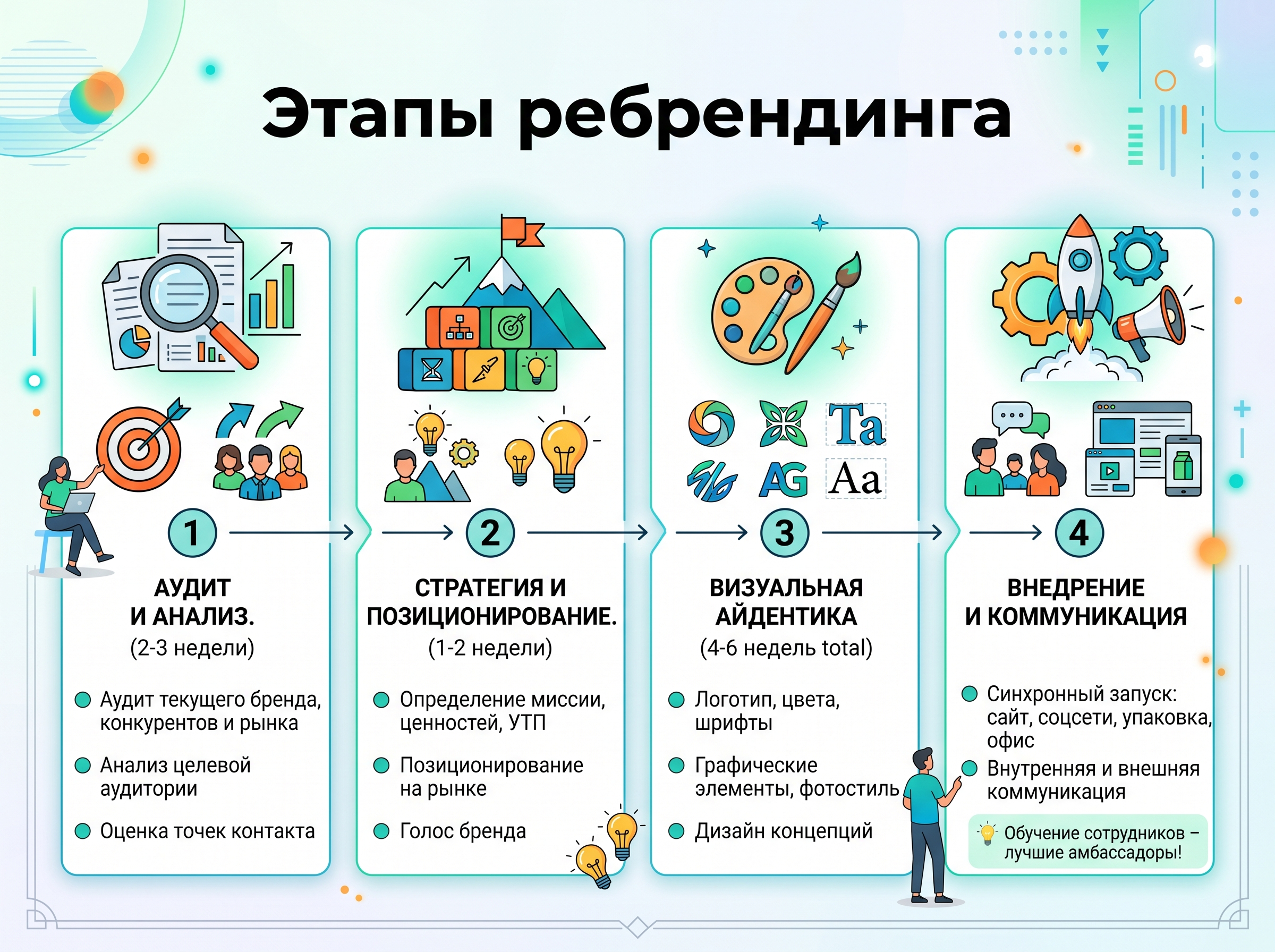
Many people think that rebranding is “assigning a task to a designer.” In fact, this is a full-fledged project with its own stages, deadlines and control points. The work begins long before anyone opens Illustrator.
First stage: audit and analysis
Before you change anything, you need to understand what works and what doesn't. At this stage of rebranding the following is carried out:
- Audit of the current brand - how clients, employees, partners perceive you. It is important to rely on current data: brand perceptions inside and outside the company often differ radically.
- Market and competitor research - where you are now and where the industry is heading.
- Analysis of the target audience - who is your client today and who will he be in three years.
- Assessing contact points - website, social networks, packaging, office, documents.
Typical period is 2–3 weeks. Skipping this stage and going straight to design is like building a house without measurements. It's beautiful, but it will move.
Stage two: strategy and positioning
Based on the analysis, a new brand strategy is formulated: mission, goals, values, unique offer, market positioning and brand voice. This is where they define who the company wants to be, and for whom. The needs of the audience are always at the center: not what the company wants to say, but what is important for the person to hear.
A good strategy looks like a hierarchy: first the essence of the brand (why you exist), then the values (what you believe in), then the positioning (how you are different), then the voice (how you speak). Each next level follows from the previous one.
Duration: 1–2 weeks. The output is a document that becomes the foundation for all visual work.
Third stage: development of visual identity
You can now open Illustrator. Designers take strategy and turn it into a visual language: logo, branding, colors, fonts, graphic elements, photographic style. Everything should work on the same image.
At this stage, several concepts are usually developed, one is selected and brought to the final state. Good design thinks not only about beauty, but also about the user experience: how a person interacts with the brand on a website, in an application, offline, and how much a new visual makes this path easier rather than complicated. Duration: 3–4 weeks for design plus 1–2 weeks for revision.
Stage four: implementation and communication
The finished system needs to be launched - and done synchronously. Website, social networks, packaging, documents, office, advertising materials - everything switches to a new image at once or according to a clear schedule.
At the same time, changes are being communicated: first within the company, then to clients, partners and the media. A well-built media wave at the time of launch works as an amplifier: even those who do not directly follow the brand will learn about the rebranding.
Working with a team is the most often forgotten stage
Employees are the first and most important audience for rebranding. If the team does not understand why the changes took place and what to convey to clients now, no brand book will help. A sales manager who says “well, something has changed here” destroys the image more effectively than any competitor.
Before the launch, it is worth holding internal sessions: explaining the essence of the changes, showing the new visual system, giving tools for work. It’s good if external communications experts join these sessions - they help remove resistance and answer uncomfortable questions that the internal team is sometimes afraid to ask out loud. A trained team is the best possible brand ambassador. And one more effect that is underestimated: rebranding done with the involvement of people becomes a point of renewal of corporate culture - employees begin to talk about the company differently and identify themselves with it differently.
Rebranding Examples Worth Studying
Russian cases
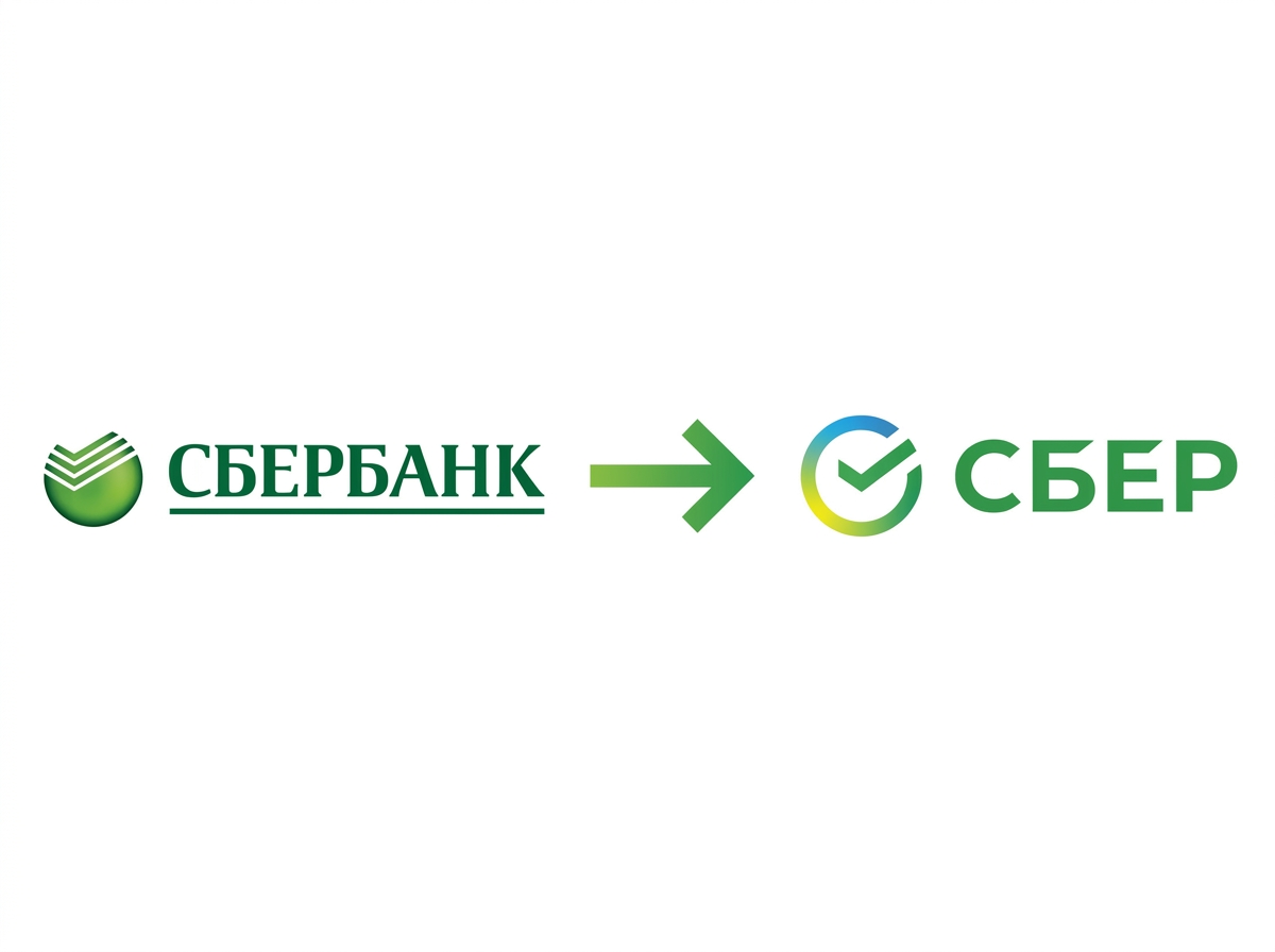
Sberbank → Sber. The largest rebranding in Russian corporate history. The company didn't just change its name and color—it rebuilt its entire image from a “bank for retirees” to a “tech ecosystem.” A new logo, a different color scheme, a completely different tone of communication. Audience reaction was mixed, but awareness and reach grew. The main lesson: the scale of change must correspond to the scale of the company.
"Siberia" → S7 Airlines. In 2006, Siberia Airlines carried out a rebranding, which is still being discussed. A new name, bright green color, modern visuals - and a complete rethinking of the image. The company wanted to move away from associations with a regional carrier and establish itself as a modern player. It turned out: S7 today is one of the most recognizable Russian aircraft brands.
Yandex. The tech giant has updated the visual system several times - each time carefully, without sudden breaks. Working with sub-brands is especially interesting: Yandex.Food, Yandex.Lavka, Yandex.Market - each has its own identity, but they are all read as part of the same family. This is an example of competent brand architecture.
VTB. The bank went through major brand transformations twice. In 2006, Vneshtorgbank changed its name to VTB and united all subsidiaries under a single brand - this was a classic rebranding for a merger. In 2018, after the merger of VTB24, the bank again updated its logo: the “wing”, which had existed since 1990, turned into three horizontal blue stripes. Both times the changes were dictated by a specific business task - unification, and not by the desire to “change something”.
MegaFon. The operator went to large-scale rebranding for a long time - and postponed it several times. In 2017, changes did take place: the corporate colors became brighter, a new slogan “It starts with you” appeared, and the three dots from the logo began to live a separate life in advertising communications. An interesting example of how a company consciously relies on evolution rather than revolution - and at the same time retains one of the most recognizable visual codes on the Russian telecom market.
"Chocolate Girl" The coffee chain has updated its image several times, moving from Soviet nostalgia to modern coffee culture. Each time, the interiors, menu and visual style changed - while maintaining a recognizable name. An illustrative case of partial rebranding in the restaurant business, where the atmosphere and assortment speak about the brand louder than any logo.
International cases
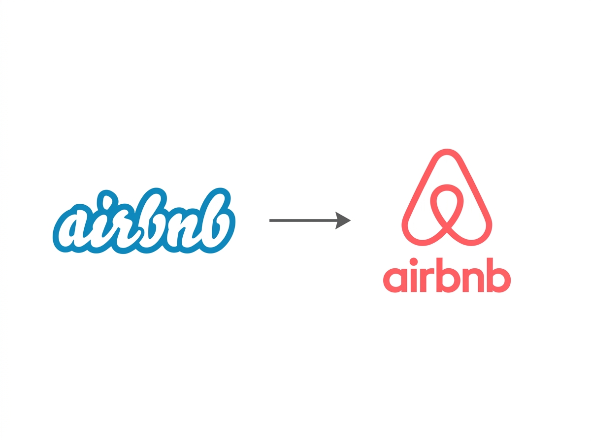
Airbnb. In 2014, the company changed its logo to the Bélo symbol, an abstract symbol that simultaneously evokes a person, a place, a love, and the letter “A.” The reaction of the Internet was stormy (some saw something completely different in the logo), but over time the symbol took root. The main thing is that behind the visual change there was a rethinking of the essence: Airbnb ceased to be an “apartment rental service” and became a “platform for belonging.”
Old Spice. Classic repositioning. The brand of men's gel and deodorant was associated with older men - and sales were falling. In 2010, P\&G (Procter & Gamble, an American consumer company) launched the "The Man Your Man Could Smell Like" campaign with Isaiah Mustafa. The visual has changed minimally, but the image of the audience has changed dramatically. In the first months after the campaign, sales increased by 125%.
Spotify. In 2015, the music streaming service updated its corporate green color and simplified its logo. Small changes, but coupled with expansion into podcasts and video, they signaled to the market: “We’re not just music anymore.” A good example of how visual changes can communicate strategic ones.
Apple. The company rarely talks about rebranding out loud, but it does it all the time. The transition from a rainbow logo to a monochrome logo in the late 90s coincided with the return of Steve Jobs and a rethinking of the entire strategy. Visual minimalism has become part of the product philosophy: how the brand looks is inseparable from how the product looks.
McDonald's. In 2009, the chain began a large-scale European restyling: the red background in the logo was replaced by dark green, the restaurants updated their interiors. The company wanted to move away from the image of “fast fast food for children” towards a more adult audience that values quality and atmosphere. No changes to the name or menu - just visuals and environment.
Burger King. In 2021, the chain updated its logo for the first time in twenty years—and returned to the retro aesthetic of the 1990s. Flat design, warm colors, rounded shapes. The decision went against the trend towards minimalism and looked like a deliberate provocation. It worked: the update received wide media coverage, and the nostalgic image turned out to be a dead ringer for the audience that grew up on the Whopper.
Legal and financial issues - boring but important
Re-registration of a trademark

Changing a name or logo means that the old trademark no longer protects the new image. It needs to be re-registered with Rospatent (Federal Service for Intellectual Property) - and this must be done before the public launch, and not after.
The registration procedure in Russia takes from 4 to 18 months. At the same time, it is worth checking whether the new name or designation is not taken by other companies - especially in your field. The legal purity of the image must be confirmed before you spend money on implementation.
If the company operates in foreign markets, international registration will be required - through the Madrid Agreement system (WIPO, World Intellectual Property Organization) or the national patent offices of the desired countries.
The change of brand also affects the company’s contractual base. It is necessary to review existing agreements with contractors that contain the old name or logo, especially when it comes to licensing agreements for the use of the brand by third parties. If the company operates as a franchise, franchise contracts will also require updating: they, as a rule, stipulate specific requirements for the visual design of outlets. Copyright for elements of a new design is a separate story: make sure that the rights to the logo, illustrations and fonts are assigned to the company and do not remain with the agency.
How much does rebranding cost?
The cost of rebranding depends on the scale of the business and the depth of changes:
- Small business, partial rebranding — from 150,000 to $5,000
- Medium business, complete rebranding — from 500,000 to $30,000
- Large company — from $50,000 and above (excluding implementation)
Implementation is a separate cost item that is often underestimated. Replacing signs, redesigning packaging, updating the website, printing new materials - this can cost more than the development itself.
The budget structure usually looks like this: analytical work and strategic planning - 15-20%, creative development of identity - 25-30%, brand book - 10-15%, introduction of a new style and communication support - 35-50%.
At the same time, the cost of development is everything before implementation: analytics, strategy, design and brand book. Implementation is considered separately and often costs more than development.
Rebranding mistakes that pay dearly
Failed cases - learning from other people's mistakes
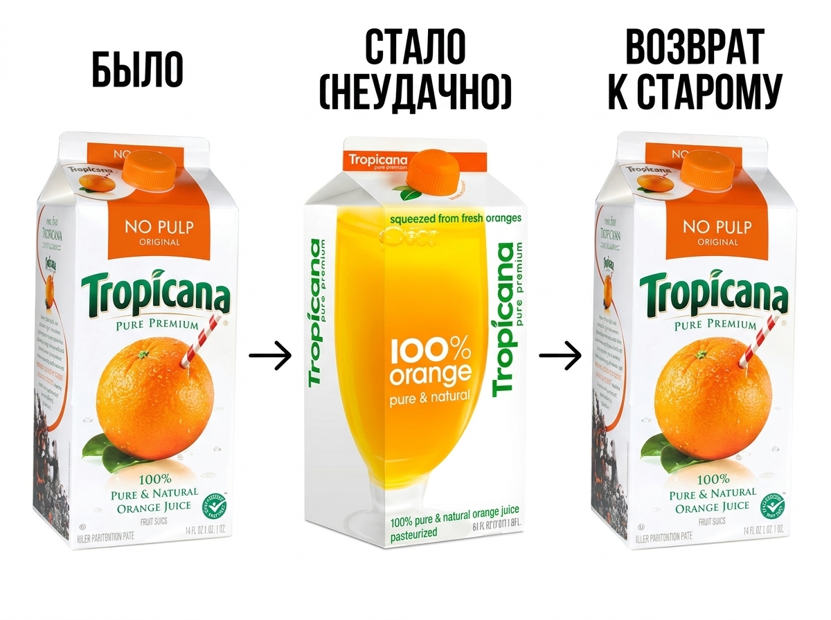
Tropicana, 2009. PepsiCo decided to update the packaging of Tropicana juice - it removed the iconic orange with a straw and made a minimalist design. Buyers did not recognize the product on the shelf. Within two months, sales dropped by 20%, the company lost about $33 million and returned the old packaging. Lesson: The audience's emotional connection to an image is a real asset that cannot be ignored.
Gap, 2010. The American clothing retailer has replaced its iconic logo with a faceless grotesque with a blue square. The wave of criticism on social networks was such that eight days later the company returned the previous logo. It cost several million dollars and a lot of reputational losses. The main mistake was that the audience was not prepared and the reasons for the changes were not explained.
Papa John's, 2018-2021. An illustrative case of rebranding under the pressure of a reputation crisis. The network's founder, John Schnatter, consistently compromised himself - first by publicly speaking about the NFL, then by using racist words in internal training. The company was forced to literally erase it from the brand: it removed the image of the founder from the packaging, changed the logo and even removed the apostrophe from the name - Papa John's became Papa Johns. The attempt helped to distance oneself from the toxic person, but did not solve the operational problems. Lesson: Rebranding can help change associations, but it is not a substitute for product and management work.
Typical mistakes that are made over and over again
- Rebranding without a strategy. They start with a logo and end with a beautiful picture without meaning. The visual must flow from the strategy - otherwise it is just an expensive decoration.
- Ignoring the audience. They didn’t ask clients, they didn’t test. Inside the company is delighted, outside - bewilderment.
- Too sudden changes. The audience is accustomed to your image. If you change everything at once, some clients simply won’t understand that you are the same.
- Inconsistent implementation. The new logo is on the website, the old one is on business cards, and a completely different one is on the sign. This is worse than not rebranding at all.
- Forgot about the employees. The team learned about the rebranding from the news - and now explains the changes to clients in different ways, depending on who they are.
How to reduce risks
The main insurance is research and testing before launch. Focus groups, A/B testing of individual elements, surveys among current customers, open discussions with a loyal audience - all this helps to catch problems before they become public.
Phased implementation also reduces risks: first digital channels, then physical media. This gives you the opportunity to correct course if something goes wrong.
How to understand that the rebranding worked
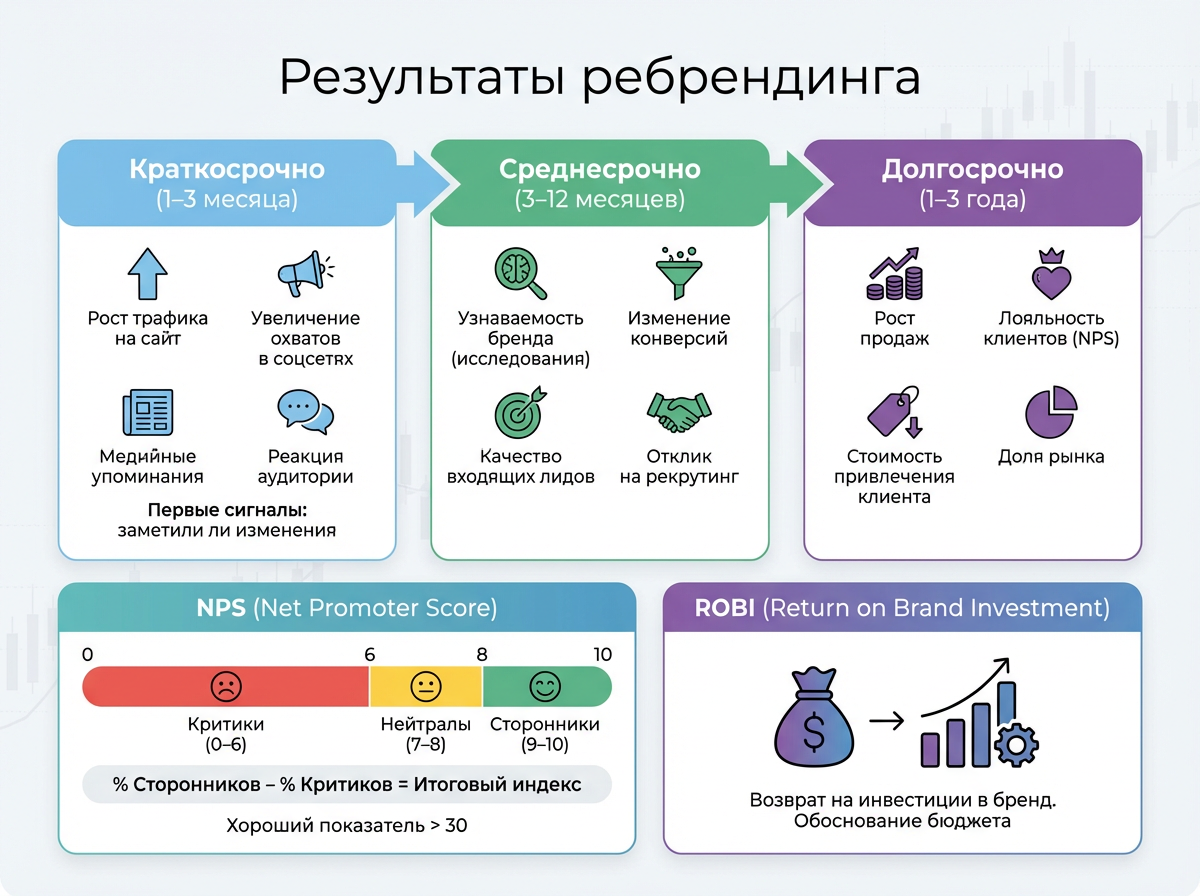
The results of rebranding do not appear immediately - and you need to look at them over different periods of time. But first you need to figure out what to count.
Quantitative and qualitative indicators of success
The good news is that there are metrics to measure rebranding. The bad: there are several of them, and each shows only part of the picture.
The main quantitative ones are sales growth, brand awareness based on research, conversions and the cost of attracting a client. These are numbers that are easy to show at the board of directors without blushing.
Among the qualitative ones - NPS (Net Promoter Score, index of willingness to recommend). It is considered simple: customers are asked how likely they are to recommend the company on a scale from 0 to 10\. Those who rate 9–10 are supporters. 7–8 are neutrals. 0–6 - critics. Final index = % of supporters - % of critics. For the Russian market, a good result is above 30\. At the same time, it is worth tracking the satisfaction index (CSI) - it shows how satisfied customers are with their interaction with the brand right now.
ROBI (Return on Brand Investment) is a more complex metric, which is also called brand return on investment. It is this that allows us to move the conversation about rebranding from the language of “we like the new logo” to the language of numbers: how much the company invested and what it received in measurable terms. Without this metric, the rebranding budget is difficult to defend to the board of directors.
Time frame for evaluating results
Rebranding is not a pill that works in an hour. You need to look at the results in three horizons.
Short term (1–3 months): growth in website traffic, social media coverage, media mentions, audience reaction. These are the first signals - they show whether changes have been noticed at all. If silence is a reason to think about communication.
Medium term (3–12 months): brand awareness based on research, changes in conversions, quality of incoming leads, response to recruiting. Here you can already see whether the perception has changed - or there was simply a surge of curiosity at the start.
Long term (1–3 years): sales growth, customer loyalty by NPS, market share. This is the real answer to the question of whether it worked. This is why companies that evaluate rebranding a month after launch are doing it in vain.
Briefly about the main thing
Proper rebranding is not about “doing it beautifully.” This is a strategic decision with specific goals, a clear plan and measurable results. Companies that approach it this way have a new image that works. Companies that make it “because it’s time” are simply wasting money.
If you feel that your brand has ceased to reflect the reality of your business, this is a signal. Not to urgently hire a designer, but to first answer the question: why, for whom and what exactly should change.
Veonix studio is engaged in turnkey rebranding - from auditing the current image to the finished one brand book with rules for all media.
Frequently Asked Questions
How long does the rebranding process take?
Depends on the scale. Visual redesign – 1.5–2 months. Partial rebranding – 3–4 months. Complete transformation with research, strategy, design and implementation - from 6 months to a year and a half. Anything faster is a compromise somewhere in the process.
Do I need to re-register a trademark when rebranding?
Yes, if the name or visual designation changes. The new image must be registered with Rospatent before its public launch. Otherwise, the new logo is not legally protected, and any competitor can copy it.
How to properly inform clients about rebranding?
Honestly and in advance. Explain the reasons, show the new image, emphasize that the essence of the company and the product have not changed. A series of publications on social networks with a history of changes works well - people like it when they are spoken to openly, rather than confronted with a fact.
What does rebranding mean and how does it differ from redesign?
Rebranding is a brand update at a strategic level: values, positioning, company voice and visual system change. The redesign is just the outer shell. A new logo without a new strategy is a redesign.
Why is rebranding needed?
So that the company's image matches its reality. Business is changing - growing, entering new markets, changing audience. If a brand does not keep up with this, it begins to hinder rather than help.
What is company rebranding - is it just a logo?
No. Rebranding a company affects everything that forms its image: name, visual system, positioning, tone of voice, values. The logo is only the visible part of this work.
What does rebranding include?
Depends on the scale. The complete one includes changing the name, logo, colors, fonts, positioning and communication strategy. Partial—spot changes while maintaining the essence of the brand. The minimum is a visual update of the corporate identity.
Is logo rebranding a full-fledged rebranding?
A logo rebrand is a starting point for visual changes, but not a full rebrand. If a new logo is not backed by an updated strategy and positioning, the company ends up with a pretty picture without meaning.
What are the types of rebranding?
Three main ones: full - everything changes, including the name and strategy; partial - individual elements are updated while maintaining the essence; visual - only corporate style without changing positioning.
What is the purpose of rebranding and what problems does it solve?
The goal is to bring the company's image in line with its real position in the market. Specific objectives of rebranding: update the perception of the audience, enter a new market, distance yourself from toxic associations, unite several brands under one.
How is the rebranding budget formed and what determines its effectiveness?
The rebranding budget consists of four parts: analytics and strategy, creative development, brand book and implementation. The effectiveness of rebranding is assessed in stages: short-term - by reach, medium-term - by conversions, long-term - by sales and NPS. The more precisely the goals are set at the start, the easier it is to measure the result at the finish.