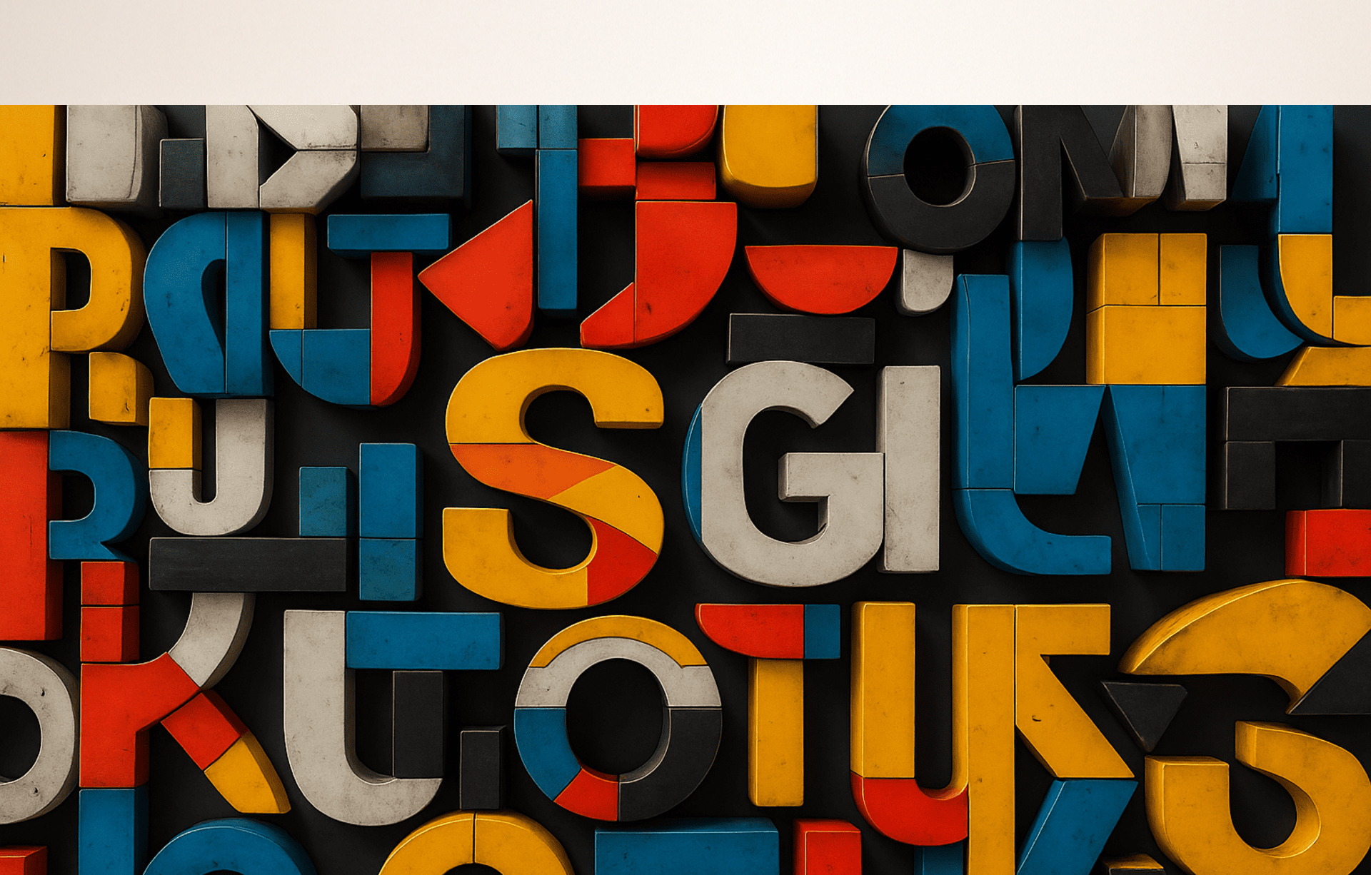
Basic knowledge of typography: choosing a font and setting text parameters
Basic principles of typography. Graphic design studio Veonix talked about the rules for selecting a font and how to correctly configure the parameters of the text used for a product or service.

In the text on site page or an advertising booklet, it is important not only what is written in it, but also how it is executed. In order for people to want to read a text and understand its essence, it must initially attract external attention.
Typography deals with the visual component of the text. After all, as we know, it is external signs that form the first impression. They help the audience decide whether to read more content or skip the page. This also applies to texts. It’s easier to understand how to create visually attractive text once you understand the basics of typography: what fonts are available, what parameters you can choose and customize to suit your needs.
Determining what is what
Before we analyze in detail the characteristics and parameters of text design, let’s remember the general terms in this topic in order to use names appropriately and set tasks correctly.
Typography - the art of text design, a set of rules that determine the use of fonts in design. Typography is a process that goes from setting printed text to designing symbols and integrating them into the overall design concept.
Trends and generally accepted norms in typography are formed based on an analysis of user experience and people’s perception of a particular text design. Fonts should be visually attractive, not create difficulties when reading, convey meaning through their design, and even somehow characterize the brand and product itself.
Font — a set of letters, numbers, signs and their composition; This is the style of characters in which the text is created. The same font can have different designs by changing the boldness of the characters, tilting, or adding decorative elements. We'll talk about this in more detail below.
Headset — a group of fonts. Just the same, fonts of the same style, but different in terms of weight and slant, are combined into one name - typeface.
Choosing a font
Types of fonts
All typefaces and fonts that we see around can be divided into several types, classified according to external distinctive features. Different species have occupied their niches over time. Each of them is suitable for certain circumstances: for logos, headlines, text on the Internet or on official papers.
Serif: fonts are distinguished by small lines, strokes, at the borders of characters. Serifs create a line drawing, which makes the text appear orderly. The characters themselves are also well separated from each other. Such fonts are used in books or documents. The well-known Times New Roman belongs to this group. Or, for example, Georgia.
Sans serif: These are also called sans serif fonts. Due to the lack of serifs, the fonts look simple and clear. And if serif fonts in their style have different line thicknesses in their characters, then in sans serifs the lines are often the same. The text turns out harmonious and verified. In certain cases, sans serif fonts look strict. Looks good in minimalist design, in texts on website pages. Fonts with thick lines are used in headlines or other short phrases to attract attention. Familiar examples are Arial, Helvetica, Montserrat.
Handwritten: Everyone easily considers this species after seeing it. Such fonts try as much as possible to replicate the style of regular writing on paper with a pencil, pen, pen, brush and other devices. It is not recommended to use them for body text; even within one paragraph they will be difficult to read. But as a design element, handwritten fonts add atmosphere.
Decorative: non-standard fonts, which are often the designer’s own work, the embodiment of his creativity. There is no general description for this species. Decorative fonts mainly create brand logos or become part of a corporate identity, but are not used in any way in regular text.
Font characteristics
Typefaces have their own characteristics. These are not customizable parameters, these are the distinctive features that make up the overall design of the font. Let us briefly outline them.
Serifs: The presence or absence of serifs is one of the most noticeable characteristics of a font. As we found out above, even certain types of fonts are distinguished by this criterion.
Fat content: The thickness of the lines in the symbol. We all often use this characteristic in text editors. But it’s not that we edit the font ourselves, we just select an option from a given typeface.
Tilt: by default, all characters have strictly vertical lines. But here, as with boldness: the typeface may have an option for italic and italic font. The difference between italic and italic is that italic font completely retains the style, while italic becomes a little more handwritten.
Width: fonts differ in character width and stretch. Accordingly, they are narrow and wide. Compare, for example, a couple of standard fonts: Impact and Montserrat.
Contrast: yes, this term is used not only in image processing. Only here contrast is the difference in the thickness of the lines and strokes of each character. Remember the ZARA logo, this characteristic is clearly visible there.
Openness of the symbol: or otherwise - aperture. This characteristic is visible in the characters C and G. The greater the distance between the extreme points of the letters, the larger the aperture.
Customizing the text
By choosing a font with all the appropriate characteristics and applying it to your text, you can, and sometimes it is very necessary, to edit the text. Here we are already talking about customizable parameters that will help make the text noticeable, readable, and easy to understand.
Skittle — font size in points. To set the desired value, select or set your own numerical value: 14, 48, 72. Headings and subheadings are distinguished by size when one font is applied to the entire text.
Kerning and tracking — distance between characters. Can be configured automatically or manually. Kerning is the ability to adjust the distance between two characters, and tracking is the ability to choose the same distance between several characters.
Leading — line spacing, the distance between two lines. Makes it possible to prevent lines or symbol elements from colliding with each other. Or vice versa, remove excess space between lines.
Thus, by selecting fonts and customizing the text, you can perfectly present text content. Typography not only helps to integrate text into the overall style and aesthetically design it. It can also tell something about the brand itself: a conservative or modern flexible approach, formality, status, technology, creativity, openness. Through the design of texts, meaning can be conveyed not only through words.
Although the focus was on the text, the article was still about design. In the 2020s, brands are increasingly using typography as a key component of their corporate identity, meaning the entire visual identity of the brand is built around it.
Intervals, thickness of lines, openness of symbols may seem like trifles that do not in any way affect the perception and visual image. But often this is only at first glance. Our work at Veonix studio is based on attention to every detail of the project. Therefore, you can without a doubt trust us to develop a design for your brand.