
5 Psychological Techniques That Will Increase Your Sales Through Design
Learn how to turn your website design into a powerful sales tool by leveraging your understanding of customer psychology. Master the laws of reading F and Z patterns, Rules that can significantly improve the performance of your business.

In order for a design to not only decorate, but also sell, one should rely not only on aesthetics, but also on a deep understanding of the client’s psychology. How he evaluates the design, how he studies, interacts and how he feels at that moment.
And now we will talk about 5 psychological laws that must be taken into account in design so that it significantly improves the performance of your business.
F and Z patterns
In the case of carefully studying information, a person’s eyes move along lines that form the Latin F. If he reads “diagonally”, in order to understand whether he needs to read carefully, his gaze glides along the trajectory of the letter Z.

these patterns are simply mirrored.
Following such patterns of studying visual information is an axiom for a person in a normal state. Therefore, they are actively used to create a strong design.
When creating a design, always mentally divide the image into quarters.
The upper left corner is the most readable area
Upper right - zone that is read deeply
Bottom left - surface reading zone
Bottom right – zone that is perceived as the end of a block of information
And arrange the information so that the value and importance correspond to the area of attention:
- the strongest sentence is in the upper left corner
- the smallest part is in the lower left
- information that increases interest is entered in the upper right
- in the lower right - a “hook” to continue reading or an interactive element aimed at a target action
For example, the offer is located in the upper left corner of the first screen, contacts are there or in the lower right. And it is most advantageous to place capture forms in the right half of the screen, in the lower half, or at the intersection of these zones - in the lower right corner.
In order to enhance the effect of this technique, pay special attention to the texts in the design:
- Highlight main ideas with headings and subheadings
- Present information with bulleted lists or infographic bulletins
- One paragraph should contain one main idea
- Keep your texts short so that the F-pattern doesn't turn into a Z-pattern
- Highlight the main points visually, for example, with color or bold font
Rule of thumb
This rule comes from the fact that the vast majority of people control their smartphones with the thumb of the hand with which they hold the gadget. It is vital to take it into account when developing adaptive website and application interfaces.
The further a person has to reach, the more likely he is to end up in the wrong place. To avoid compromising the user experience, make sure that the main active elements are located in the thumb area and are large enough to be easily reached.
It is located from the lower left corner to the center of the screen and a little higher - this is where you need to place interactive elements - capture forms, check boxes, buttons and others.
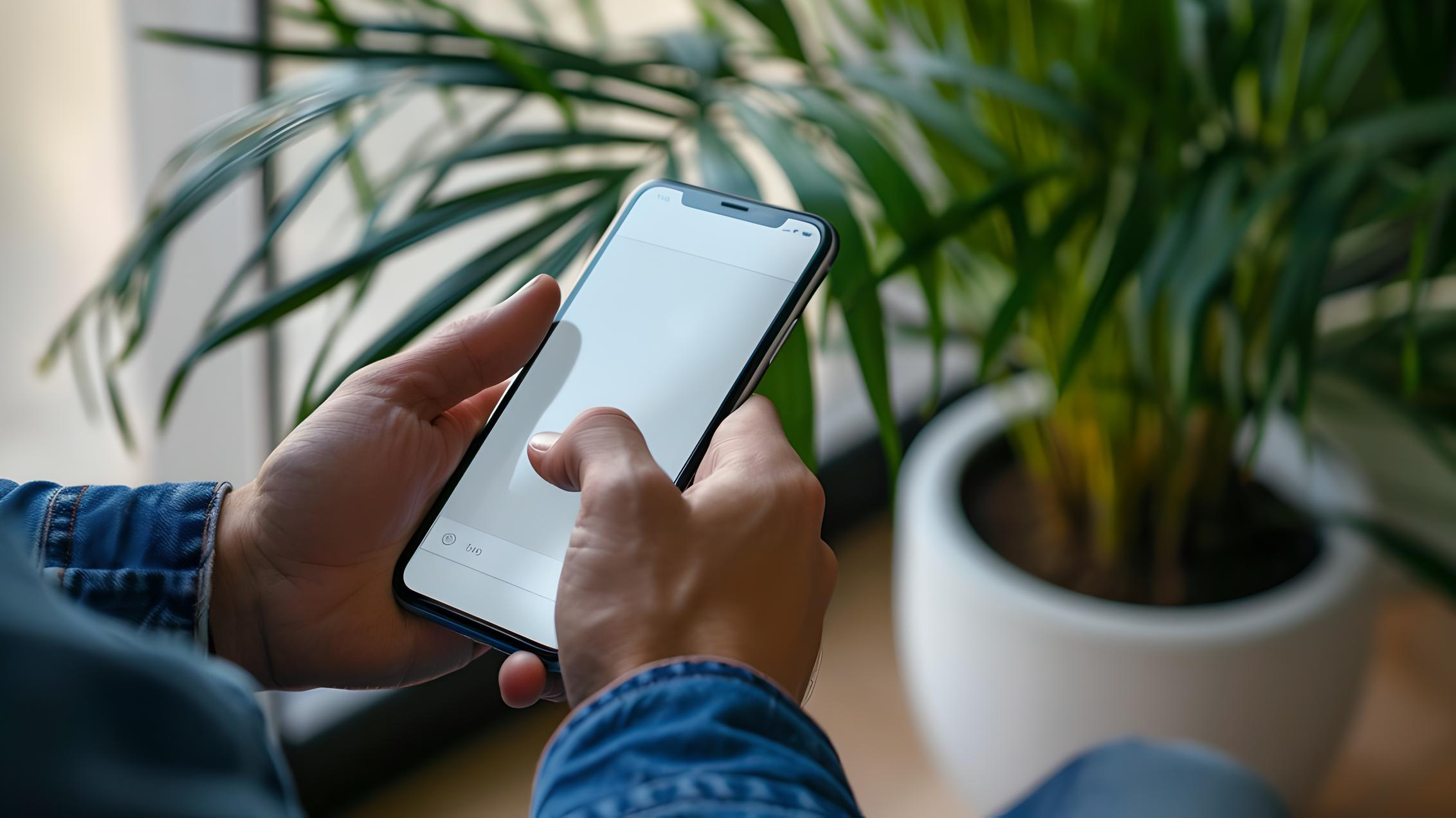
The top left and bottom right corners turn out to be blind spots, which require a person to change their grip on the phone or use their second hand to interact with. It is better to place inactive text or rarely used functions there.
Edge effect
A person is most attentive and better remembers information located at the beginning and end of an information block - a page or screen.
The most important information should be placed at the beginning of the page, and in the middle, where attention is scattered, more accents should be used, for example, digital facts, infographics, graphic elements. At the end there is a reinforcement of the first thought or a call to action.
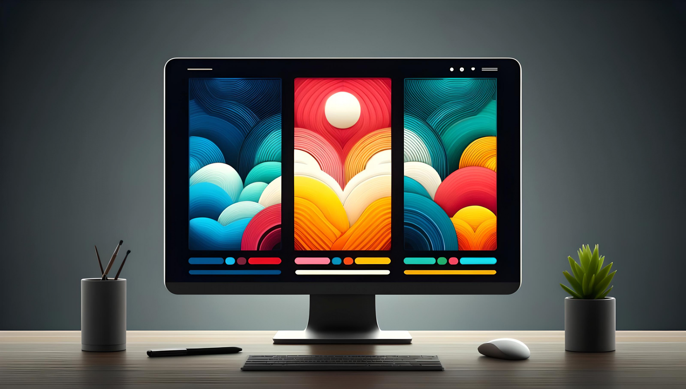
This presentation structure takes advantage of the edge effect and slightly compensates for the decline in attention in the central segment of information.
For the same reason, you should duplicate the offer, place it not only in the header of the site, but also in the middle, and also at the end.
Novelty effect
The recency effect states that a person's short-term memory is limited, and new information received most recently is remembered better.

For it to work in design, you must:
- Each information block should be separated from others by free space or graphic elements.
- Highlight the most important points so that they are deposited in short-term memory
- Put one thought into one information block, do not interfere with meanings
Isolation effect
This effect is expressed in the fact that in a group of similar elements, the one that differs from them most attracts attention and is remembered. The soloist always gets more attention than the choir.
The isolation effect only works in a group of three or more similar elements, and here’s how to use it advantageously in your design:
Visually highlight the element that should receive increased attention - frames, dies, size, color - make it different from others.

If you want to distribute attention evenly, make each element different from each other.
For example, if you have a service on your site in three price ranges, you can visually highlight the one that sells the best to encourage visitors to leave a request. If the services are equivalent, you can highlight their main differences to simplify the choice.
Conclusion
Design that takes into account the client’s psychology is perceived easier, more interesting and faster. A precise balance between aesthetics, functionality and understanding of the person for whom the visual is being created is the key to increasing conversion and sales.
You can see what it looks like in action: using the site as an example, which we made for a construction company - Tims Group. The entire design is based on the patterns described in the article, so a person quickly receives the necessary information and is more likely to leave a request.
Do you want your website to also solve its problem effectively? Then entrust its design to our studio.