
3 golden principles of creating a logo
3 golden principles for creating a logo. Graphic design studio Veonix will talk about how a company can understand whether its logo is good or bad.

How can an entrepreneur understand whether a logo is good or bad? After all, most businessmen do not have knowledge in graphic design. So, here are the three golden pillars on which any successful logo is built!

Originality
You want your brand to become popular and bring more and more profit over the years, right? For this, it is important that the logo is remembered by customers.
To achieve recognition, the logo must be original. Otherwise, you may simply be confused with your competitors.
It is important here not to fall into the trap called “primary associations.” This is when the logo uses a banal idea that is repeated by every second competitor. For example, half of dental clinics use an image of a tooth. So try to distinguish these logos from each other!
Originality is especially important if you want to register a trademark.
Rospatent employs incredibly strict officials who meticulously check the uniqueness of logos.

Therefore, we conduct a thorough study of competitors before sending the logo concept to you for approval.
That is, our cost of creating a logo includes not only concept and drawing, but also preliminary marketing research. This guarantees the uniqueness of the logo that we will develop for you.
Conciseness
Sometimes there is a temptation to put a lot of meanings into a logo, but here it is important not to overdo it. Here is a striking example from design history:
Few people know, but at first the Apple logo depicted the scientist Isaac Newton sitting under an apple tree. According to legend, he made a great scientific discovery when an apple fell on his head.

The idea was monumental, but using such a logo turned out to be terribly inconvenient - it was impossible to reduce it due to the many tiny details and signatures.
The inventive Steve Jobs took stock of the situation, turned to professionals and in the end left only one bitten apple.
Let's follow his example to be better remembered by clients!
Minimalism and brevity have captivated the whole world. Your logo should remain recognizable even when reduced many times. A minimum of small details and clever curls. A person should read the meaning of the logo in a split second, without looking closely!
For example, we sought to achieve maximum conciseness and simplicity when developing logo for youth clothing Modl. Since we were talking about introducing a new brand to the market, we chose the most readable and modern font ACTAY WIDE BOLD.
Versatility
The logo will be used by you on a variety of media:
- business cards,
- website,
- forms,
- souvenirs, etc.
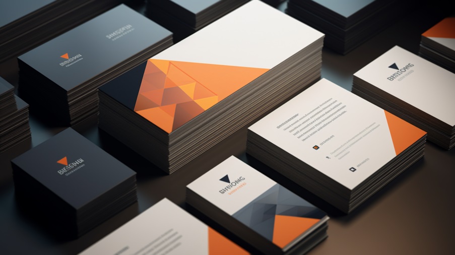
It should look decent both on a huge poster and in a tiny site favicon - an icon in the browser history.
Therefore, the logo is created in the so-called “vector format”. It allows you to enlarge and reduce the image as much as you like without losing quality at all!
Of course, when developing a logo you have to take into account many dozens of nuances, but this is the task of professionals. The main thing is that now you know the 3 main criteria that 99% of successful company logos meet!