
Selling website design - we manage the client’s attention and inspire his trust
Selling website design - we manage the client’s attention and inspire his trust. Veonix design studio will talk about how to make a website design that sells.

Many entrepreneurs mistakenly perceive website design as decoration. These people will never see their profits grow fivefold and drive around in Lambos sipping mojitos!

After all, only those who understand 4 aspects get the maximum conversion into sales on the site selling design:
Color range
Color plays an important role in tuning a website visitor to the “buying wave.”
Each product has its own emotional background, which is expressed in color schemes.
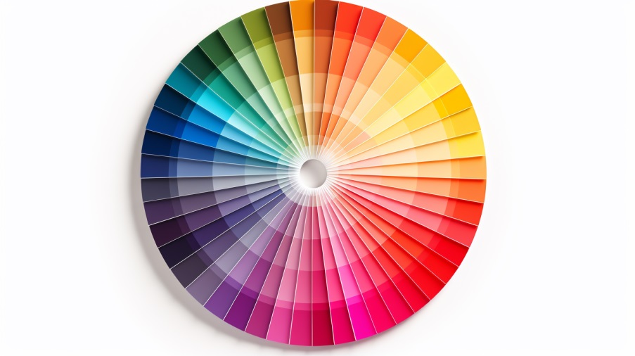
For example, for a supplier of high-tech equipment, it is fundamentally important to establish trust. That's why we used in the design corporate portal of Zanger LLC blue color - it is associated with reliability and a business approach.
In turn, for the website of a company that produces environmental packaging, we used green color. After all, it is associated with nature, naturalness, health.
The correctly chosen color seems to tell the user’s subconscious: “You can trust these guys!”
Shapes and shapes
Shapes and even the features of line drawing play an equally important role. Each geometric shape evokes certain associations in a potential client, which inevitably influence the perception of the product.

Let's look at this with specific examples.
Zigzags and pointed diamonds are associated with dynamics and energy. This, for example, would be suitable for an extreme entertainment club aimed at a risky youth audience.
However, it would be foolish to use such typefaces on the website of a company that states conservatism, security and stability among its values.
In this case, you can resort to balanced symmetry, such as squares and rectangles.
The style of the font also affects the perception of information. A textbook mistake - one company wrote a slogan “Lose weight with us!” in bold, sweeping font. When a client encounters such contradictions in the design of marketing materials, his trust in the company begins to weaken.
In a professionally executed web design, every line should serve a marketing purpose.
Highlighting the main thing
When a user visits a site, his gaze should move along the trajectory set by the designer together with the marketer.
For this, proven techniques and technologies are used:
-
Eye-stoppers (eye-stopper is a design element whose purpose is to “catch” or stop the user’s gaze). For example, bright stickers with the inscription “New”, images of human faces, unusual animation effects. The operation of these techniques is explained by the characteristics of the human brain.
We pay attention to people's faces because we are social by nature. We are attracted to moving objects. Most people like novelty because following trends allows them to be more successful.
-
F-pattern. Researchers have found that when studying content, the user’s gaze moves along the approximate outline (pattern) of the Latin letter F. Thus, the user’s priority attention area from the first moments is the upper left corner of the web page. This is where you should place a strong argument in favor of your company!
-
The power of contrast. To highlight important information on the site, simply make it more contrasting. Tell us about your business in numbers. Display key information about the company in large font, such as:
- year of foundation;
- number of employees;
- volume of products produced, etc.
This way you can better convey your benefits to your potential client.
Premium or Economy
Completely different websites are made for expensive and cheap goods.

It’s just that the user has already formed an idea of what a premium company’s website should look like. In order not to disappoint him, it is important to meet expectations.
A premium color scheme usually includes a minimal amount of muted colors. Monochrome is often used - even to someone inexperienced in web design, laconic white text on a black background seems stylish and “expensive”.
Another distinctive feature of premium web design is a large amount of “air,” that is, free space between text and images.
In turn, in the economy segment, red and yellow colors, as well as white backgrounds, are actively used.
In general, the design of premium sites is often dark, while those in the middle and economy segment are often light.
Of course, all this is just a small part of the nuances that our employees take into account when developing a selling website design. In fact, this craft is at the intersection of science and art.
Making design that helps solve commercial problems, and not just pleases the eye, is the key principle of Veonix designers.