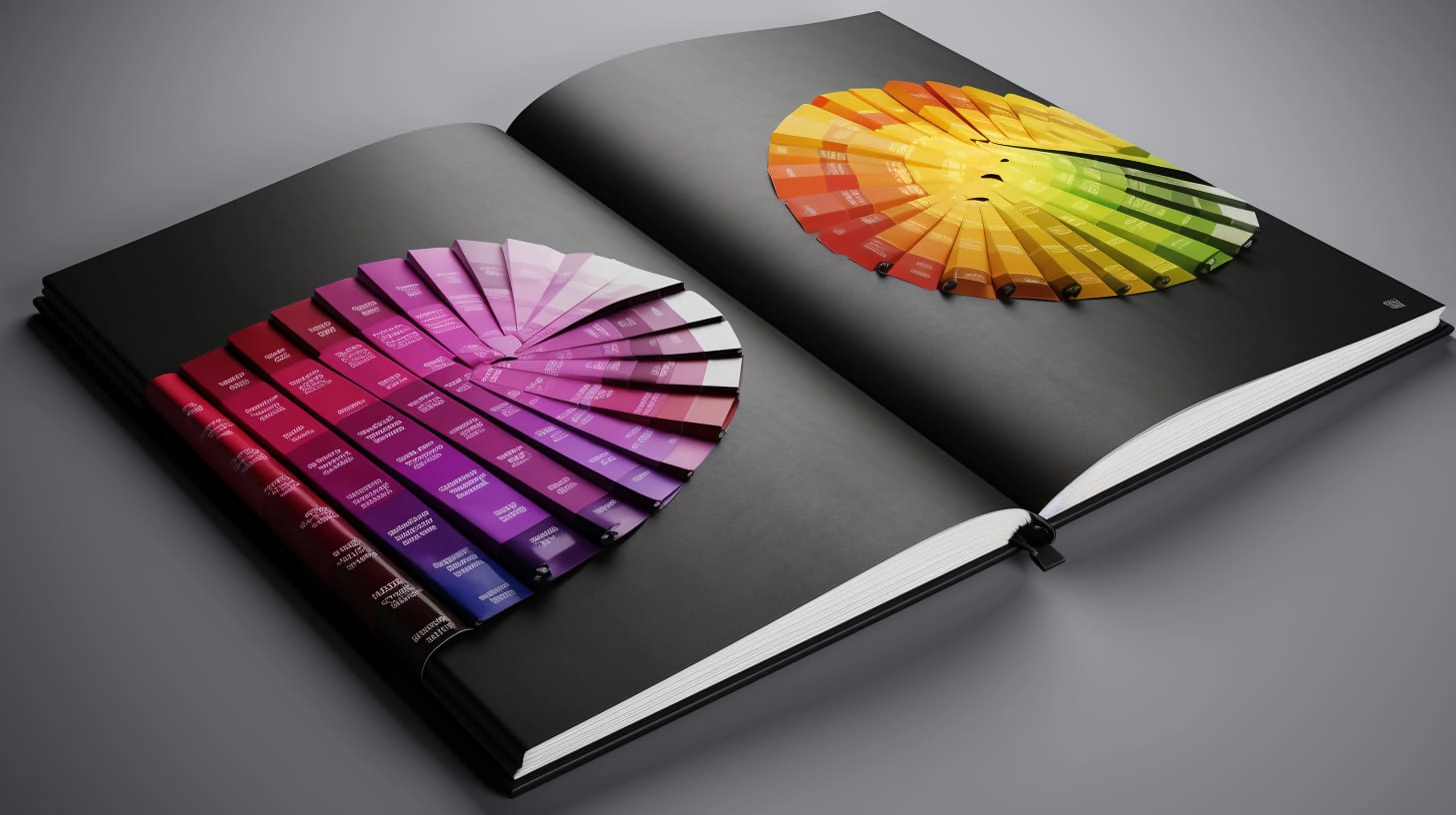
Different from competitors? Examples of unexpected color solutions in design.
Graphic design studio Veonix talked about how to be different from other competitors and showed examples of unexpected color solutions in design.

Everyone has encountered “color clichés” at certain points in their lives. Imagine a can of condensed milk, what does it look like? White and blue. We think your first thought is the same. Many manufacturers produce packaging with different designs, but in your memory you still have the same tin container with a paper label. What about the world's most famous can of tomato soup? If you know the name Andy Warhol, then you guessed it. Sometimes, after taking a quick glance at a cafe sign, brochure, brand book, and just noticing a couple of color spots, we already draw conclusions.
Move aside the basic combinations and consider others! Everything that has become commonplace for us now was previously innovation. Thanks to the fact that someone showed creativity and attracted the attention of hundreds, thousands or millions of people to the idea that appeared.
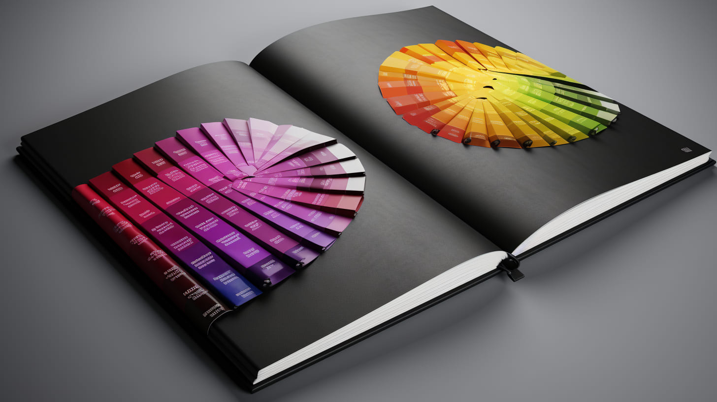
Classic red
Gift services, travel agencies and online schools, transport companies and other organizations use this tone. But we offer an unusual combination of red and green!
A short lyrical digression about the interaction of these colors. About how the palette affects us and thereby the brand, some minor event in life or objects that we have seen can form an associative series. If you like films with a mystical theme, then you have probably seen or at least heard the name “A Nightmare on Elm Street”. There is a theory that the film was remembered by viewers thanks to the negative character in a red and green sweater.
Introduced? This happened because color merging is not standard because... green and red are on opposite sides of each other on the Oswald circle. By the way, you will see this combination in the noble shades of the corporate identity of the Italian brand Gucci.
Red and blue next to each other will also be very contrasting. The first attracts huge attention and increases the level of reaction, while the second is neutral. The result is a balance, and besides, they can be used in almost any industry.

Orange sun, orange sky
We suggest you use such an unexpected tone! Orange is created for true lovers of originality, because... Either they love him or they don’t hate him. Use it with blue, yes, if it is not the main one, but an accent color, then you have already seen this combination.
Or with pink! Have you often visited sites with combinations of such colors? They interact perfectly, will clearly distinguish you from your competitors, and will look great on the elements of your corporate identity. In this case, shades of orange will convey brightness and cheerfulness, and pink will become its soft complement. On our own behalf, we suggest using them in topics related to the entertainment sector.

Ice cube
Subtle translucent undertones of blue can be a great alternative. They are appropriate in any situation (on the website of a medical clinic, bank, logistics company) and will have a positive impact on the emotional state of the visitor to your website or the one leafing through your brand book.

Green lawn
The light green tone evokes memories of the sun and outdoor recreation; it is relaxing and does not oblige you to be strict. Its combination with coral, peach, soft blue, and pink will be non-standard.
If you are involved in the field of health, beauty, tourism, sports, then this range will be suitable and will look fresh.
Candy abundance
Cakes, lollipops, marmalade, marshmallows, marshmallows? We recommend taking this entire warm and cold palette of sweets for use in the design of printed materials, a website, or developing your corporate identity in pastel shades. Reliably suitable for the field of beauty and personal care, jewelry, household items, and additional education.
Neon lights
If the acidic palette comes into view, then it is impossible to be distracted!
Pink, green, blue, purple, yellow, red, orange and their interaction with each other together can only be applicable for real lovers of saturation, therefore, when collecting such a set not only on an advertising sign, focus on an active progressive audience. If the company is engaged in creative events, this will be the best choice!

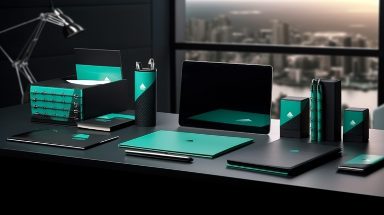
Black
What does the base tone do in this selection? Interacts with emerald, mint, coral.
If you stick to simple combinations and are sure that black is the best color in the world or the company's activities are related to science and technology, then you can create bright accents. Green will look rather discreet and will not distract from important information and files with drawings and projects. Mint and coral will dilute the depth of the dark background.
Colored crayons
Yes, just like on asphalt! Blue, light green, yellow, lilac, peach and other existing variations. Bright colors, whitened with white, will create a rather unusual range of design and will be associated with joy and fun.
Websites of creative agencies, online catalogs with interior items, household chemicals, cosmetics, books, etc. could be in similar colors. Such a palette could become the basis for the corporate identity of a company that deals with various events, food, and children's products.
Metal
It's still unusual, but it's on trend so you can stand out and be relevant.
All variations are good: gold, silver, bronze. Let your brand book shine with gold, like the chains around the neck of a rap artist! And if the field of activity is metalworking, graphic images of machines and components will look great in this design.
Retro vibe
Do you miss old times or want to experience them but have never been there? If this is to your taste and reflects the company's philosophy, then you will like these combinations. Smaller elements can be deliberately emphasized in the same style.
Shades of cobalt
Gradations of blue refer us to the colors of old posters and Olympic sweatshirts. We think that such a color tandem will be suitable for many niches, for example: clothing brands, footwear, technical enterprises, companies related to the food industry, unusual accessories stores, etc.
Violet and emerald
The combination of purple and emerald is quite rare. Depending on the warmth and depth of color, you can create an unusual effect and significantly differentiate yourself from your competitors.
Whatever idea you choose, classical or experimental, suggest which segments of the color spectrum are right for you and develop a website design our specialists can!