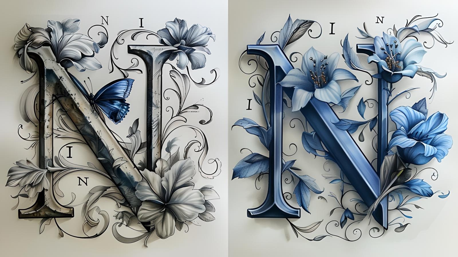
Nice font? Wrap two! What are font pairs and how to select them
We help you choose a beautiful font and the right font pair. Graphic design studio Veonix explains how to avoid making mistakes when choosing your new font.

Olivier and mayonnaise, Ed Sheeran and a guitar, a right and left sneaker - some things are designed to exist in pairs. It's the same with fonts.
The golden rule of design: don't overdo it. One font pair is more than enough for a project. Sounds pretty simple. But the Google Fonts library alone stores over 800 font sets. It’s easy to get drowned in an ocean of styles, serifs, and apertures. And whoever drowns, as you know, will no longer swim.
Calm down! We throw a typographic lifeline from our experts and tell you which fonts will become a pair.
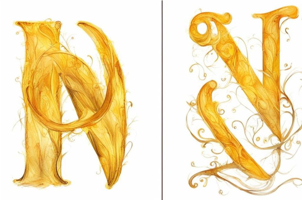
Why do fonts come in pairs?
Text is a visual tool just like illustration. Different font pairs can evoke different emotional and cognitive reactions.
A font pair is used to design text content in one space: in a landing page, presentation, brochure or city design code. In a font pair, like in any good team, there is a clear division of responsibilities. Font size also matters. Large - headline, it should catch attention. Text will take care of the rest. Its job is to be readable.
By the way, there was a hypothesis that what is written in a complex font is better remembered, but experiments refuted it. So there is no need to be too clever.
What font pairs can do
Structure information
Headings are typed in an expressive font and large size to show the reader that the previous text block has ended and a new one is beginning. The title also sets expectations about further content. Ideally, the user should scroll through the page and understand by the headings what is being said.
In typography-based design, text generally becomes the main carrot on a string that commands the audience's attention. Example - by link.
Convey the atmosphere
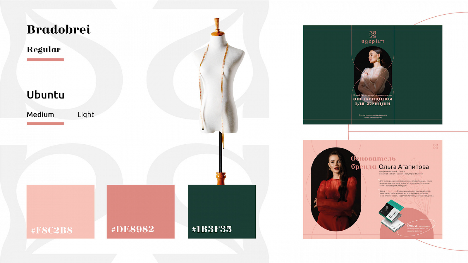
The font reinforces the main idea. As an example - our case. In a presentation for a young premium women's clothing manufacturer, we chose a font with thin, rounded serifs and high contrast, which convey the sensuality, elitism and soft power of the brand. Color or slant will help make the font even more expressive.
Enchant
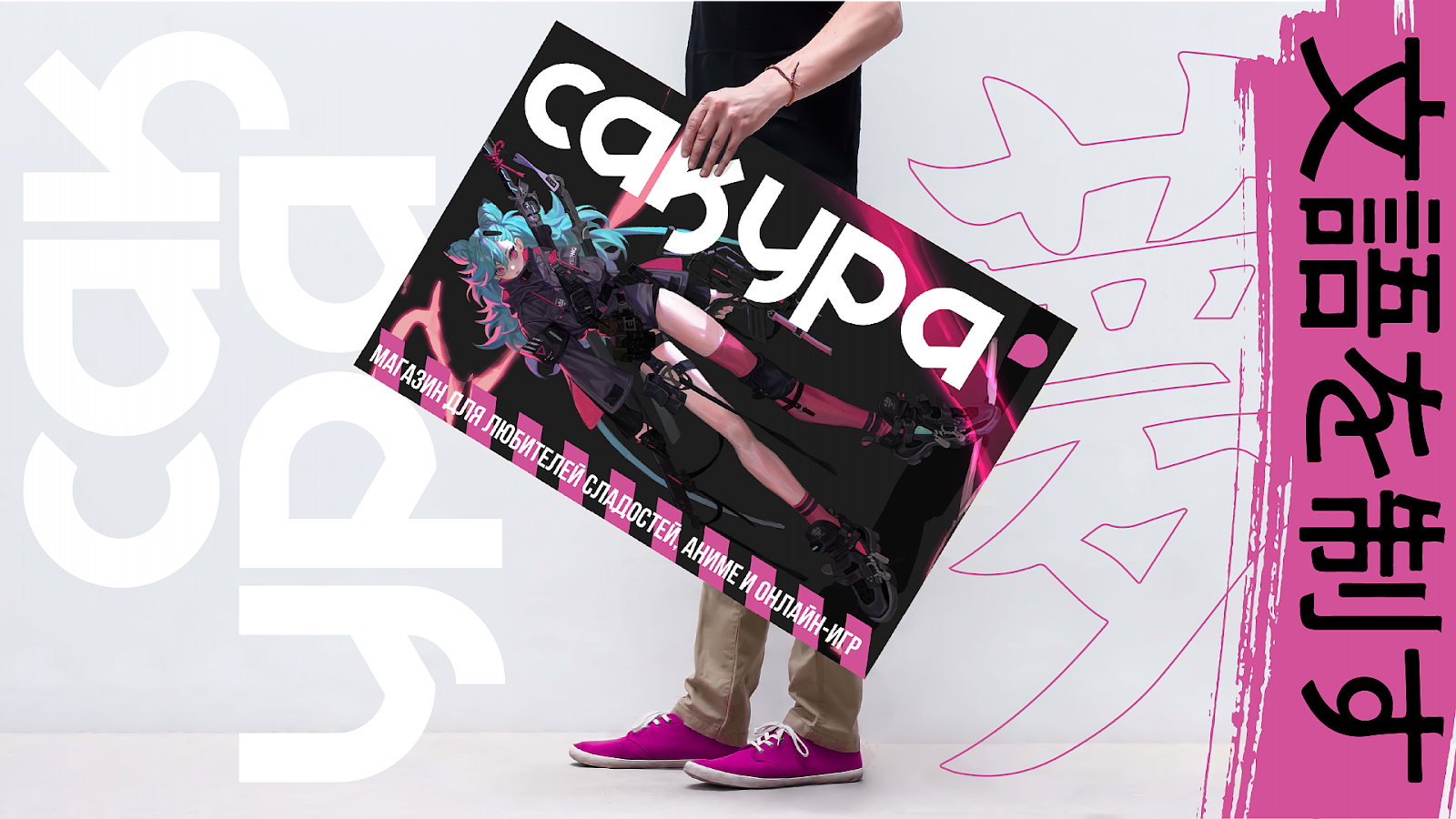
There is a group of decorative fonts, they are called display fonts, which produce a wow effect. They usually appear on movie posters, covers or logos. For example, we used KD William Regular font with an oriental character for the corporate identity of a Japanese sweets store.
How to find your perfect soul mate for a font
- Proportions. This is the ratio of the height and width of the letters. The letter “O” tells the best story about the proportion of a font. For example, Advent Pro has an almost rectangular shape, while Comfortaa has a distinct circle.
- Aperture. This is the name given to the degree of closedness of the letters. This can also be checked on one letter: in Lato “C” is almost closed, but in Nunito it’s the opposite.
- Contrast. This is the ratio of the thickness of the main and connecting strokes. There are non-contrast, low-contrast and contrasting fonts.
- Lines. They can be smooth or angular.
- Serifs. Everything is simple here: either they exist or they don’t. Fonts with serifs are also called serifs, and fonts without are called sans serifs.
How to combine
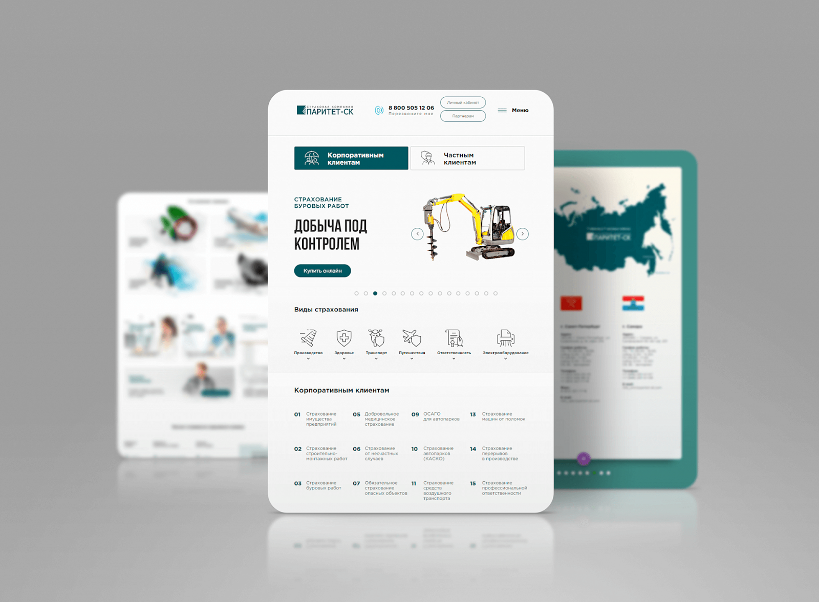
The first strategy is to choose two completely different fonts: serif and sans serif. But contrast can also be achieved by using only antique or grotesque fonts.
The second way is to choose two fonts from one typeface. Typefaces are families of fonts that differ in style. For example, Comfortaa has a completely weightless option, and there is a thicker one - only five gradations. And all these are different fonts of the same typeface. They can and should be combined, too, not forgetting the contrast, of course.
How not to get too carried away
It is important to remember who all this is being done for. The deeper the understanding of the project, its goals and audience, the easier it is to choose a font pair.
For example, according to research, people with low vision find it easier to read sans-serif fonts. Arial, Helvetica, Verdana or Adsans are suitable for the website of an ophthalmology clinic.
Here are some more insights about the perception of fonts:
- The rounded soft lines look friendly. They are suitable for cafes and restaurants.
- Sans serif fonts are modern and sporty.
- Serif fonts convey that the brand is serious and respected.
- Narrow fonts look strict and intellectual.
- Handwritten fonts are emotional - suitable for projects with an emphasis on the visual.
- Contrasting fonts are aristocratic.
- Geometric and angular shapes are rigid and sublime.
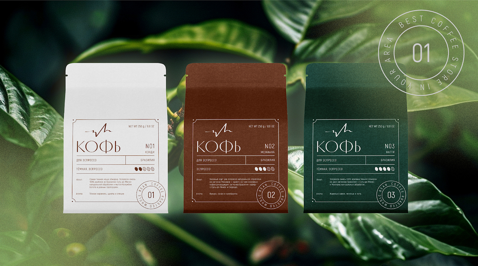
If there are any doubts about the compatibility of a couple, a friend's hint will help. And our best friends are A/B testing and focus group work.
You should make several layouts and change the font on each one - use different options. A pre-prepared questionnaire will provide information for analysis. For example, you could ask the target audience of a baby food brand whether the font pairs seem soft, sharp, childish, or adult to them.
Briefly about the main thing
- One font pair is enough for one project. There needs to be a good reason for introducing additional fonts.
- Properly selected fonts will help structure information and convey mood.
- Proportions, aperture size, thickness of strokes, the presence of serifs - these characteristics should be taken into account when combining fonts.
- Fonts in one pair should look both contrasting and harmonious.
- A contrasting pair can be created even from fonts of the same typeface.
- Handwritten and display fonts are the most emotional. Suitable for catchy headlines.
- In order for a font pair to convey the right emotion, you need to understand the preferences of your audience.
If it doesn't work out
When it doesn’t work out to make a couple right away, that’s normal. Typography is an art. The good news is that there are specially trained people on the planet who will not only select a beautiful font, but also do everything else: from concept to content.
This is us - designers, programmers and editors of the Veonix studio. We are ready to discuss your project, just fill out the brief.