How to keep the user's attention when scrolling through a website page?
If a person has already landed on the landing page of your product, then he needs it. There are certain engagement techniques. They help design a website page in a way that further engages the user so that he or she views the entire page.

The main factor in a user’s continued presence on the site will still be interest in the topic, the importance of the problem, need for the product. The productivity of interaction with the offer initially depends on this. If a person does not feel a real need for something, he will not actively write search queries.
And if a person has already landed, for example, on the landing page of your product, then he needs it. And here there are certain retention techniques. They help create a website page in a way that further engages the user, giving him the right impressions that will guide him throughout the entire page. And then the right mood can motivate him leave a request for cooperation.
Fill the page with content on the topic
We have declared a topic, which means we need to follow it to the very end, give benefit on this issue on every screen. If the title says “Building a country house: the whole process of work in 7 main stages,” then these stages should be there: sequentially, in detail. Perhaps in the context of working with your company, but practically useful things come to the fore.
And when, instead of the topic, the user reads about the advantages of living outside the city or about landscaping the site, then already on the 2-3rd screen he will lose all desire to look further. He realizes that he has fallen for a trick. At best, the level of interest will decrease, and at worst, the person will get angry, immediately close the page and mark your site and brand as undesirable. Some additional information can be added, but at the end, when the user has already received benefit and gained confidence.
Eliminate the monotony of presentation
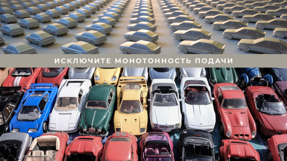
It's all about the structure of each screen. The user quickly gets used to the monotonous layout of the page: it is not so interesting for him to go into details, his attention is scattered. Therefore, it is worth coming up with your own arrangement of elements and different moves for each block.
As usual: the title is at the top, the text is below it, and the illustration is next to it. This template needs to be diversified: somewhere, put a full-screen image with text explanations on it, somewhere, parallel blocks of text, then a table, infographics, video. Variations may vary depending on the source material. Then the user focuses on each block of information, because he understands that every time he is offered something new, and this is interesting, he needs to be on his guard.
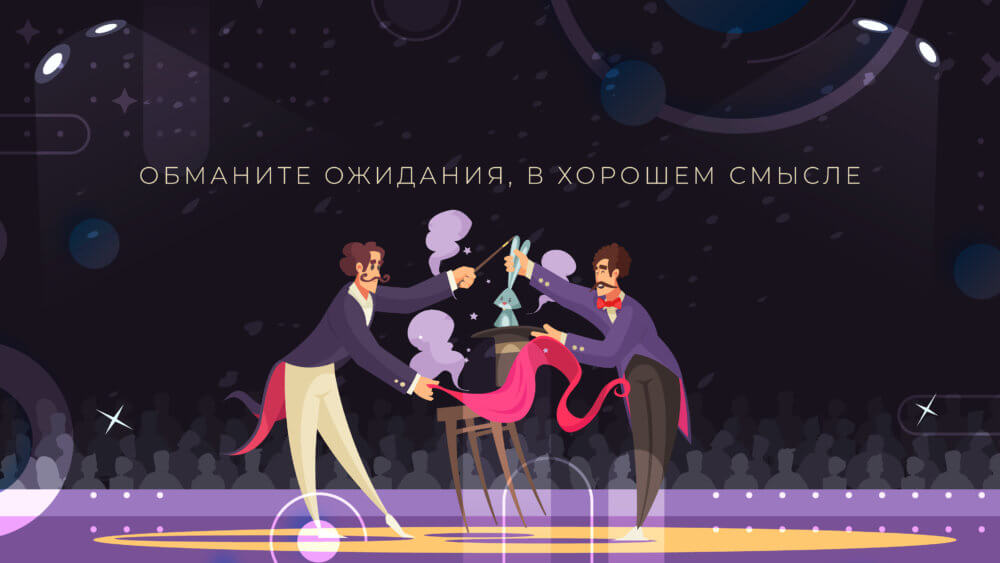
Subvert expectations, in a good way
Continuing to move away from monotonous presentation. In addition to the varied arrangement of elements on the screen, you can, in principle, change the usual mechanics of scrolling a page: use horizontal scrolling, use pop-up information when you hover over text or an object, offer to perform some action to move on. The essence is the same: it prevents a person’s brain from getting bored, retains attention, and the user will always be concentrated. It also pleasantly surprises and activates emotions, which greatly influences interest in the content.
Add animation
Let some graphic elements start moving. Perhaps a little and with a small amplitude, cyclically. It’s also good if both the elements themselves and their movements carry some meaning, and a micro-plot appears in the illustrations.
The user’s attention, so to speak, will be in good shape: when the elements are dynamic, it is unusual, interesting, and eye-catching. You can use this to direct the user to the right places on the site page.
Make Animation Interactive
When the page and its elements are static or animated with small automatic animations, the user notices interesting things, but at the same time remains an observer from the outside.
Or you can take a slightly different approach to adding animation to the site and invite a person to guide the process, to determine the movement of objects on the page. Make it so that when you scroll the page, elements or text blocks appear and disappear, and when you scroll back, they appear again, change scale and position. Or so that infographic elements appear upon user click.
When we add interactivity, the user is no longer an observer, he is a participant in what is happening, he is in charge here. And this gives the maximum effect of involvement.
All these techniques can be implemented separately or in combination. For some, it will be enough to arrange the elements in an unconventional manner, while others can afford not to skimp on animation. It all depends on the topic, product, field of activity.
But it is important not to get carried away and not to overload the site with all the techniques in a row. Otherwise, the user will become unpleasant and it will be more difficult to perceive the main useful content. And this may not have the best effect on the speed of the site.
To avoid difficulties with website development, we invite you to work on your project together. Leave a request, Veonix studio specialists will help you both in solving specific problems and in a comprehensive format: from idea to launch.