Pantone - what is this institute and who chooses the color of the year?
Pantone - what is this system and why does the whole world follow their choice? The history of the Color Institute, how the Matching System (PMS) works and why designers and printing houses need it.

Every year at the beginning of December, news spreads around the world: what will be the color of next year according to Pantone. Have you ever wondered what Pantone is and who gave them the authority to become trendsetters, determining the main color of the year? Today we will tell you how a small American printing house revolutionized the world of design and became world famous thanks to its system.
Small family printing house
Pantone's history began in the early 1950s in New Jersey. Brothers Mervin and Jesse Levine founded a small family printing company - M&J Levine Advertising. The company was engaged in the production of color pigments for light industry: cosmetics, medical products, textiles. In 1956, the brothers hired Lawrence Herbert, who had just graduated from the university, who specialized in chemistry and successfully applied his knowledge to his work.
After a while, Lawrence Herbert realized that the main problem in his work was the difficulty in communicating with clients. The customer wanted “exciting red” or “sky blue”, but in the end he was dissatisfied, because he imagined the result completely differently. Then Lawrence came up with the idea of creating a catalog with color samples, each of which was assigned a unique number. In total, the palette contained a little more than 40 colors, but even this small number made the work much easier.
Meanwhile, Herbert's career was rapidly going uphill, and already in 1962 he bought the company from the Levine brothers, renaming it Pantone. Lawrence did not stop working on his color system; on the contrary, a few years later catalogs with the palette were sold in over 100 thousand copies. At the same time, the Pantone color system acquired an official name - Pantone matching system.
“God created the world in seven days. And on the eighth he asked for Pantone
make it colorful,” Lawrence Herbert, founder of Pantone.
A color palette known throughout the world
The PMS system became more popular every year, designers all over the world used it in various fields - from cosmetics and clothing, to furniture and building materials. Therefore, over time, Pantone ceased to be a printing house, completely focusing its activities on color systematization.
All colors in the system have their own name, serial number and proportions of colors in the composition. Over time, Pantone expanded its palette by releasing catalogs for different materials: fabric, glossy and matte paper, metal. It now exists in both digital and physical formats, printed in the form of a fan.
To be fair, the PMS system is not unique - there are other color palettes. However, they are all much less popular than Pantone.
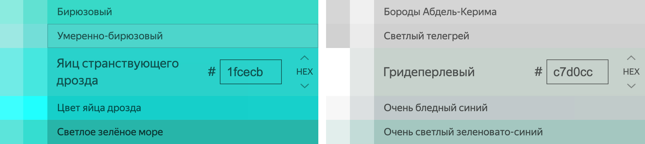
Today, the Pantone color palette consists of 3026 spot colors. All colors are given not only unique numbers, but also names that often sound funny, such as the color of “wandering thrush eggs” (#1fcecb) or “grid-pearl” (#c7d0cc).
Pantone Color of the Year
The next milestone in the development of the Pantone brand was the “Color of the Year” event. Since 2000, the company has officially announced the next year's color in December. And although this event was initially intended as a joke, over time, public interest did its job. Now millions of users associated with the fashion world are making predictions about what the color of the coming year will be. Thanks to this, Pantone has become world famous not only among professionals whose activities are related to design, but also among a huge number of people far from fashion.
The company itself approaches the determination of the color of the year with all seriousness: in-house psychologists study the influence of color on the human psyche, analyze the events of the previous year and people’s moods, and monitor what is happening among the masses. Therefore, Pantone's color of the year almost always reflects current events in the world, even if at first glance it seems that it was chosen randomly.
In 2007, Lawrence Herbert sold all of his assets to X-Rite, a spectrophotometer company that studies color scientifically. Fortunately, the new owner continued Lawrence's work, taking the Pantone brand to a new level.
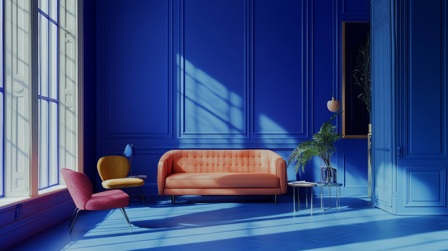
Color of the Year 2020 - Classic Blue
In 2020, classic blue was chosen as the main color of the year according to Pantone. Why? Firstly, a need for stability and tranquility arose in society. Global events have prompted us to pay attention to things that really matter. This is about simple life things, confidence in the future, unification. The color blue evokes associations with something basic and fundamental. PANTONE 19-4052 Classic Blue reminds us of calm skies and a boundless future.
Color of the year 2021 - give two
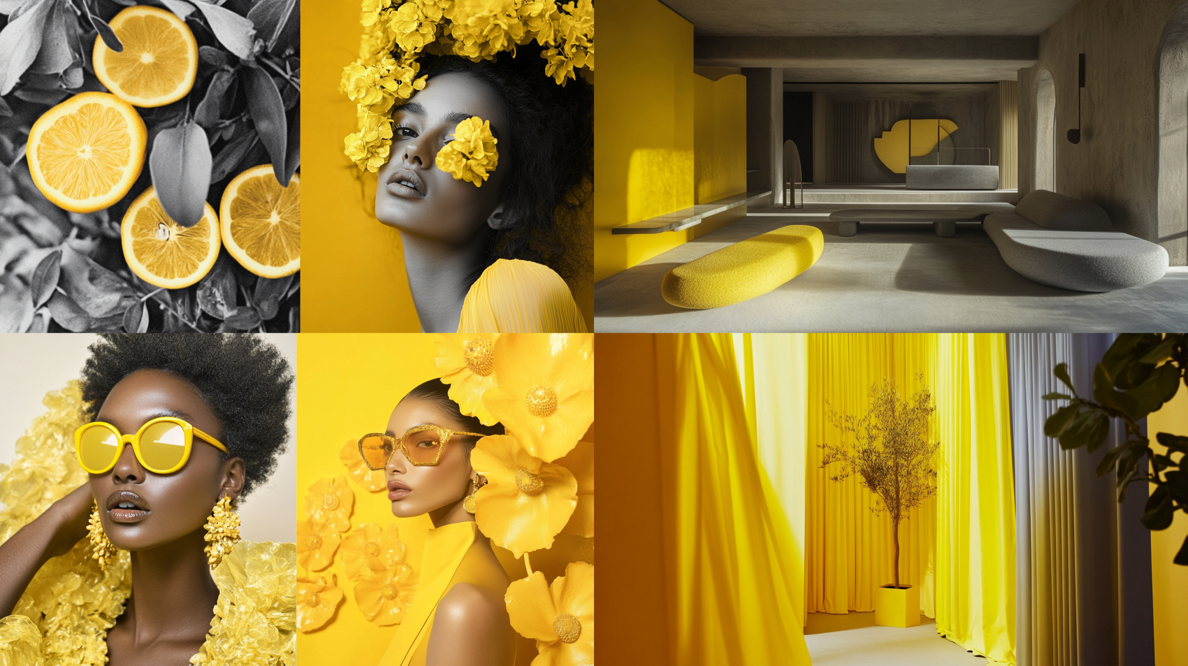
PANTONE has declared yellow and gray, or more precisely, Ultimate Gray and Illuminating, as the colors of 2021.
Why two? Because it was necessary to express much more than one color can express. These colors symbolize two different states: resilience and optimism. Gray tells us about strength and composure in the sense that in life it is important to be resistant to changes and not always pleasant changes. Yellow is reassuring, gives us the opportunity to feel the desire to live, inspires optimism.
In a word - balance.
Color of the Year 2022 - Creative and Inspiring
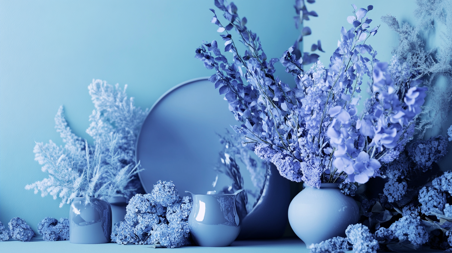
The year 2022 passed under the auspices of the color “periwinkle” or Very Peri according to Panton. Blue-violet characterizes the symbiosis of creativity, virtual reality and change. This color reflects the bold mood in society, the desire to stand out, express yourself and create. All this is happening at a time of rapidly growing digitalization, when the virtual world is closely intertwined with the real one. There are millions of possibilities open to a person, and Very Peri reminds us of this.
How it works, since 2022 this beautiful purple has literally taken over the world of product and service design. With its luxury, it fits into interior solutions, clothing and our favorite websites (see our logo).
Color of the Year 2023 - Bold
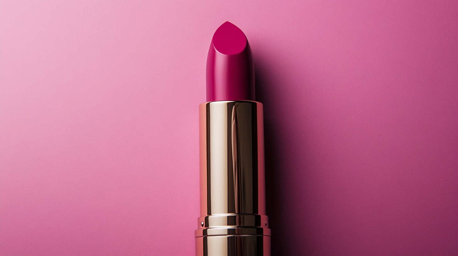
Pantone has named Viva Magenta as the color of 2023. This is a shade of natural cochineal dye, which is obtained with the help of insects. That's why the Panton Institute calls it natural. What does it symbolize? A unique response to powerful world events. A symbol of hope and energy, as a kind of hope for global renewal in the future. He is like a bright flower, breaking through the concrete with the help of a thirst for life and strength of spirit.
Viva Magenda gives us hope for a better future through bold decisions, unity and self-realization. These sentiments are expressed in the use of color in creativity, design, interior design, fashion, cosmetics and other areas. The energy of red in 2023 permeates literally all areas of life.
Color of the year 2024
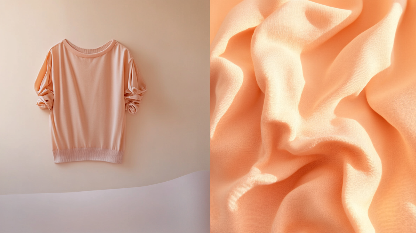
Bright red was replaced in 2024 by Pantone Peach Fuzz - a color called peach “fuzz”. Throughout 2023, Panton Institute specialists studied trends and found that it was the shades of delicate powdery orange that dominated the identity and design solutions. What does this color say? It’s immediately clear that this is about lightness and airiness.
According to Panton Executive Director Leatrice Iseman, the chosen tone reflects our desire to protect ourselves and loved ones. When we see peach color, there is a desire to touch the object. Recently, society has demanded tactility, a desire for unity, kindness and tenderness towards each other. Shades of pink and orange create a feeling of calm that is used in everything from interior design to hair coloring.
Color of the year 2025
And the color of 2025 was announced at a presentation from Pantone in December 2024! By the way, everyone can take part in the voting and try to guess the next color of the year. To do this, you just need to leave a request on the website of the Color Institute.
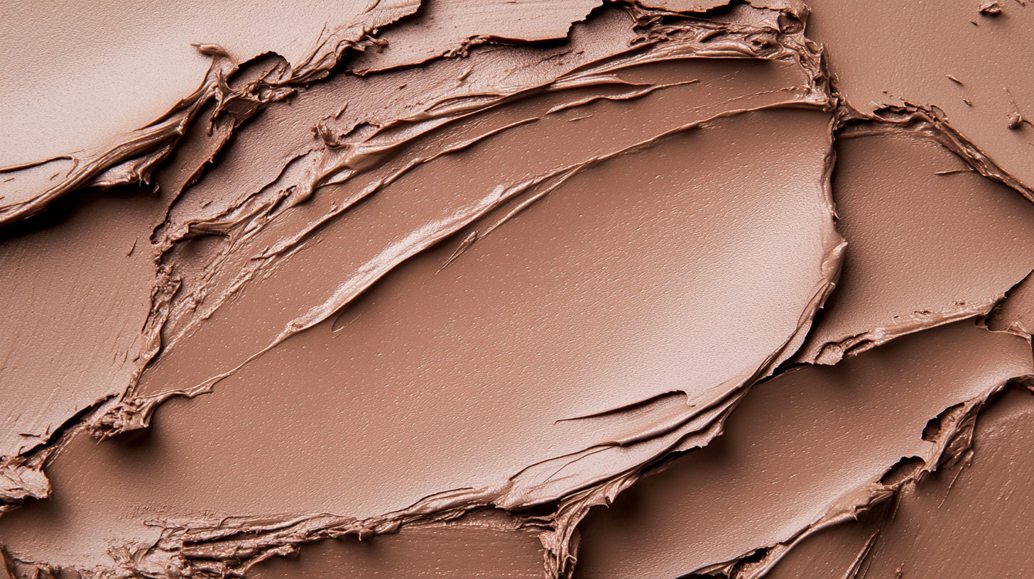
Mocha Mousse has become the symbol of 2025. A light brown hue that is associated with the taste of milk chocolate or coffee with milk. This color personifies warmth, comfort and an atmosphere of goodwill. Serenity, safety, reliability - what every person strives for. This trend will accompany us in all areas of our lives.
We are in a hurry to implement them into our and your designs!
Color catalogs and more
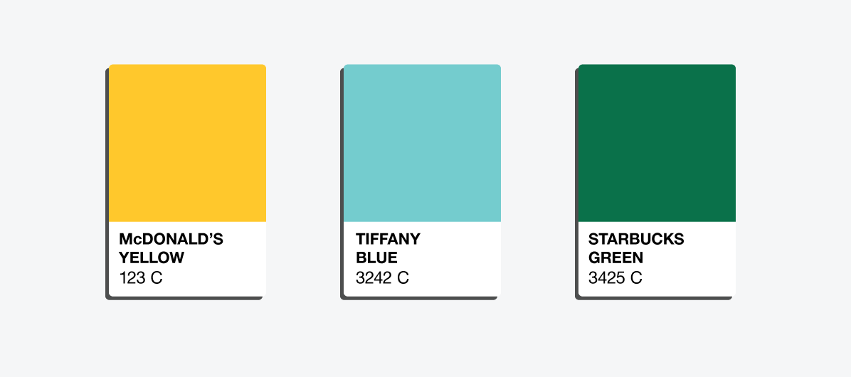
Pantone now has several profitable lines of business. They still print catalogs with color palettes that are successfully sold all over the world. In addition to color layouts, the brand has its own merch - various products from mugs to sneakers, painted in Pantone colors with corresponding numbers. The company is also actively developing the area of consulting - in-house psychologists can develop a unique color for the brand, which will become a business card and make the business recognizable precisely because of it. The developed colors are named after Pantone's customers, who will even be able to sue competitors who decide to use a unique shade. Among the famous companies that have used color matching services are such giants as Starbucks, Tiffany & Co., McDonald's. It’s hard not to agree that when a brand is mentioned, its signature color, developed by Pantone, immediately comes to mind.
The history of Pantone is a brilliant example of how a small business can grow into a large company with worldwide fame and become a trendsetter. Herbert Lawrence managed to carve out his niche and create a unique product that makes the work of millions of designers around the world easier. Over time, Pantone has proven to many people that color is much more than what we are used to seeing. Now, no matter where you turn and what designer you work with, you can always call the color by number and be sure that the result will be exactly the way you imagine it. And the credit goes to Lawrence Herbert, who many years ago came up with a unique color palette system.
Veonix team designers can develop for you corporate identity using the perfect color that will make your brand recognizable and unique. We have many years of experience in graphic design, so we know exactly how to help your business reach a new level.