5 Signs Your Logo Is Outdated
Graphic design studio Veonix explained how to tell if your logo is outdated. 5 signs of an outdated logo, as well as tips on how to update your logo and make it relevant.

A theater begins with a coat rack, and a profitable business begins with a cool logo that passersby stare at. The company's logo is its brainchild, its face and its most recognizable part. It should be as popular as a governor in a rural town, and as memorable as a superstar's performance at the Olympic Stadium.
Have you noticed that the target audience pays attention to the neighbor’s stray kitten, but ignores the sign near the store? It probably not only went out of fashion, but also became downright uninteresting.
Alas, over time, even the coolest, stylish and fashionable logo becomes outdated. It's not very pleasant, but there is something you can do about it. First, let’s figure out why logo design is losing relevance. There are usually 5 signs that indicate this.
Changing trends
A year ago, it was fashionable to illuminate a brand with neon, and all the signs in the city looked like advertising a disco. But, with the advent of the “natural beige” trend, it is quite logical that the old logo design will literally catch the eye with its pretentiousness.
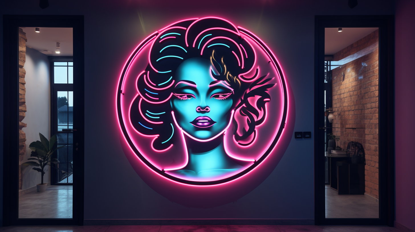
And it’s not that the previous logo suddenly became bad. It’s just that fashion has changed, and clients usually unconsciously pay attention to those emblems that correspond to the new style.
It's hard to keep up with all the trends. But it is likely that when analyzing ideas for a cool logo, there will be a middle ground. For example, laconicism. It was in fashion in the early 2000s, when there were simply no opportunities to create such options as now, and at the same time it is popular in our time - when logos from the category “I want everything at once” became a symbol of redneck and bad taste.
Inappropriate design
The right logo is the one that seems to be “related” to the company’s mission. It should reflect the essence of the business so that customers understand: this is a sign of a place where you can come for the right product, service and excellent service. If everything is the other way around, then the target audience will be confused: does this brand really offer what I need? What if, behind a strange logo, I’m waiting for less-than-quality service?
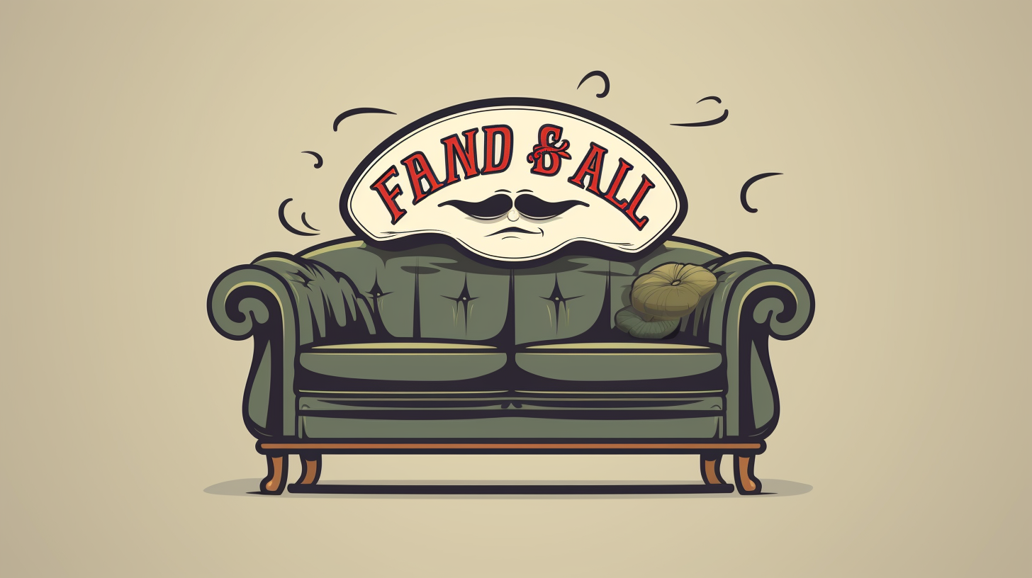
Let's give an anti-example: a company is engaged in fashionable interior design, and the sign of its store is made in the spirit of the 90s. Such dissonance is unlikely to be assessed as “look how creative they are!” Most likely, clients will simply choose the company that has a fashionable logo that directly demonstrates the scope of their activities: made of stylish metal, with bright contrast and thoughtful eclecticism.
Difficulty of perception
A current logo is always easy to understand. The principle of recognition works here: if what you see quickly “gets stuck” in your head, then the concept is guessed correctly.
The problem with many old logos was the artists' blind belief in the client's demands. Like, well, the customer wants to make a mare, and a crown, and a castle against the backdrop of a waterfall - how can we really protest? And then it turns out that such a hodgepodge looks, to put it mildly, awkward. Or it even completely scares away buyers who don’t understand where to look in the hope of just reading the name of the company.

Logo creation – the process is always creative. But the main thing is not to overdo it. This should be understood by the customer himself, who strives to “shove” into his design everything that is remotely related to business.
It is better to take an example from market leaders:
-
one apple as an association with the name;
-
corporate tones for quick recognition;
-
a well-known slogan that will immediately confirm is “the same logo of the same company.”
Don't try to fit everything in at once. It is also not recommended to make the logo overly confusing and associative. Buyers don't like to think. It is important for them to immediately understand that this is their favorite brand. He looks at me and doesn’t hide, doesn’t try to deceive. Everything here is simple and clear.
Unprofessionalism
It would seem that there is nothing complicated in developing a logo. Come up with a font, a background, take a small picture - and a unique idea has found its implementation. But it’s not always possible to be creative and interesting.
Sometimes the only problem with a bad logo is that it was created by “amateurs” – those who don’t understand anything about design, don’t follow trends, or are too confident in their abilities.
Typically, unprofessionalism occurs among business owners who do not want to spend “extra” money on creating their corporate logo. Why, if they “can handle it themselves?” But in fact, only a few people manage to create a beautiful logo without experience, and even then by accident.
Similarity to a famous brand
Trying to be like “that same company” can ruin the development of even the most promising brand. Seriously: in the 21st century, does anyone believe that customers like to buy cheaper copies? Of course not.
The desire to have something similar to a company that has achieved great heights in the same industry is understandable. It would be foolish to deny that everyone dreams of becoming an object of imitation by competitors. But being on the other side, stealing logo ideas under the pretext of “do the same, but a little differently,” is clearly not worth it.
Creating a brand will be doomed to failure if the new logo is very similar to one already known to the market. Even if a similar logo is not so popular, it is also not worth repeating. Plagiarism always leads to loss, especially in business. And no one is immune from problems with the “theft of ideas.”
If you really want to take something from a competitor, you can use a combination of colors, a font, or other small ideas. “Licking up” everything is not only unsightly, but also boring. It’s better to ask for a custom logo to be made than to try to come up with everything yourself, only thinking in your head of stealing a competitor’s idea.
Making a logo is not an easy task. Recognition and customer loyalty depend on it. Therefore, you should not trust the work to beginners. With us you can order a logo, which will not go unnoticed. Entrust the development of your brand to professionals so that you don’t have to rack your brains later about why the previous logo stopped attracting customers’ attention.