
5 headshots for the perfect presentation
5 headshots for the perfect presentation. There are a number of common mistakes when creating a presentation. Veonix Studio spoke in detail about what is important to know and what not to do.

Ideally, the presentation of a product or service should lead the client to understand one simple thought: “I need this.” What if make a quality presentation, the result will be even better. The client realizes with hopelessness: “I urgently need this - and right now!”
Any marketer knows what needs to be done to lead to this idea:
- to interest you with an unusual presentation;
- engage with interesting visuals;
- inspire confidence with impressive facts;
- amaze with attractive numbers;
- convince that the matter is worthwhile.
It sounds clear and simple. But it’s more difficult to implement all this than to describe the stages. We need a well-coordinated team of experts and a professional approach. Luckily, we have both.
It is also important to know what not to do and what is unacceptable. There are details that radically change the overall picture. At first glance, they may seem insignificant, but any of them is a reason to ring the bell due to doubts about the performer’s expertise.
Let's call them headshots, because each of them is a fatal shot to the reputation of an amateur who fancies himself a professional.
Negligence
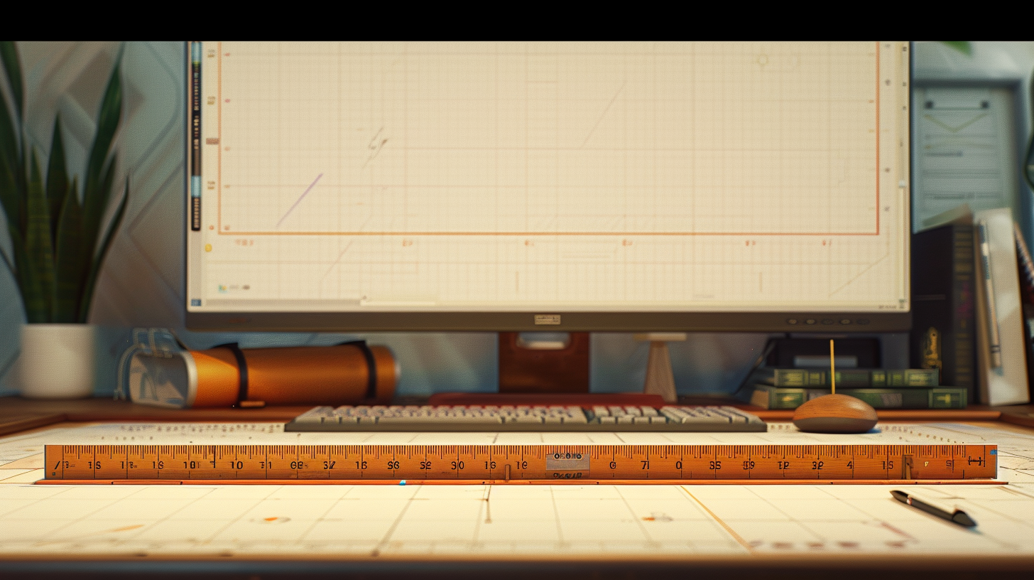
Carelessness conveys an attitude towards a potential client. Crooked tables, floating frames, clumsy hyphens, ridiculous abbreviations are a reason to argue. Align everything: margins and indents, paragraphs and spacing. The uniformity of headings, the clarity of the system, the consistency of the structure are the guiding stars.
Illiteracy
Errors should not end up in the final version of the presentation. Typos should be burned out of the presentation with a hot iron. Check everything: grammar, spelling, punctuation. Simplify your vocabulary, speak simply and clearly, do not overuse terms. Speak the language of your target audience: clearly and accessible.

Lack of unity
The difference in styles used and the lack of a unified concept indicate an inability to think holistically. Illustrations that differ in genre and resolution, and a riot of fonts suggest that the material was borrowed from somewhere.

Unoriginality
Using the slogan “A healthy mind in a healthy body” to promote a fitness center is trivial. If the presentation is replete with template wording, hackneyed appeals, loud promises that lack freshness, the chances of hooking the audience tend to zero.

pretentiousness
Visual perception is the most important channel for obtaining information. Even before a person begins to delve into the structure of the presentation, he will look at it as a whole product. If you don’t fall in love with the design right away, it will be more difficult. A clutter of shapes, acid gradients and psychedelic colors are unlikely to work. Pretentiousness is the path to instant devaluation of the project, no matter how brilliant the text may be.

Each of these five points will mercilessly turn your presentation into smoking ruins.
The only way to avoid headshots is to evaluate the work at every stage and bring the result to the ideal before the recipient sees it. Despite all their simplicity and obviousness, these points are often missed, which leads to reputational and material losses.
Let us remind you that this requires a well-coordinated team and a professional approach. Everything is at our disposal, and we will be happy to provide it to you. See for yourself order a presentation.