A new logo for the Varezhki cottage village
- Logo
- Corporate identity
- Brand applications
- Brand book
Goal
Objectives
Implementation
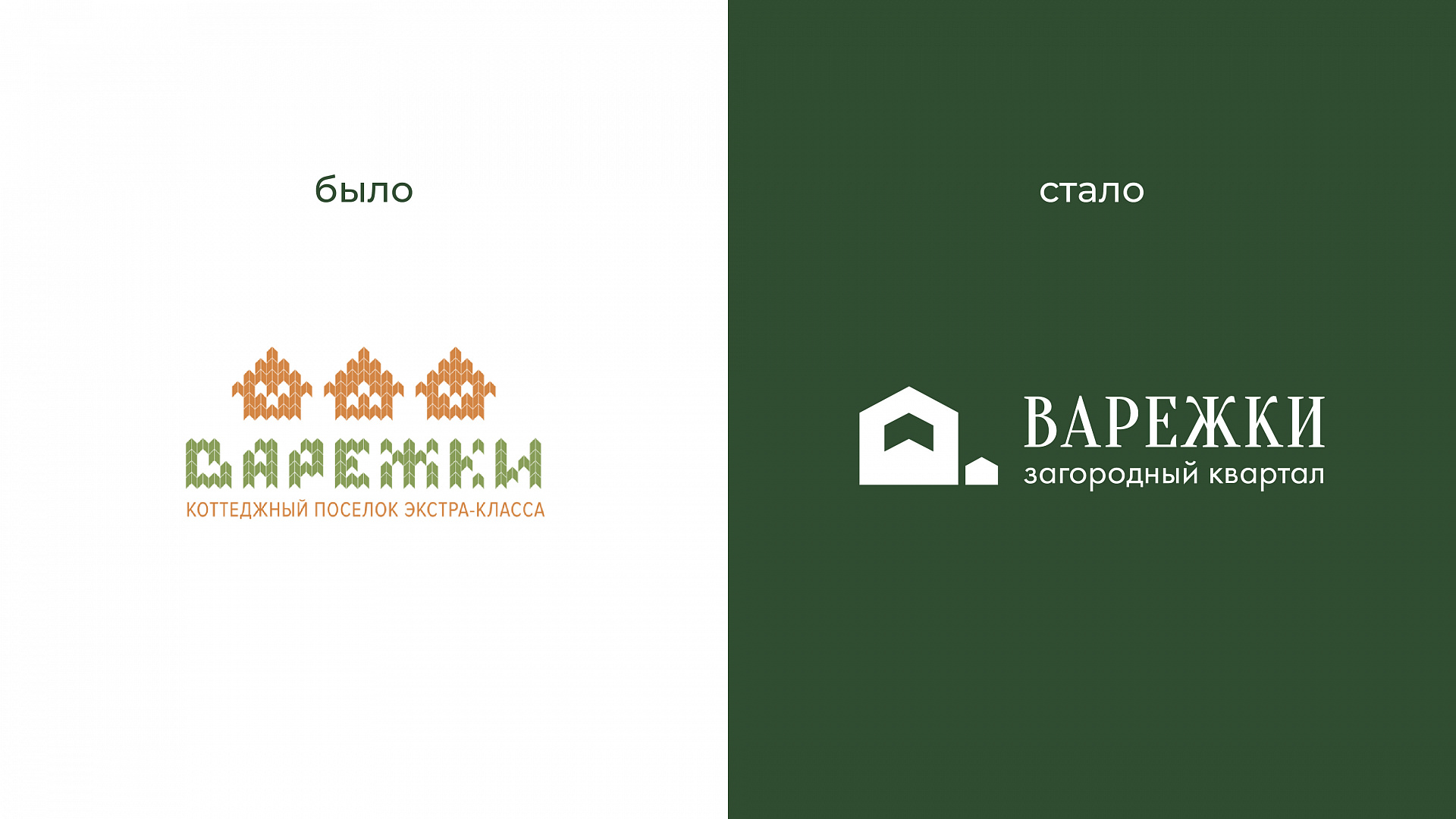
When we started the project, the village already had a logo. But it was too cartoonish: it suited the comfort class well, but did not fit the new premium European-style houses at all. The task was a difficult one: keep the brand recognisable while moving the style towards something serious and solid.
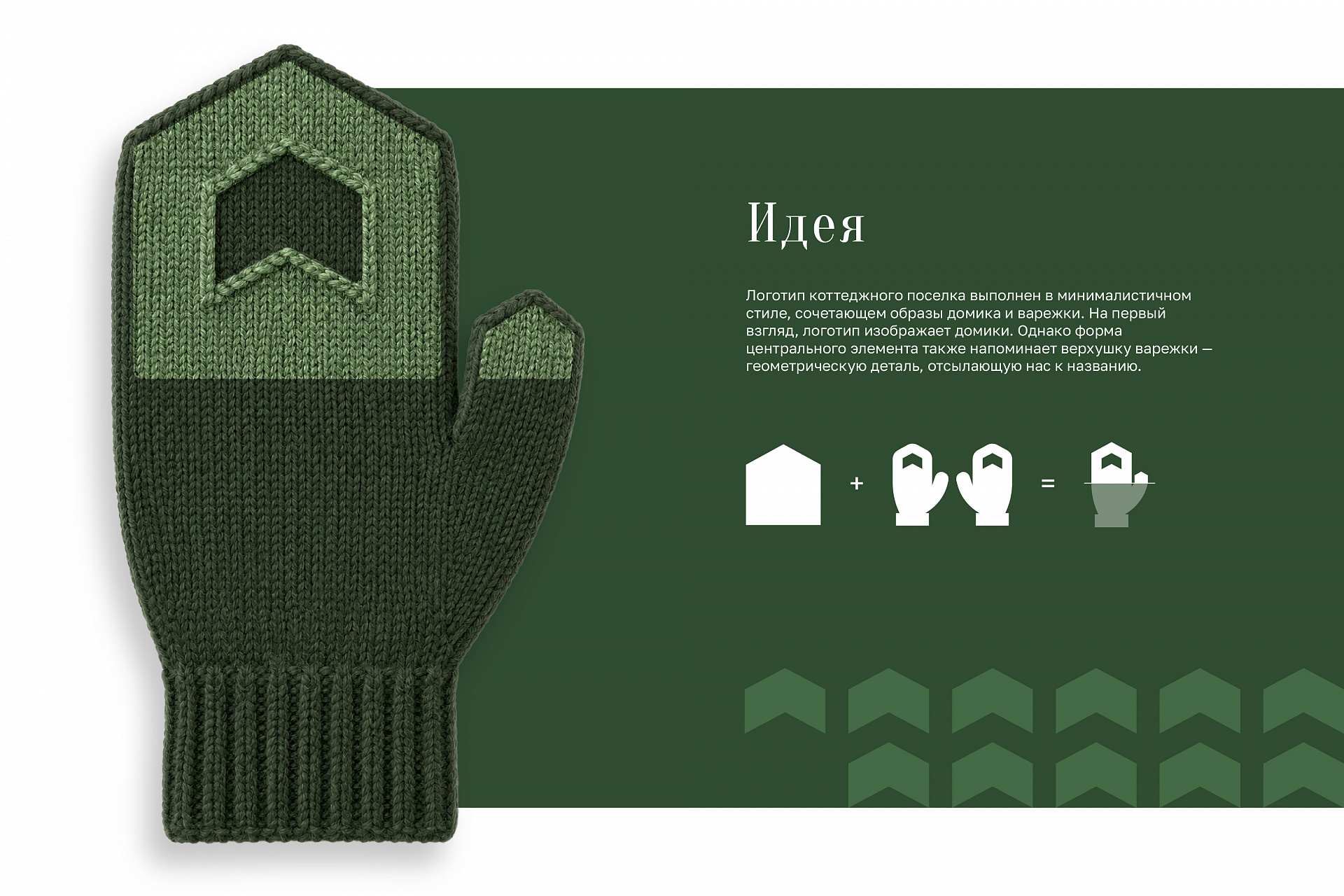
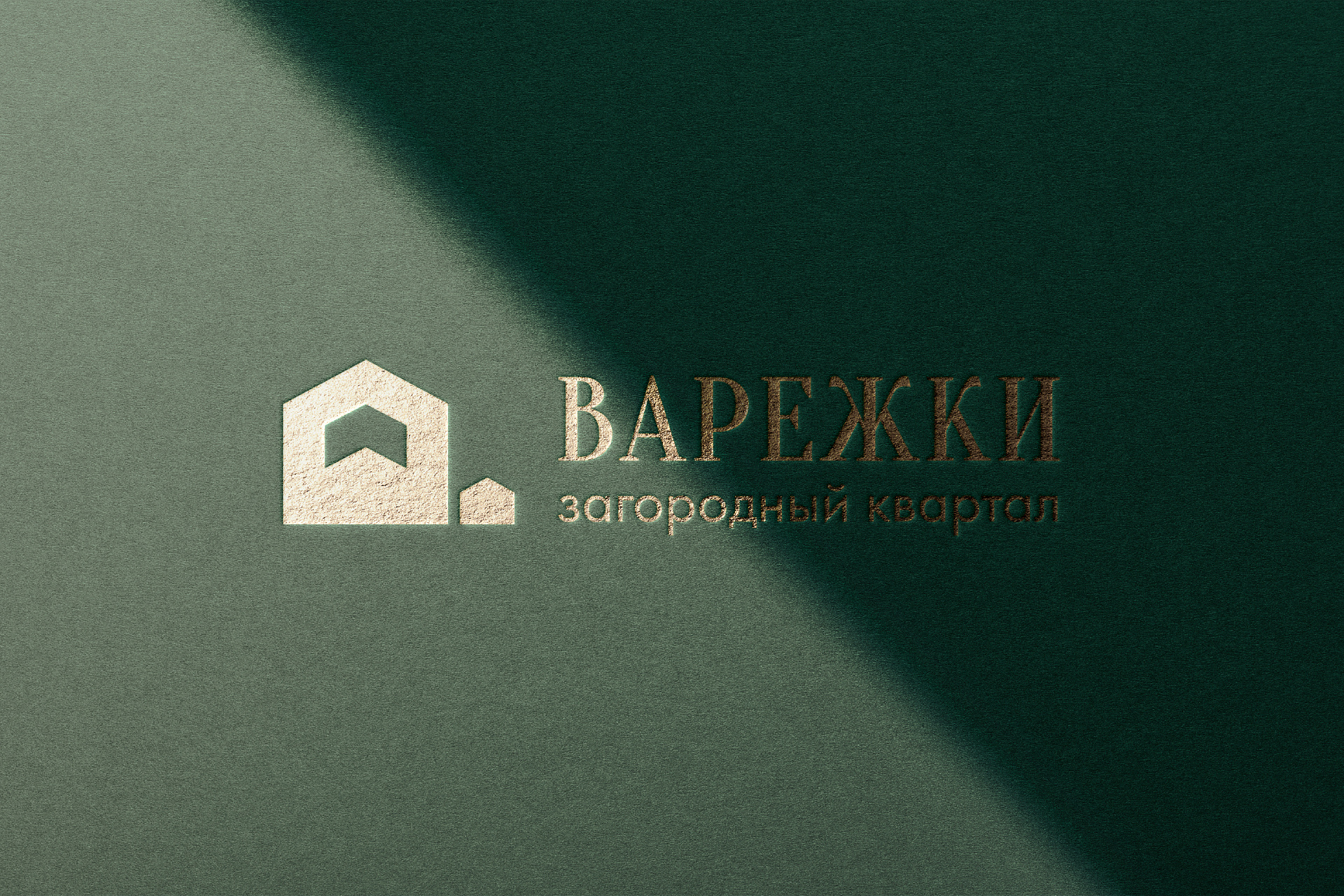
We started with the logo and decided to play on the name — Varezhki means “mittens” — through a minimalist image: at first glance it shows neat little houses, but the whole composition resembles a mitten. Simple, clear and without any affectation.
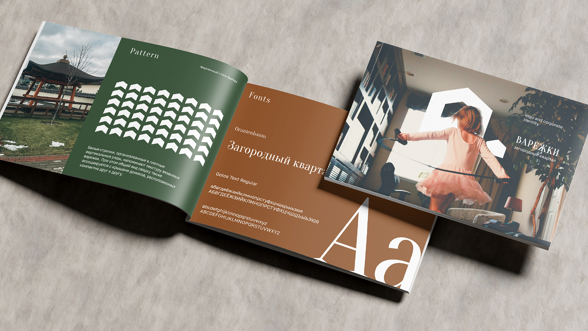
The key find was the pattern. White arrows arranged in tight vertical rows create a double association. On the one hand, it is the texture of knitted mittens, soft and cosy. On the other, it is the roofs of houses standing close to each other. This way, we combined the name and the essence of the village in one visual solution.
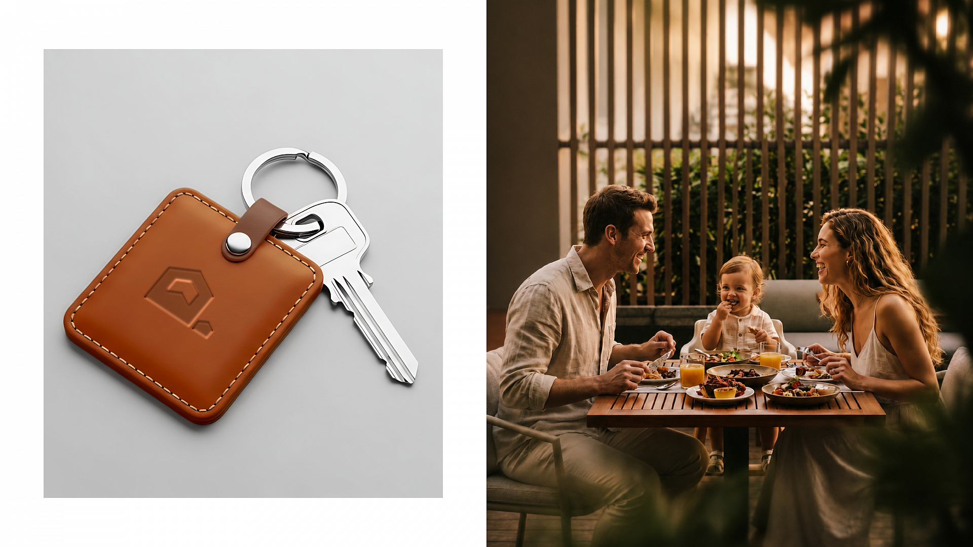
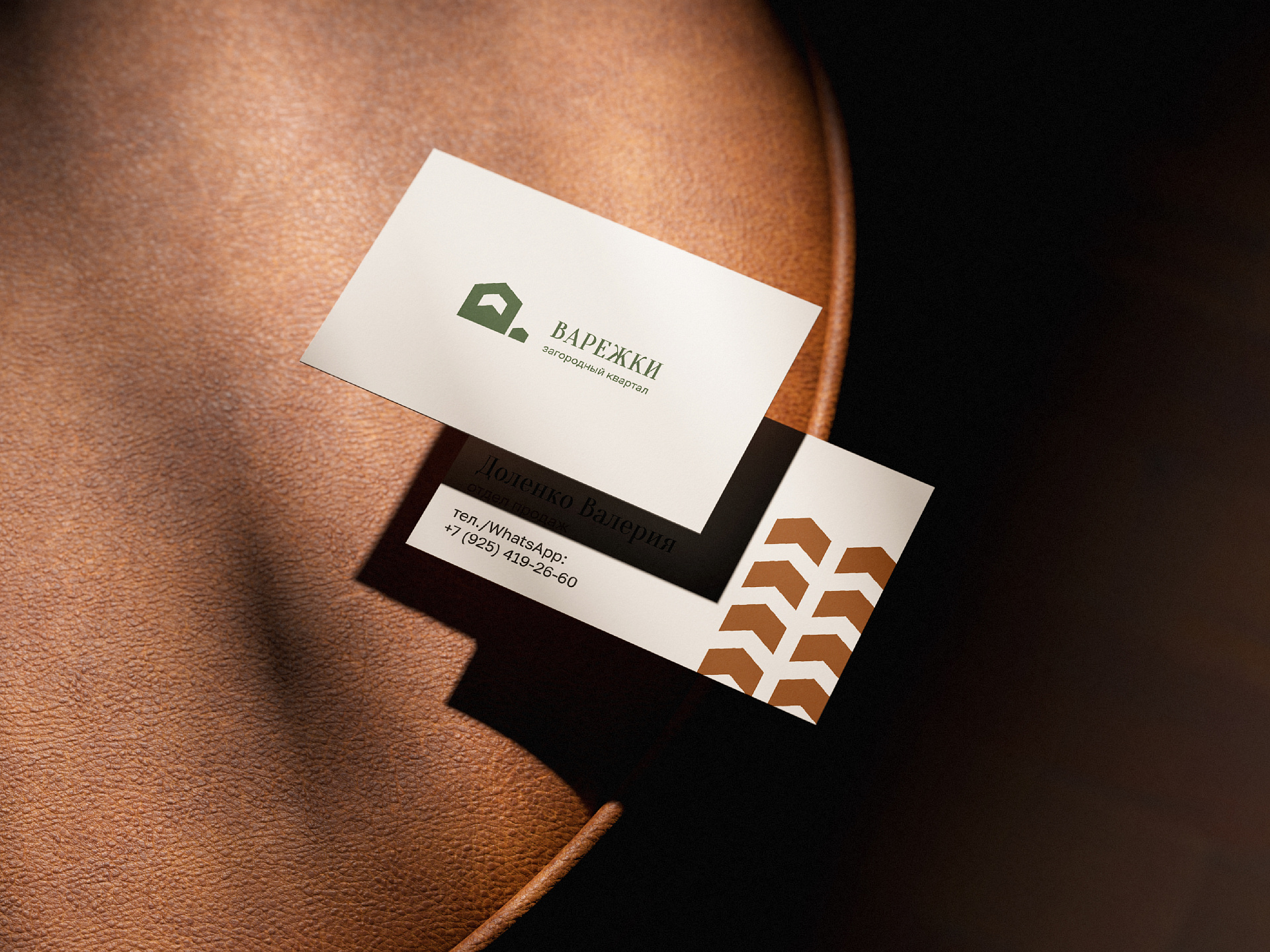
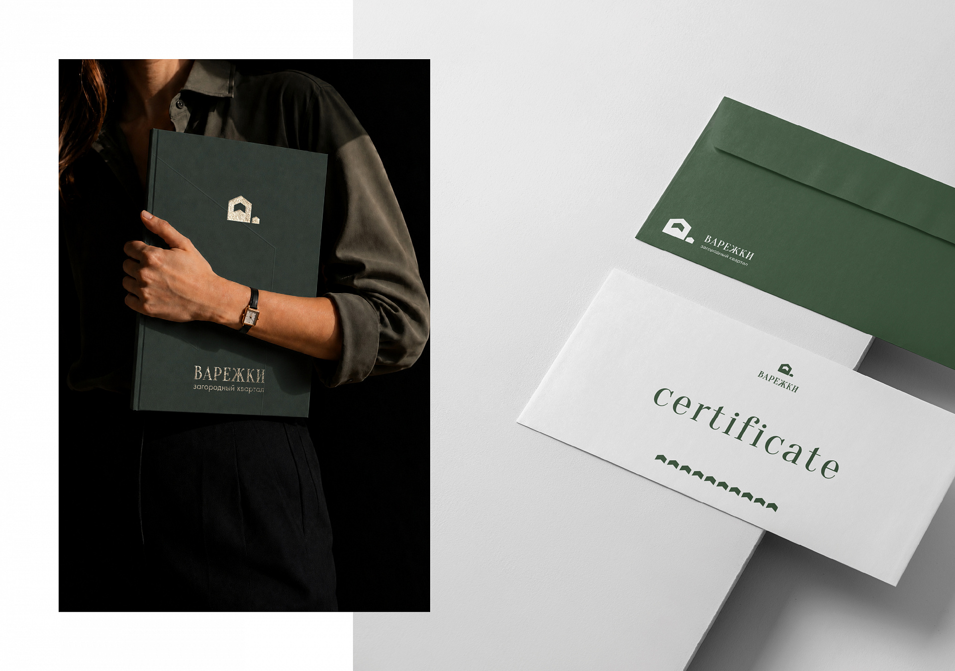
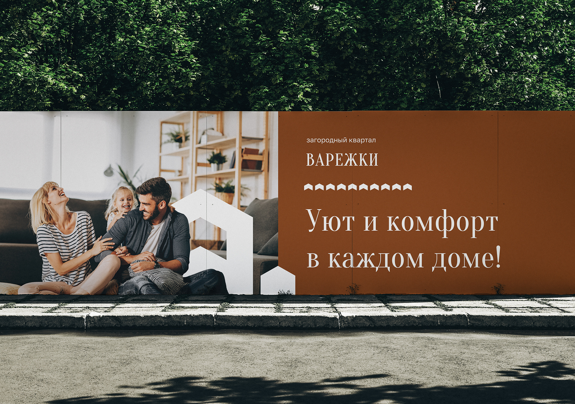
We also chose a restrained Scandinavian palette and new typefaces and designed all brand applications, from flags and business cards to the sign at the main checkpoint. By the way, the sign was one of the first physical applications to be produced, even before the brand book was finished — that is how much the client liked the new logo. After the brand book, we started working on the new website and presentation, which we tell about in another case study.
Result
The village’s new identity now speaks the language of premium. The logo catches the eye, the pattern adds depth, and the new style works everywhere, from business cards to the website. Sales of the new phase took off, and we were reminded once again that good branding is not just about looking nice: it is packaging that sells the content.