- Website development
- Catalogue architecture
- Logo redesign
- Corporate identity refresh
- Copywriting
- SEO promotion
Goal
Objectives
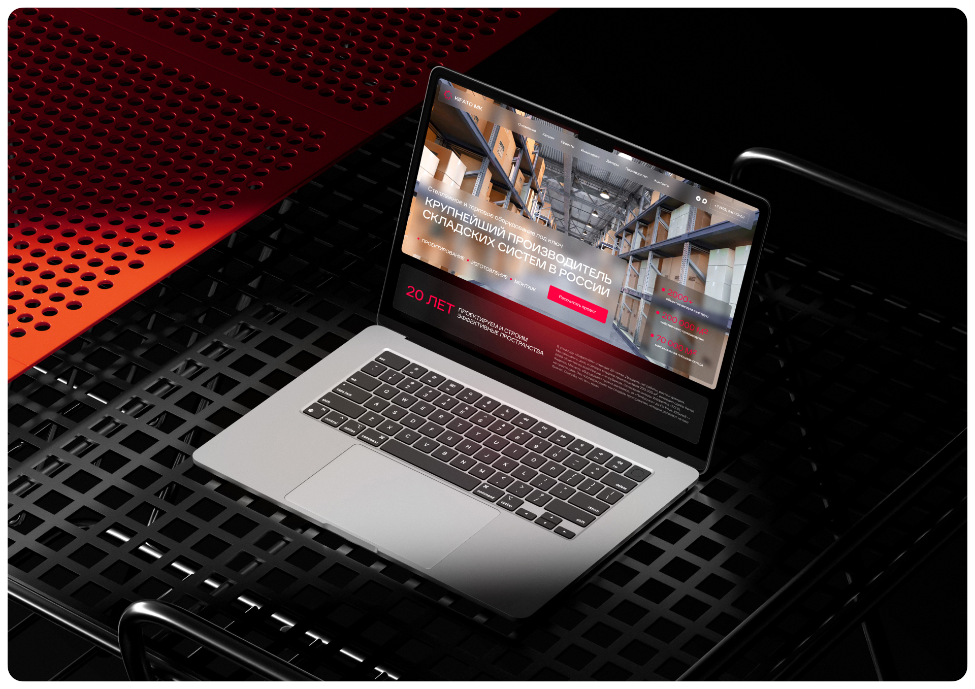
Implementation
You can equip a huge warehouse and work with the country’s leading marketplaces — and still look on your own website as if you had a small workshop on the outskirts. That is roughly the situation Kifato MK found itself in. The company had the scale. All that was left was to make sure website visitors did not have to guess about it.
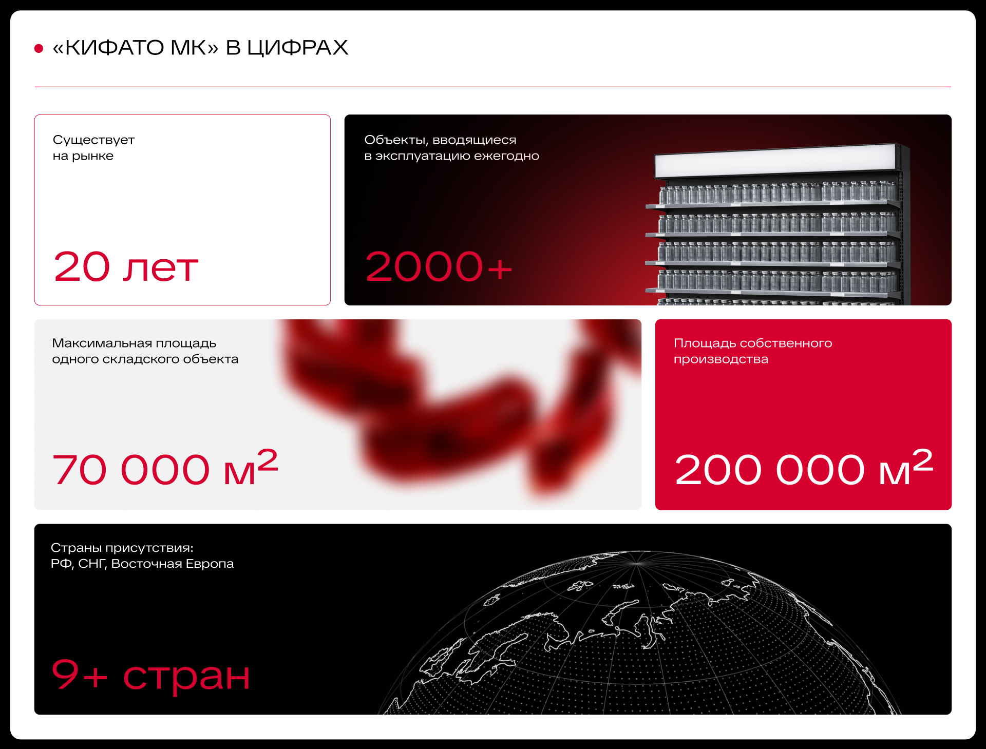
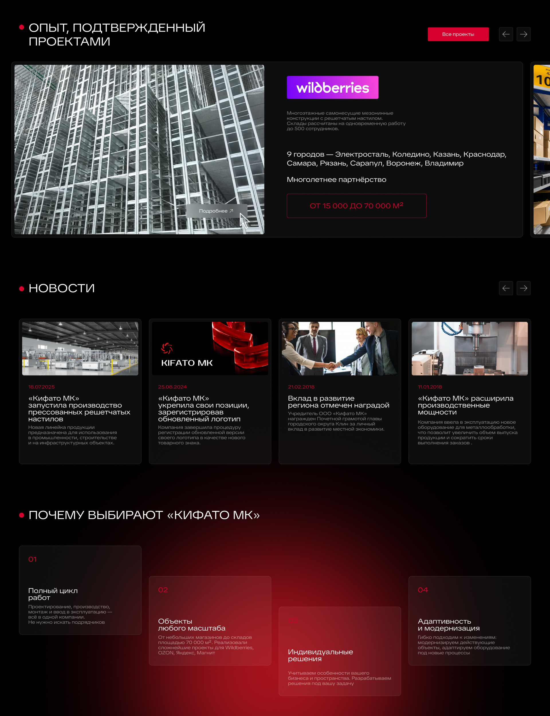
Kifato MK manufactures warehouse and retail equipment: racking, mezzanine structures, shopping and cargo trolleys. Behind this rather modest description are 200,000 m² of in-house production, more than 2,000 facilities commissioned every year and projects for Wildberries, Ozon, Yandex and Magnit. In short, if you have ever ordered something from a marketplace, your purchase may well have met the company’s equipment before you did.
The client came to us to update and expand the website. The old design could not be called bad: neat, fairly stylish, quite modern. But it told the company’s story far too modestly. It was hard to tell that you were looking at Russia’s largest manufacturer of warehouse systems, trusted to equip huge logistics facilities.
The catalogue was even more modest. Several categories held PDF files — electronic versions of printed materials. They were split by country and line of business, overlapped in places and duplicated each other in others. Visitors were expected to open the documents, compare the information and find the right equipment on their own. The catalogue was there. What it lacked was a navigator.
That is why structure became the core of the project. We had to sort through a large body of information and turn it into a website that helps the buyer: explains what the company makes, how its solutions differ and where to go with your task.
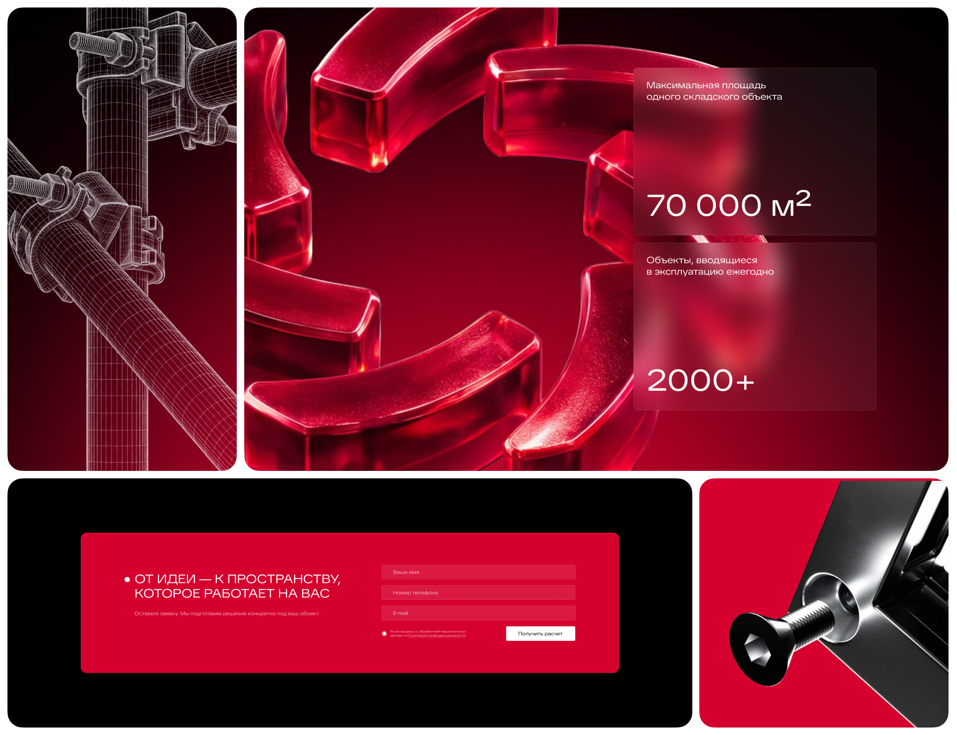
We started with the corporate identity. Kifato MK already had a recognisable look, so we were not going to give the brand a fresh start from Monday. We kept the palette and the basis of the logo but carefully updated its geometry: refined the lines, added sharpness and made the mark more concise.
Its elements resemble a rotating mechanism, so movement and an industrial character are already built into the shape. We strengthened these qualities while keeping the familiar silhouette. It is one of those cases where the brand looks noticeably fresher, yet clients do not have to double-check that they have come to the right place.
Then we chose new typefaces, designed patterns and brought the design elements together into a coherent system. It became the foundation of the future website: confident, modern and restrained enough for the attention to go to the company itself and its products.
The next big stage was the catalogue. Here we literally had to put everything on the shelves. For a racking manufacturer, you will agree, there was no other way.
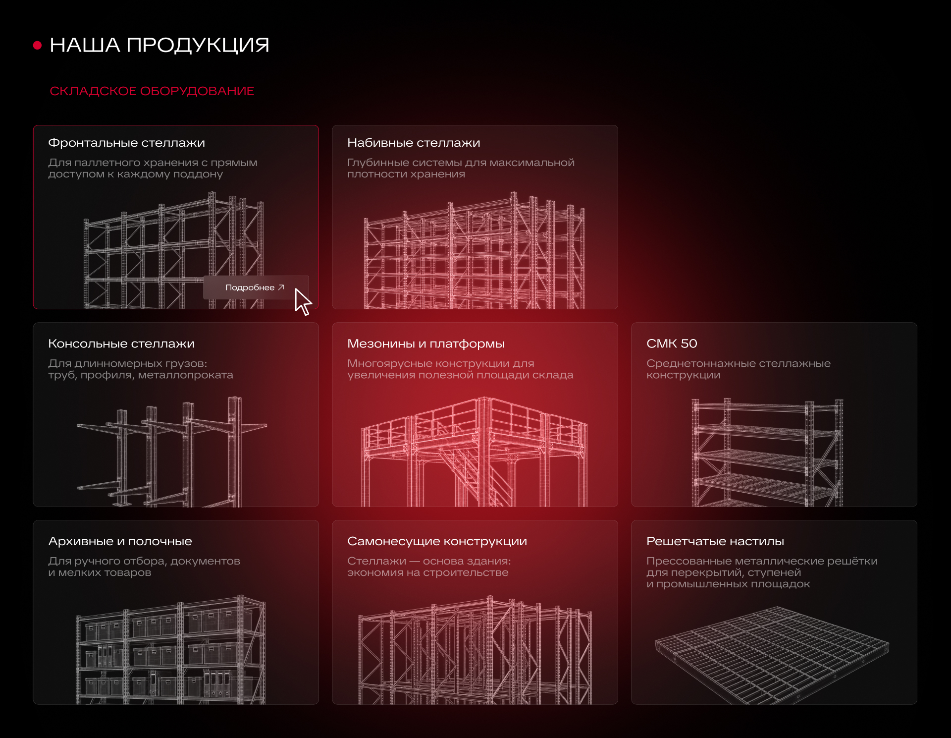
We studied the printed materials provided, analysed the product range, and organised the categories and subcategories. Instead of the logic of “here are the documents, figure it out yourself”, we built a consistent path from a product type to the exact item you need.
The catalogue now has two main sections: warehouse and retail equipment. Inside are racking systems, mezzanines, platforms, trolleys, retail fixtures and other groups. Getting to know the range now happens right on the website: you can move through a clear structure, gradually narrowing down which solution fits your task.
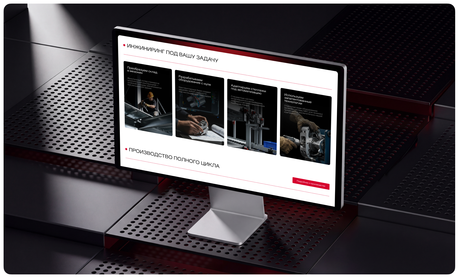
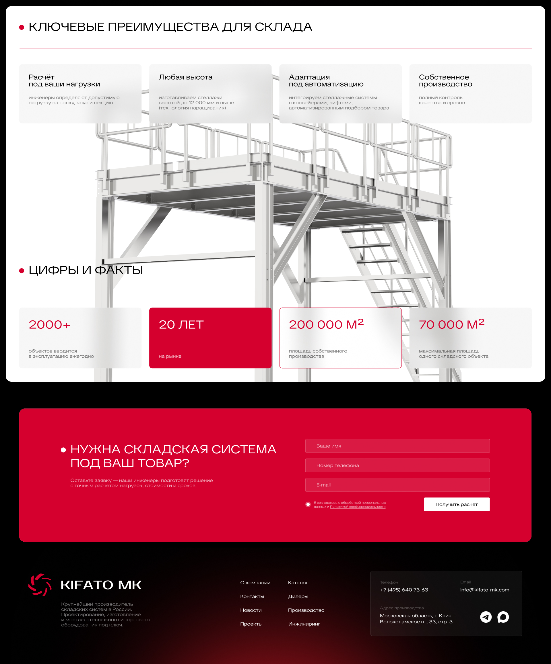
In parallel, we wrote texts about the company, its production and services. We showed that Kifato MK takes on the full cycle of work: it designs, manufactures, installs and commissions the equipment. We also highlighted its engineering capabilities — developing custom structures and adapting solutions to a specific site.
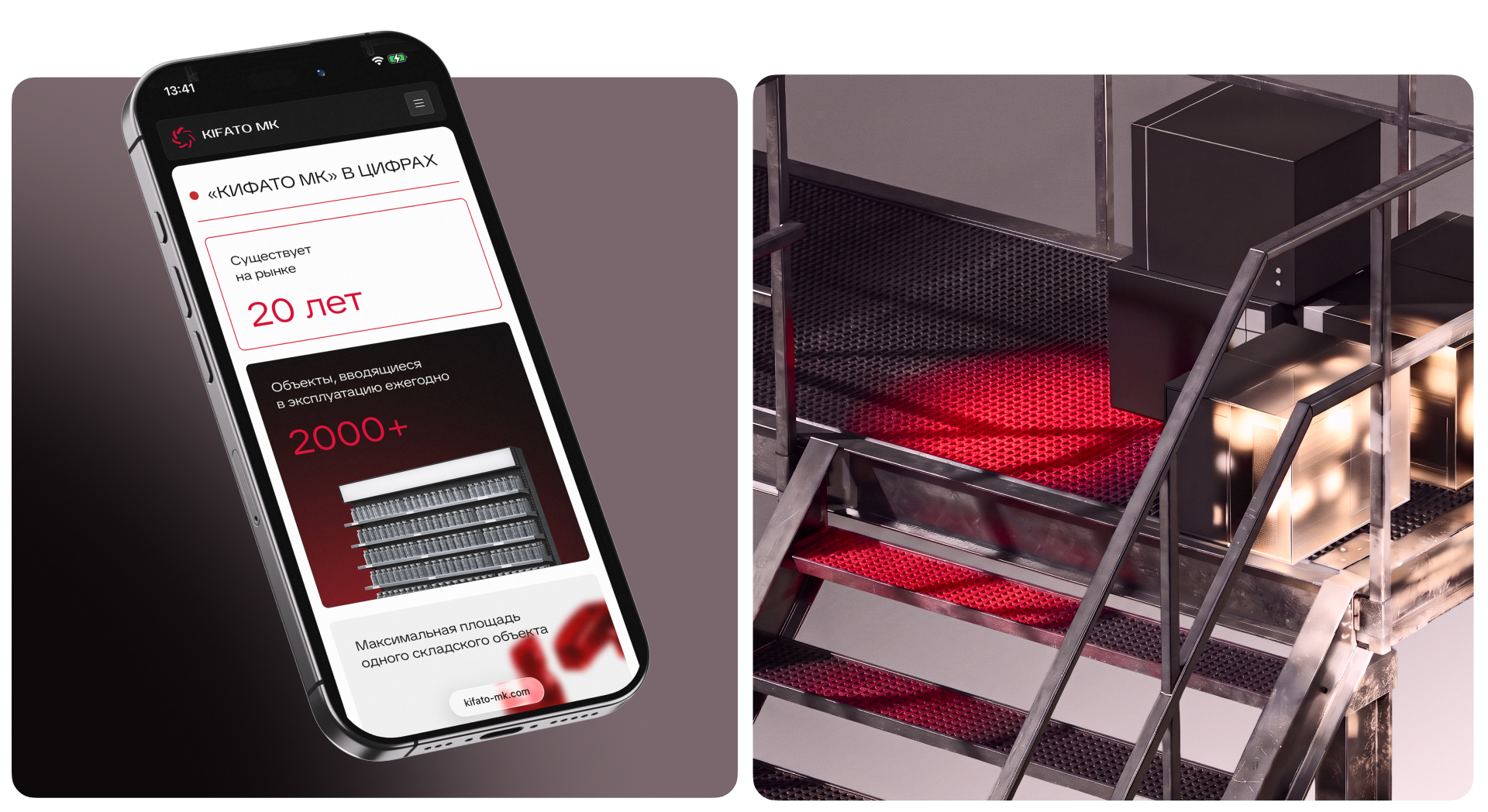
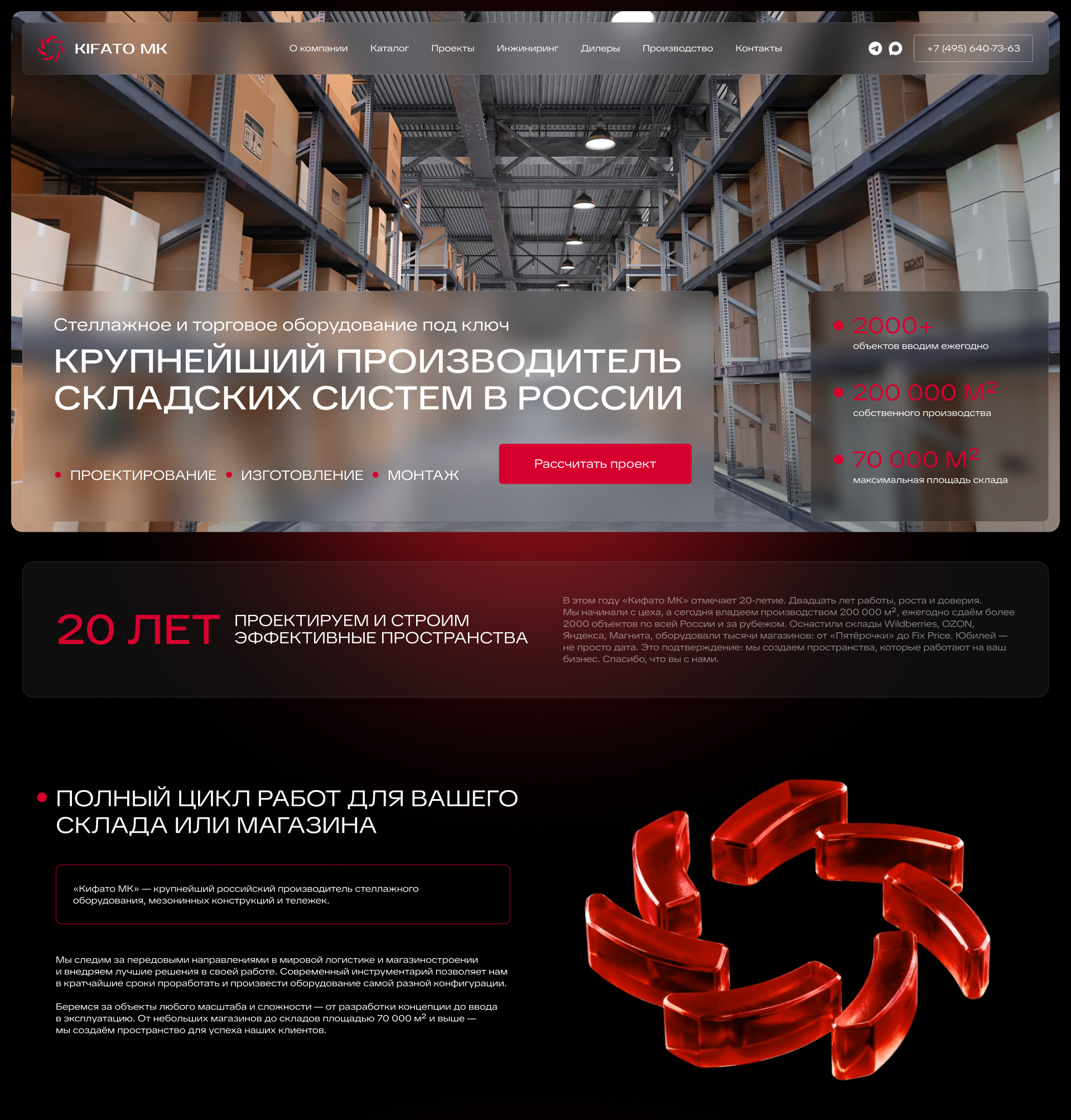
We paid separate attention to scale. Production figures, geography, completed projects, the largest clients — everything that used to stay in the shadows now has a prominent place on the website. When a company has this kind of experience behind it, it definitely should not be hidden behind a few generic phrases.
Based on the new structure and texts, we designed the pages. We built a visual hierarchy, placed the accents and united the catalogue and corporate sections with a common style. A large amount of information had to be easy to take in: visitors come to choose equipment, not to pass an exam on the product range.
Once the design was approved, we moved on to front-end and back-end development. And this is where, by the laws of the genre, there should be a paragraph about sudden difficulties, the fifth version of the concept and the heroic rescue of the project. But ours is a different story.
The project went through without a single revision.
The Kifato MK team came to us with a great deal of trust, approved stages quickly and gave us room to work. The client shared knowledge of their business, we proposed solutions, discussed them and moved on. Everything went so smoothly that inventing drama for this case study turned out to be harder than finding common ground on the project.
We truly value this kind of collaboration. When the client trusts the team’s expertise and the team pays close attention to the client’s business, there is more time left for quality work. On this project, mutual understanding was there from the very start and helped us quickly get from the first discussions to a finished website.
Result
Kifato MK now has a website that reflects the company’s true level. The scale of production, engineering capabilities and experience with the largest clients are presented convincingly. The product range has become a full catalogue with clear navigation, and the refreshed corporate identity has kept the brand recognisable.
We did not say goodbye at launch. We are now continuing to develop the website, expand its capabilities and work on SEO promotion.
This seems like the best ending for a project where both sides are happy: finishing one big stage and gladly starting the next. Now we are helping Kifato MK become more visible to new clients. Because a company like this deserves to take up a lot of space — both in the market and in search results.