Pattern in design: how a repeating motif becomes a brand tool
A pattern in design is a repeating visual element. We explore pattern types, key qualities, strategic use in branding, tools and common mistakes to avoid.

A pattern in design is a repeating visual element that sets the rhythm of a composition and helps people recognize a brand. The Burberry check, the Louis Vuitton monogram, a signature grid on packaging: all of these are patterns that long ago stopped being mere decoration and became part of a company’s visual identity.
Over the decades of graphic design history, the pattern has traveled from wallpaper and textiles to digital interfaces and corporate identity.
The short version:
- In a designer’s hands, a pattern is a strategic tool of visual communication.
- A good pattern combines three qualities at once: it is seamless, scalable and balanced.
- There are five main types of patterns, each suited to different tasks and brand personalities.
- A single pattern can work across a dozen touchpoints, from a business card to an interior wall panel.
What a pattern is: more than just a repeating motif
A pattern is a repeating visual element that forms a single, unified rhythm across a composition. Unlike texture (the tactile quality of a surface) or a background (a passive base beneath other elements), a pattern carries meaning: it organizes space, and the viewer reads it as part of the message.
Ornament has accompanied humanity for thousands of years, from the geometric paintings of ancient Egypt to the textile designs of the Arts and Crafts movement, led by the English designer William Morris in the 19th century. The same principle, a module plus repetition, is applied today in digital interfaces, corporate identity and packaging. The technology has changed; the essence has not.
A pattern in design is a visual element, or a group of elements, repeated according to a set rule to create a coherent overall design. What sets it apart from a simple motif is that a pattern is built on a modular grid and stays seamless when scaled.
At the heart of every design pattern is the module, or repeat: the smallest recurring fragment from which the whole pattern is assembled. The repeat defines the rhythm. The more tightly the modules are packed, the more dynamic the composition feels, and vice versa.
Key qualities of an effective pattern
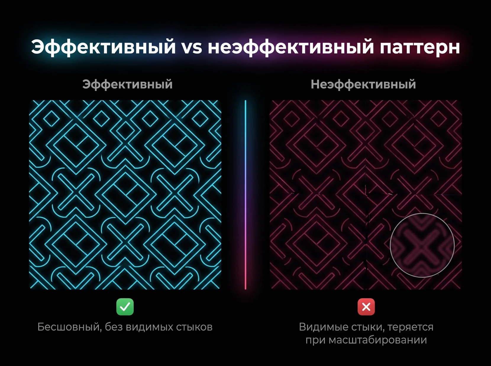
A good pattern strikes a balance across several parameters at once. Miss just one, and the pattern either falls apart when scaled or jars the eye with visible joins.
- Seamlessness. The joins between modules are invisible: the eye cannot tell where one fragment ends and the next begins. The test is simple: offset the module by 50% vertically and horizontally and check for gaps or doubled lines.
- Scalability. A pattern designed for packaging must look just as good on a palm-sized business card as on an exhibition stand several meters wide, with no loss of detail legibility.
- Compositional balance. The density of elements is evenly distributed: no visual “holes” where the eye drops through, and no “clumps” where elements merge into a mess.
- Brand consistency. The same pattern looks identical at every touchpoint, from the website to the packaging, with no distortion of color or proportion.
- Adaptability. When reduced to the size of an app icon or favicon, a complex pattern is simplified down to its key shapes, staying recognizable even in miniature.
A seamless pattern is a baseline requirement for almost any commercial project: a single visible seam on packaging or a website instantly gives away unprofessional work.
From decoration to strategic brand tool
For a long time, patterns were treated as mere decoration: wallpaper, textiles, ornaments for the sake of beauty. That has changed. Today the pattern has become a tool of strategic design that builds brand recognition and an emotional connection with the audience.
How a pattern becomes part of brand identity
A telling example is the Burberry check: first used as a lining for trench coats, it grew into a brand element in its own right, recognizable even without a logo nearby. Louis Vuitton tells a similar story with the LV monogram on its signature canvas. Here the pattern effectively is the brand, read instantly and in any context.
Brand recognition grows precisely because the pattern is unique. Copying a competitor’s logo is illegal and risky, yet plenty of companies try to imitate the general style of a “nice-looking pattern”. A signature pattern of your own, patented and recognizable, closes that loophole.
The psychology of how we perceive patterns
A pattern’s rhythm, shape and color trigger an emotional response before the viewer consciously takes in the content. A strict geometric rhythm (squares, straight lines, equal spacing) conveys order and reliability, which is why banks and tech companies so often choose it. Chaotic, “scattered” patterns with uneven spacing between elements add energy and movement, an approach often seen in brands aimed at a younger audience.
An emotional connection with a brand is built on more than the logo. A background pattern on packaging or a website works on a subconscious level, signaling “my kind of style” or “not for me” faster than a person can read the text.
A company that goes through a rebrand and replaces a random set of decorative elements with a signature pattern usually sees recognition rise: a single visual code across every touchpoint adds up to a coherent image that sticks from the very first encounter. If your brand is just setting out on that journey, the Veonix team offers corporate identity design from scratch, including patterns created for your specific goals.
Types of patterns in graphic design
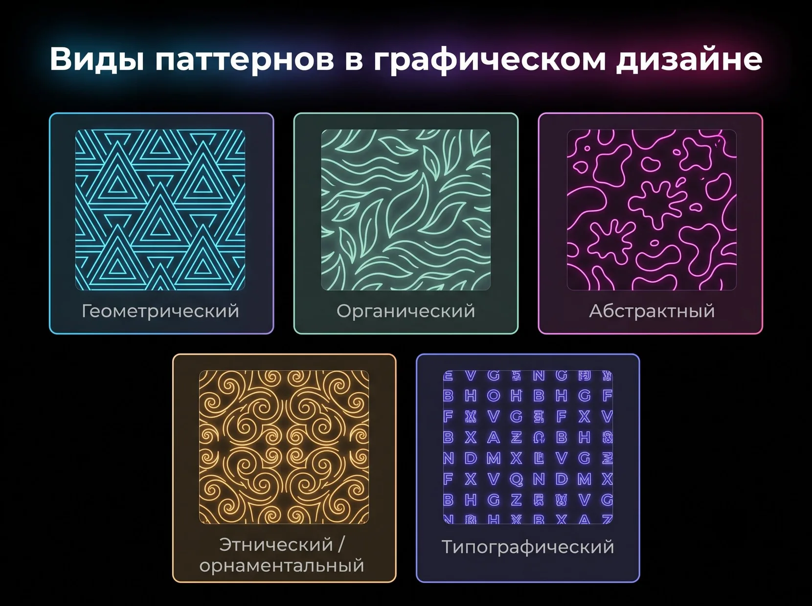
Patterns fall into five main categories, each serving its own visual purpose, from strict corporate layouts to emotionally driven consumer brands.
Geometric patterns
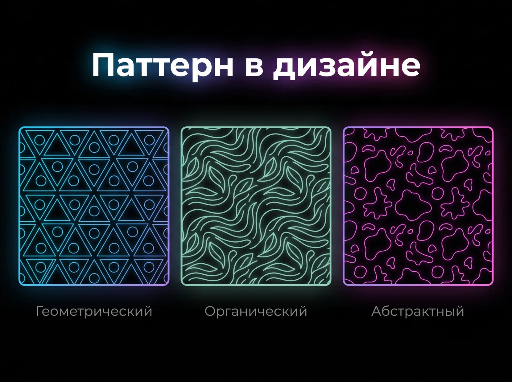
These are built on mathematical shapes: circles, triangles, straight lines and regular polygons. A graphic pattern of this kind communicates order, precision and reliability, which is why geometry is a favorite of tech brands and financial companies, where a sense of stability matters. A strict grid scales easily and stays legible even at small sizes, making geometric patterns a practical choice for corporate design.
Organic patterns
These draw on forms from the living world: leaves, waves, cellular structures, marbling. Organic shapes convey naturalness and softness, so they are popular with eco brands, food producers and makers of natural cosmetics. Unlike geometric patterns, organic ones are rarely strictly symmetrical: here, asymmetry heightens the sense of life without tipping into chaos.
Abstract patterns
Free-flowing forms with no direct link to real objects: spots, splashes, freehand lines. Abstraction offers maximum creative freedom and suits the fashion industry and art projects, where a bold image counts for more than a literal message. Such patterns are harder to fit into a strict brand book, but their unpredictability makes them more memorable.
Ethnic and ornamental patterns
National motifs and traditional designs, from Russian Khokhloma painting to Scandinavian runes. These patterns carry a cultural code and lend a brand authenticity, which is why craft producers and tourism projects often choose them to highlight a local identity.
Typographic patterns
Here the pattern is made of letters, numbers or symbols: a repeated brand name, initials or individual characters arranged in a rhythmic grid. Publishers and educational projects often use this approach, turning the text itself into a visual element of the composition.
Patterns in practice
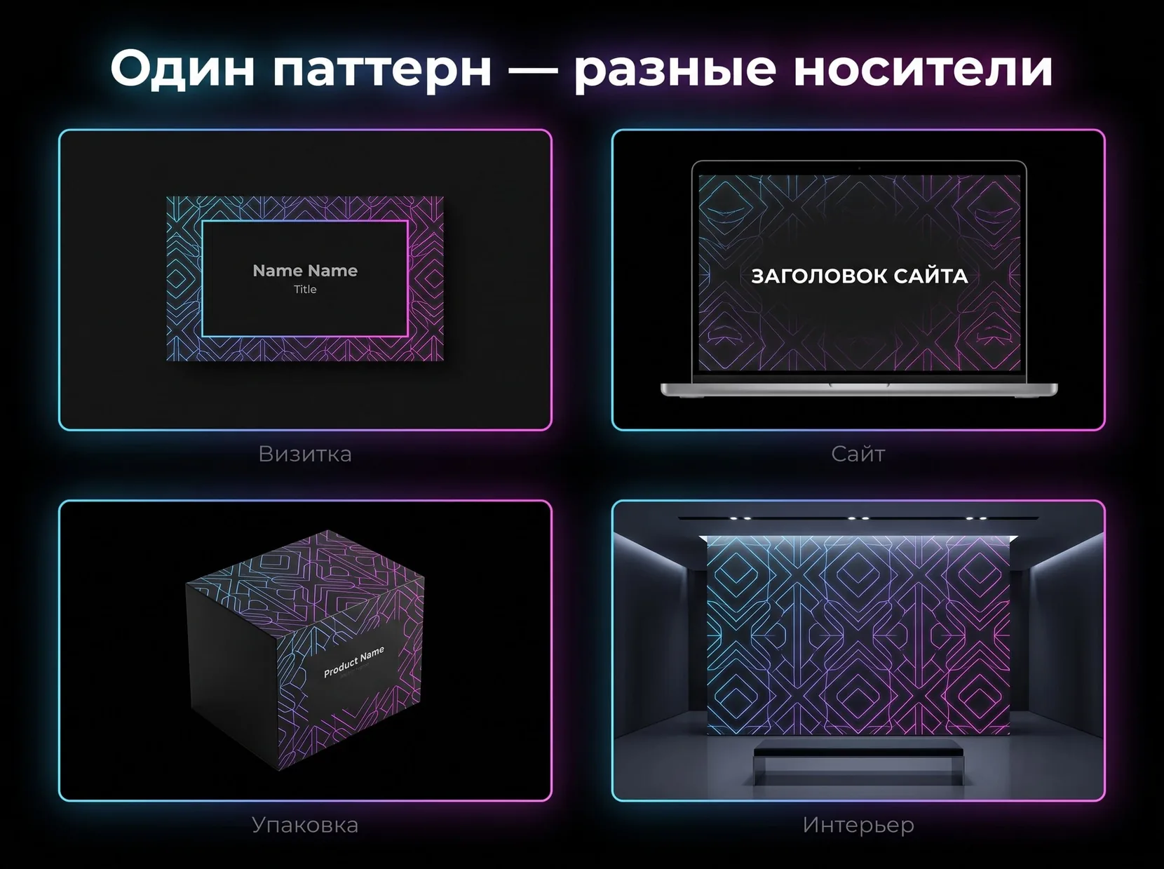
One well-thought-out pattern can work across a dozen different touchpoints at once, from a business card to an interior wall panel. That versatility is what makes it a sound investment: design it once, then adapt it to any task.
Patterns in branding
A signature pattern appears at every customer touchpoint: business cards, envelopes, presentation folders, corporate merch. This continuity supports brand consistency: people see the same visual code whether they are holding a business card or opening a company presentation. The Veonix studio delivers end-to-end branding, including signature patterns for the full set of brand assets.
Patterns in web design
In digital environments, a pattern most often serves as a background for website sections, a decorative interface element or an animated hover effect that comes alive under the cursor. The key is not to overdo it: a pattern that is too dense or too high-contrast behind text hurts readability, so you have to strike a balance between brand recognition and reading comfort.
Patterns on packaging
Wrappers, labels, shipping boxes: on packaging, a pattern works on two levels at once, making the product stand out from competitors on the shelf while confirming that it belongs to the brand. The same signature pattern is often scaled from a small label to a large shipping carton, keeping its proportions and legibility intact.
Patterns in interiors and print
Wall panels, textiles, floor tiles: patterns also move into physical spaces, such as a company’s showroom or office. In print, they appear in catalogs, brochures and posters, either as a background element or as an accent detail on the cover.
Tools for creating patterns
The industry standards are Adobe Illustrator and Figma. Which tool to pick depends on the task, the budget and whether you work alone or as part of a team.
- Adobe Illustrator remains the gold standard for professional pattern work: its built-in Pattern Make feature assembles a seamless pattern in a couple of clicks, and because the program is vector-based, you get full control over every element of the module with no loss of quality when scaling.
- Figma is built for teamwork: patterns are created with plugins such as Pattern Hero or Patter, and every project member sees changes in real time.
- Adobe Photoshop suits raster patterns and textures where surface and painterly quality come first, for example background textile designs.
- Affinity Designer is a solid alternative to Illustrator, with similar features and a one-off license fee instead of a subscription.
Online generators such as Patternizer or Patternico are handy for quick prototypes and rough sketches, but they are not suitable for a final commercial product: they lack precise control over the repeat and color.
To get started, Figma’s free plan is enough; for professional commercial projects, practitioners more often rely on Adobe Illustrator.
Common mistakes when creating patterns
Even experienced designers sometimes fall into the same traps when working with patterns. Looking at the most common slip-ups helps you avoid repeating other people’s mistakes on your own project.
An overly detailed module
The more complex the repeat, the harder it is to spot visual problems during development, and at smaller scales fine details turn into a pixelated mess. A pattern with dozens of tiny elements looks great on a large print but becomes completely illegible on an app icon or favicon. The rule is simple: the wider the range of applications, from a billboard to a browser tab icon, the simpler the base module should be.
Ignoring contrast with the background
A pattern that looks great on its own on a white Illustrator artboard can fail completely on a real surface: dark packaging, a colorful website, glossy paper. Before signing off on the final version, test the pattern on different backgrounds and under different lighting: a working file in Illustrator only ever shows you the ideal picture.
Placing modules at random, without a grid
Ditching the modular grid in favor of placing things “by eye” may feel like creative freedom, but in practice it almost always leads to uneven density: elements bunch up in some places and leave gaps in others. Even organic and abstract patterns that look free-form are actually built on a hidden grid, just one that is less obvious than in strict geometry.
Using stock patterns without adapting them
A pattern downloaded from a free library saves time but robs the brand of uniqueness: the very same pattern may already be on a competitor’s packaging or on hundreds of other projects online. For one-off decoration this is not critical, but for a corporate identity it undermines the very idea of recognition, which is the whole reason for creating a pattern in the first place.
Skipping the print test
A pattern that looks perfect on screen can lose color vibrancy in print because of the difference between the RGB and CMYK color models. Before starting a print run, it makes sense to order a test proof: that is cheaper than reprinting an entire batch of packaging because the colors came out unexpectedly dull.
Conclusion
A pattern in design is a working brand tool that goes far beyond a pretty background. A well-designed pattern keeps a brand coherent on any medium, from business card to billboard, from packaging to website. Building a pattern into brand strategy is a job for professionals: the Veonix team creates logos and brand identity, treating patterns as part of a unified visual system.
Frequently asked questions
How long does it take to develop a signature pattern for a brand?
Anywhere from a few days for a simple geometric module to a couple of weeks if you need several variations for different media and client approval.
Can one pattern be used in several color variations at once?
Yes, this is standard practice: the base module stays the same, and only the color palette changes for a particular medium or seasonal campaign.
What is the difference between a pattern and an ornament?
An ornament is usually tied to a specific cultural or historical tradition. A pattern is a broader concept that covers any repeating visual module, including abstract and geometric forms with no cultural context.
Does a small business need a pattern, or is it only for big brands?
A signature pattern is useful at any scale. Even a small coffee shop benefits from recognizable packaging or a branded background on social media, and it does not take a Burberry-level budget.
How can I protect an original pattern from being copied by competitors?
A unique pattern can be registered as a trademark or an industrial design. This gives you legal protection and the right to demand that competitors stop using a similar pattern.